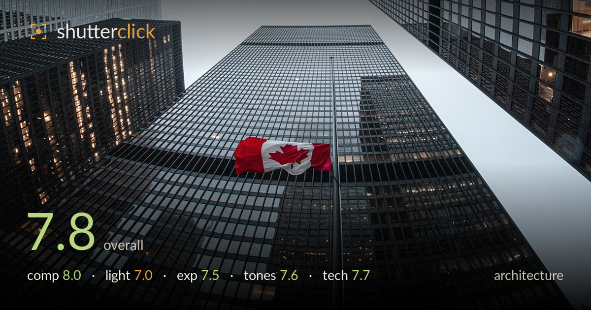
Canadian flag among the towers
Photo by 12659751

No EXIF metadata in this file
Technical analysis based on visual assessment only.
A confident look-up composition that converges four glass towers toward a soft white sky, with a single red Canadian flag providing the crucial punch of colour against an otherwise cool, muted palette. The upward vanishing perspective is the engine of the shot and it works. What most holds it back is the flag's placement — offset low-left rather than anchored to a strong point — and the flat, overcast light that keeps the glass facades reading as grey grids without much dimensional pop. The tonal balance between shadowed panels and the bright sky is well handled and the frame reads clean.
The four-tower convergence toward the pale sky is the strongest asset — the eye is pulled up and inward cleanly. Placing the towers along the frame edges and letting the sky open the centre gives the composition breathing room. The red flag is the intended focal accent, but its low-left position feels slightly stranded rather than deliberately anchored. Rotating the frame or shifting the flag toward a convergence node would sharpen its role. The near-symmetry across the vertical axis reads as intentional and holds the image together.
Flat overcast light gives even, shadowless coverage across every facade, which keeps the glass panels legible but robs them of modelling and depth. The soft sky works as a clean negative-space backdrop and prevents blown highlights, yet the buildings read as uniform grey grids with little tonal separation between planes. Warm interior window lights offer small pockets of contrast that lift otherwise static surfaces. A break in the cloud or low-angle side light would carve the geometry and give the towers more sculptural presence.
Exposure is well judged for a high-key sky against dark glass. The bright overcast background sits just short of clipping while the shadowed facades retain panel detail rather than crushing to black. The dynamic range is handled competently — window reflections and interior lights survive without either extreme losing information. The overall brightness reads slightly muted, which suits the mood but leaves the darker towers on the flat side. A touch more midtone separation in the glass would add snap without threatening the highlights.
The cool blue-grey palette is cohesive and lets the single red flag carry disproportionate weight — a smart tonal strategy. White balance leans cool, reinforcing the overcast mood. Contrast is gentle, which keeps the glass grids soft but risks feeling grey and low-energy across the mid-tones. The red reads accurately and vividly. Slightly deeper blacks in the shadowed panels and a fraction more contrast would give the facades more bite while preserving the muted, moody character that defines the image.
Sharpness holds well across the frame, with the window grids crisp enough to read detail into the distance, suggesting a suitably small aperture and steady handling for a look-up wide shot. The ultra-wide focal length is the right call here — it captures all four towers and drives the dramatic convergence, though it inevitably stretches the corner buildings and exaggerates perspective, which reads as intentional. Focus appears accurate throughout; the deep depth of field keeps both near facades and the distant tower tops acceptably sharp. Verticals converge toward a central vanishing point rather than being corrected, which is appropriate for this upward-looking approach rather than a straight-on architectural study. Noise is well controlled in the flat sky. The main technical refinement would be ensuring the frame is precisely levelled so the symmetry reads as deliberate rather than slightly canted — small rotational adjustments in post would tighten the geometric balance and make the convergence feel fully intentional.
What would elevate it
Tags
Shot something like this?
Expert photo critique, on demand — scored across six categories, EXIF-aware. Start with 3 free critiques, no credit card.
critique my photo — free