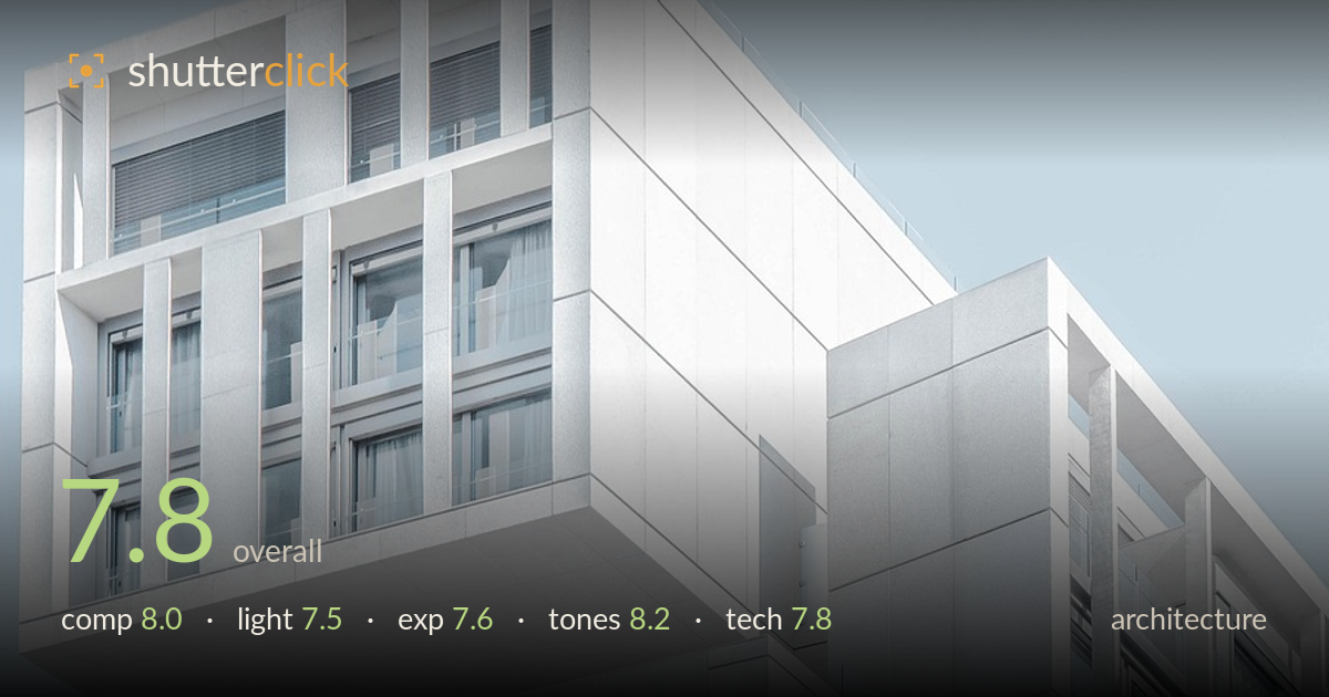
Cantilevered white facade against blue sky
Photo by Pexels

No EXIF metadata in this file
Technical analysis based on visual assessment only.
A clean, confident study of a modern white facade, carried by the cantilevered upper volume that reads as the anchoring gesture against generous blue-sky negative space. The layered stepping of the blocks and the high-key palette give the frame a cool, minimalist calm that suits the subject well. What holds it back most is the verticals: the building leans and the parallels converge slightly, which undercuts the geometric precision the architecture demands. The near-blown facade also sacrifices some texture on the white stone. Correcting the perspective and pulling back the highlights would sharpen an already strong composition.
The stepped, interlocking volumes are the real strength here, with the cantilevered upper block placed high-left and set against a broad field of sky that lets the geometry breathe. The diagonal roofline draws the eye cleanly through the frame. The subject sits slightly heavy toward the left and bottom, and the sky, while effective as negative space, occupies a large upper region that could be reconsidered. The interplay of window grids and solid panels gives satisfying rhythm across the facade.
Soft, high, slightly diffused daylight keeps the white surfaces bright and even, reinforcing the clean minimalist mood. The light direction produces a gentle shadow on the recessed right-hand volume, which adds just enough separation between the stacked blocks. What's missing is raking, directional light that would carve out the depth of the reveals and mullions more dramatically. The near-shadowless rendering flattens some of the three-dimensional stepping, and a lower sun angle would give the projecting slab far more sculptural presence.
The high-key treatment is deliberate and largely successful, holding the cool palette without letting the sky go dull. The whites of the stone facade sit very close to clipping, though, and the brightest panels have lost fine surface texture that would enrich the material. Shadow detail in the glazing and recesses is retained well, preserving the window structure. Pulling the highlights back by a fraction and lifting exposure off the brightest walls would recover tonal information without disturbing the airy overall feel.
The cool white-and-pale-blue palette is the image's signature and is handled with restraint — a consistent, slightly cyan white balance that unifies stone and sky into one calm register. Contrast is intentionally low, suiting the minimalist intent, and the subtle grey gradations across the panels give the surfaces quiet depth. The blue sky provides just enough colour to keep the frame from feeling sterile. A touch more mid-tone separation on the facade would add dimension without breaking the clean, monochromatic mood.
Focus is accurate across the facade, with the window grids, mullions and panel joints all rendered crisply, indicating a sensible aperture and a lens resolving fine architectural detail well. Noise is not a factor in this bright, high-key capture. The most pressing technical issue is perspective: the building tilts and the vertical lines converge inward, a keystoning effect that is judged strictly in architecture. This suggests an upward-tilted camera without correction. A tilt-shift lens, or a straight-on stance with more distance, would keep verticals true; failing that, perspective correction in post would straighten the parallels and restore the rigorous geometry the subject calls for. Framing is otherwise clean, with no distracting fringing or obvious distortion beyond the convergence. The high-key exposure appears deliberate rather than accidental, and the overall execution is competent — the discipline of straight verticals is the one element separating this from a polished architectural result.
What would elevate it
Tags
Shot something like this?
Expert photo critique, on demand — scored across six categories, EXIF-aware. Start with 3 free critiques, no credit card.
critique my photo — free