Carved sandstone temple frieze
Photo by User:Ggia

| Focal length | 50 mm |
| Aperture | f / 5.6 |
| Shutter | 1/60 s |
| ISO | ISO 250 |
| Exp. comp. | 0.0 EV |
| Shot at | 14:32 · Mar 3, 2012 |
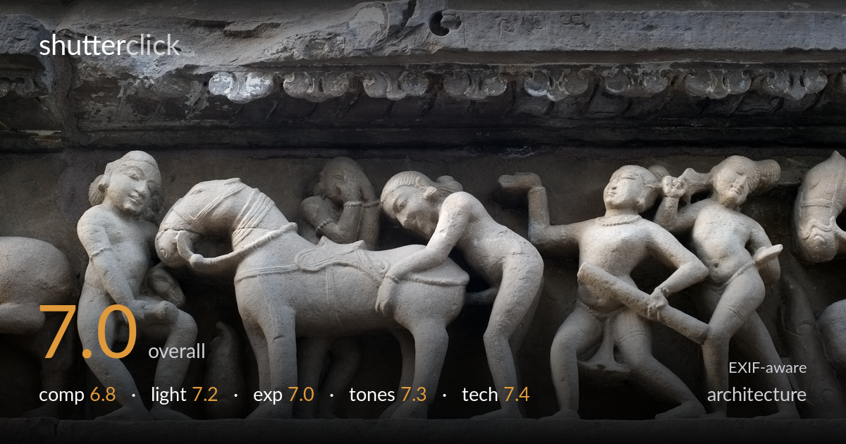
A well-executed documentation of a carved sandstone frieze, with the relief's three-dimensional depth rendered convincingly through soft directional light. The horizontal banding of the architecture is held nearly level, and the carving detail is resolved cleanly across the frame. What most holds it back is the framing: the figures are clipped hard at both edges, severing the narrative sequence and leaving incomplete forms on the left and right margins. The dark upper register also competes for attention without adding much. A composition that respects the panel's natural breaks would let the relief read as a coherent whole.
The horizontal register of the frieze is held close to level, which suits the architectural subject, and the relief fills most of the frame with strong tactile presence. The weakness is the cropping: figures are sliced through at both left and right edges, breaking the narrative band mid-figure and leaving amputated forms. The dark sculpted cornice above occupies a large share of the frame without carrying equal interest. Framing to a natural break between figures, or stepping back to include a complete panel, would give the sequence more coherence.
Soft, slightly raking daylight does real work here, modelling the carved volumes so the figures separate from their recessed background and the musculature and drapery read with depth. The directionality is gentle enough to avoid harsh black shadows in the undercuts while still defining form. The upper cornice falls into deeper shade, which adds tonal weight but loses some detail. Light slightly more raking from the side would deepen the surface texture of the weathered stone, but this is a capable handling of available light.
Exposure is well judged for the stone's mid-grey value, holding highlight detail on the brightest carved surfaces without clipping and retaining information in the shadowed recesses between figures. The darker upper band sits low but not crushed. The histogram appears to use the available range sensibly, with the relief's midtones placed where the texture reads best. A touch more shadow lift in the cornice would recover the ornamental detail there, but the core subject is exposed accurately and deliberately.
The cool grey-blue cast of the weathered sandstone is rendered with a believable, consistent white balance, and the subtle warm undertones in the better-lit figures keep the stone from going lifeless. Contrast is moderate and appropriate, separating the raised carving from the recessed ground without forcing it. Tonal gradation across the curved forms is smooth, preserving the sense of polished and weathered surface. The patches of pale mineral deposit read naturally. A slight contrast lift in the shadowed upper band would balance the tonal weight top to bottom.
The settings are sensibly matched to the subject. At f/5.6 on a 50mm lens, depth of field is sufficient to hold the shallow relief plane sharp front to back, which is exactly what a low-relief frieze needs. Focus lands accurately on the carved figures, and detail is crisp across the central span. ISO 250 keeps noise negligible in the D700's full-frame sensor, and 1/60s is adequate for a static subject shot with steady support or careful handholding. There is no visible motion blur or camera shake. The only technical reservation concerns the lens choice relative to position: at this distance the 50mm forced the edge figures out of frame, so a slightly wider lens or a step back would have captured the full panel without cropping. Sharpness falls off marginally toward the far right figures, suggesting either slight plane misalignment or the relief receding from the focal plane. Overall, a clean, technically sound capture of a demanding textured subject.
what would elevate it
tags
Shot something like this?
Expert photo critique, on demand — scored across six categories, EXIF-aware. Start with 3 free critiques, no credit card.
critique my photo — free