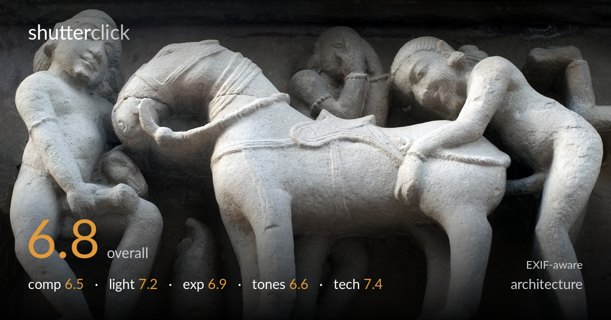
Carved stone figures in raking light
Photo by User:Ggia

| Focal length | 50 mm |
| Aperture | f / 5.6 |
| Shutter | 1/60 s |
| ISO | ISO 250 |
| Exp. comp. | 0.0 EV |
| Shot at | 14:33 · Mar 3, 2012 |
A confident, frame-filling record of a carved stone relief, with raking side light doing the most important work — pulling form and texture out of the figures. The carving's three-dimensionality reads clearly, and detail in the lit stone is well held. What holds it back is framing discipline: the bands of architecture above and below are cut into awkward slivers, and the central horse figure dominates while the human figures fall partly out of frame at both edges. The cool, slightly flat grey tones are accurate but inert. As documentation it succeeds; a touch more breathing room and a warmer rendering would lift it from record to image.
The relief fills the frame edge to edge, which makes the carving immediate, but the cropping is unresolved. Figures at both left and right edges are sliced through, and the dark architectural band along the top is reduced to an uneasy sliver while the plinth below gets a similar fragment. The central horse becomes the dominant mass almost by accident, pulling weight away from the more interesting human figures. Including the full frame of one complete panel, or framing on a single figure group, would give the composition an intentional anchor rather than a slice of a longer band.
The low, raking side light is the strongest decision here — it skims across the stone and reveals the carving's depth, modelling muscle, drapery and the rounded forms of the figures with real dimensionality. The directionality separates lit planes from shadowed recesses cleanly. The upper architectural band falls into deep shadow, which frames the lit relief but loses its detail entirely. Slightly more open shadow, or shooting when the light reached a touch higher into the recesses, would retain that upper structure without flattening the modelling that the angle achieves so well.
Exposure is judged competently for the lit stone. The brightest planes of the relief hold texture without clipping to paper white, and the midtones sit where the carved detail reads best. The trade-off is the upper band, which blocks up into near-black with little recoverable detail — acceptable as a framing device but a loss of context. The histogram clearly favours the highlights. A half-stop pull, or an exposure blend to lift the deepest recesses, would preserve both the lit carving and the architectural setting around it.
White balance leans cool, rendering the sandstone a flat neutral grey rather than the warm honey tone these reliefs usually carry. It is technically defensible but emotionally inert, and the contrast is moderate without much sparkle in the highlights or richness in the shadows. The tonal separation between lit and shadowed stone is decent thanks to the light, but the overall grade does the material no favours. A warmer white balance and a gentle contrast lift would give the stone presence and better convey its age and surface.
The settings are well matched to the subject. At f/5.6 on the 50mm, depth of field is sufficient to hold the shallow relief sharp across the frame — a deeper plane is not needed for a near-flat carving, so this is an efficient choice. ISO 250 keeps noise negligible and preserves clean tonal gradation in the stone. The 1/60s shutter is fine for a static subject, assuming a steady hand or support at 50mm, and there is no visible blur. Focus appears accurate on the foreground figures, with the texture of the sandstone resolving crisply. The 50mm focal length gives a natural, undistorted rendering of the panel without the line stretching a wider lens would introduce — appropriate for architectural detail. The only technical reservation is depth: with the relief running across the frame at a slight angle, a touch more stopping down to f/8 would have guaranteed edge-to-edge critical sharpness with no real cost given the static subject and steady light.
what would elevate it
tags
Shot something like this?
Expert photo critique, on demand — scored across six categories, EXIF-aware. Start with 3 free critiques, no credit card.
critique my photo — free