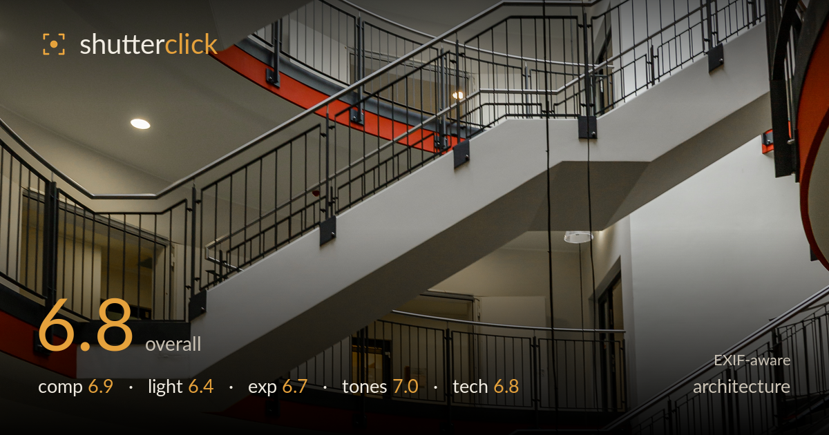
Cascading staircases in an atrium
Photo by Friedrich Haag

| Focal length | 20 mm |
| Aperture | f / 4.5 |
| Shutter | 1/20 s |
| ISO | ISO 100 |
| Exp. comp. | 0.0 EV |
| Shot at | 11:05 · Feb 12, 2020 |
A strong sense of vertical rhythm carries this atrium interior — the zigzagging staircase flights and the recurring red-and-white banding build genuine layered depth. What most holds it back is the tangle of black cables running down the centre and the two intrusive pendant lamps, which cut across the cleanest lines and pull the eye away from the architecture. The framing captures the stack of levels well but doesn't fully resolve into a single reading; the eye wanders without a clear anchor. Cleaner separation of foreground clutter and a slightly more decisive vantage would elevate an already competent structural study.
The stacked, staggered stair flights create a satisfying diagonal cascade against the vertical framing, and the repeated red bands act as consistent guides through the levels. The layering of depth from near door to distant skylight is genuine. The weakness is the dangling cables and pendant lamps bisecting the frame — they intersect the crispest architectural lines and add visual noise the geometry doesn't need. The right edge is busy with railings that don't resolve. A vantage that cleared the cables from the strongest lines would tighten the whole reading.
The light is soft and largely even, filtering down from the skylight and supplemented by interior fixtures, which suits the interior but leaves the scene somewhat flat. There's little raking direction to carve out the curved undersides of the landings or emphasise the banding, so surfaces read as broad tonal masses rather than sculpted form. The warm pockets around the lit doorways give welcome contrast to the cool greys. More directional or lower-angle light would model the curves and give the staircases more dimensional presence.
Exposure is well controlled across a demanding range — the bright skylight at top is close to clipping but retains some structure, and the shadowed doorways hold usable detail. Midtones on the white walls sit cleanly without going muddy. The overall brightness reads deliberate and balanced given the mixed interior sources. The darkest railing areas near the base lose some separation, and the top-centre skylight blows slightly, but nothing critical. A gentle highlight recovery would tame the skylight edge without hurting the mid-range.
The muted grey-and-white palette with the recurring orange-red banding is the image's strongest tonal asset — the restrained colour scheme keeps the eye moving through the accents. White balance is neutral and consistent, and the warm doorway lights provide pleasant contrast points without disrupting the cool overall cast. Contrast is moderate and appropriate for the airy interior. Saturation is well judged. A touch more mid-tone contrast on the white surfaces would add crispness where the walls currently read a little soft and undifferentiated.
At 20mm on the 6D Mark II, the wide focal length is well suited to capturing the multi-level atrium and its converging geometry. f/4.5 delivers sufficient depth of field to keep the stacked planes acceptably sharp front to back, and ISO 100 keeps the image clean with no visible noise. The 1/20s shutter is slow for handheld work at this focal length; while wide angle is forgiving, critical sharpness on the fine railings looks marginally soft, suggesting minor camera shake or the edge of the sharpness envelope — a tripod or 1/60s would have secured it. Focus is placed reasonably across the mid-planes. Verticals show mild convergence typical of an upward-tilted wide lens; for architecture this reads as slightly uncorrected keystoning that a small perspective adjustment in post would straighten. Overall a competent capture that would benefit from a faster shutter for guaranteed crispness and a stricter handle on the verticals.
What would elevate it
Tags
Shot something like this?
Expert photo critique, on demand — scored across six categories, EXIF-aware. Start with 3 free critiques, no credit card.
critique my photo — free