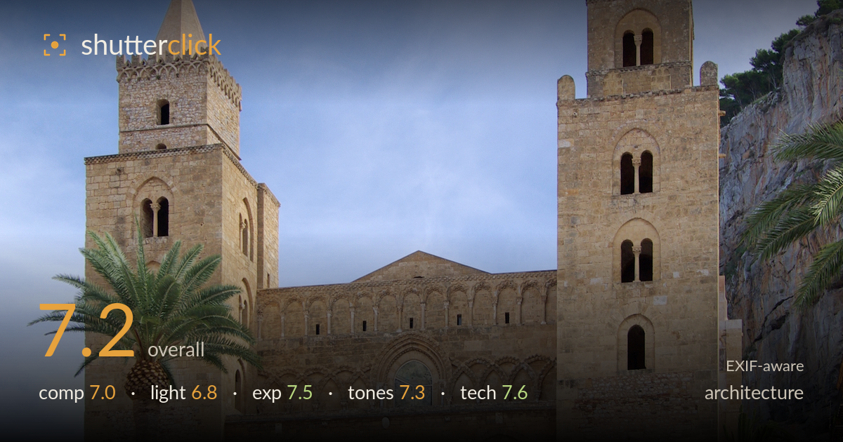
Cathedral facade under a bright sky
Photo by Berthold Werner

| Focal length | 24 mm |
| Aperture | f / 11.0 |
| Shutter | 1/350 s |
| ISO | ISO 100 |
| Exp. comp. | -1.5 EV |
| Shot at | 12:12 · Oct 11, 2012 |
A clean, well-executed frontal record of the cathedral that captures its symmetry and the warm stone against blue sky. The twin towers anchor the composition and verticals are largely controlled for a 24mm frame. What most holds it back is the crowded, busy foreground of market stalls and figures, which competes with the architecture rather than supporting it, and midday light that flattens the facade's relief. The palm on the left works as a framing device, but the right edge feels cluttered by the cliff and buildings. A cleaner base and directional light would lift this from a solid travel document to something more considered.
The centred, symmetrical framing suits the twin-tower facade and the palm on the left adds welcome foreground layering. Verticals are reasonably upright for a 24mm lens, showing care with camera position. The weakness is the lower third: the market umbrellas, potted plants and scattered tourists create a restless base that pulls attention from the building. The right side is heavier than the left, with the cliff and buildings crowding the tower. A slightly higher vantage or a moment with fewer figures would clean up the entrance and let the architecture dominate.
The light is high and near-frontal, typical of midday, which lights the stone evenly but flattens the deep Norman arches and blind arcading that give this facade its texture. The recessed portico reads as an undifferentiated dark mass rather than modelled depth. The sky holds decent gradation and the stone glows warm, but raking side light from earlier or later in the day would carve out the relief and separate the two towers more dramatically. As shot, the illumination is serviceable but does little to sculpt the subject.
The -1.5 EV compensation was a sound call, protecting the bright stone and sky from clipping while keeping the histogram in check. Highlights on the sunlit facade hold detail and the sky retains tone. The trade-off is the shaded portico and lower arches, which sit quite dark with little recoverable detail. A single exposure struggles with this range under harsh light, but the choice reads as deliberate rather than accidental. Overall a balanced, controlled exposure that favours the highlights sensibly.
White balance is clean and believable, the honey-toned limestone rendered warmly against a natural blue sky. Contrast is moderate and the tonal range spans deep portico shadows to bright stone without harsh clipping. Saturation is restrained and realistic, letting the material read as stone rather than oversaturated postcard. The blue sky could use a touch more depth to make the towers pop, and the shadowed areas verge on muddy, but the colour relationship between warm stone and cool sky is pleasing and coherent.
The settings are well matched to the subject. f/11 at 24mm delivers front-to-back sharpness appropriate for architecture, keeping both the near palm and the distant towers acceptably crisp, and sits in the lens's sweet spot for corner performance. ISO 100 keeps noise negligible and preserves the fine masonry detail in the stone. 1/350s is more than fast enough to freeze the moving tourists and any camera shake at this focal length. Focus is accurate across the facade, and the choice of a moderate wide angle captures the full building without excessive distortion. Verticals are close to true, suggesting careful levelling or modest post-correction. The K10D's sensor renders the stone texture with good micro-detail. The only technical caveat is that the dynamic range of a single frame at these settings leaves the shaded portico under-detailed — bracketing or a graduated approach would have helped. Overall a technically sound execution with sensible, deliberate choices throughout.
What would elevate it
Tags
Shot something like this?
Expert photo critique, on demand — scored across six categories, EXIF-aware. Start with 3 free critiques, no credit card.
critique my photo — free