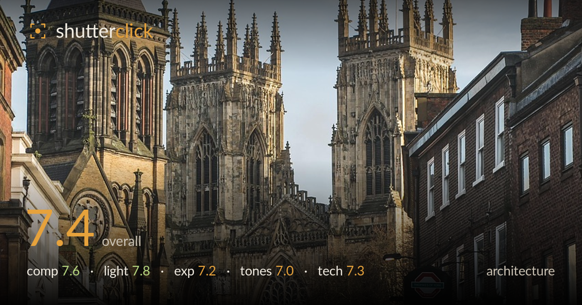
Cathedral towers down a quiet street
Photo by eduardovieiraphoto

No EXIF metadata in this file
Technical analysis based on visual assessment only.
A confident use of a street as a frame to build up to the cathedral, letting flanking buildings and the receding road funnel the eye to the Gothic towers. The soft raking side light gives the stone welcome texture and dimension. What holds the shot back is the busy lower foreground — parked cars, signage and figures compete without a clear anchor — and slightly heavy shadows in the near buildings. The verticals also lean inward. Tightened perspective control and a cleaner foreground moment would lift a strong compositional idea into a polished frame.
The street works well as a leading device, its converging kerbs and building lines drawing the eye to the twin towers and the great west window at centre. Layering front-to-back gives real depth. The two towers sit high and balanced against the sky. The weakness is the crowded lower third — parked cars, a white van and scattered pedestrians clutter the base without a resolved focal moment. The right-hand brick terrace is heavy and slightly crowds the frame edge, pulling weight away from the cathedral.
Low, warm side light rakes across the cathedral's west front, catching the tracery and pinnacles and separating stone from sky — exactly the kind of directional light that reveals Gothic detail. The shadowed left tower and dark near buildings build contrast and mood. The overcast, hazy sky is a touch flat and lacks drama, and the shaded street floor falls quite dark. Still, the timing captures a flattering rake across the facade rather than flat midday light, which is the harder and more rewarding choice.
Exposure is judged to protect the sunlit stone, which holds highlight detail in the towers without clipping the pale sky. The tradeoff is dense shadow in the foreground buildings and street, where fine detail is largely lost. The midtones on the cathedral read well and the dynamic range is used sensibly for a high-contrast scene. Lifting the shadows modestly would recover texture in the near facades and pavement without flattening the image, giving the lower frame more presence to match the well-held upper portion.
A muted, cool-neutral palette suits the overcast winter light, with warm sandstone tones lending the cathedral quiet richness against the grey sky. Contrast is a little heavy, deepening the foreground into near-black and slightly muddying the shaded buildings. The white balance sits believable, if faintly cool on the sky. Mid-tone gradation on the stone is the strength here. A touch more warmth and a gentler shadow curve would balance the tonal split between the luminous facade and the darker lower half.
From visual evidence the cathedral is rendered sharply, with the tracery, pinnacles and stonework holding fine detail — focus sits correctly on the facade and depth of field appears deep enough to keep both the near street and distant towers acceptably crisp. The apparent focal length compresses the scene well, stacking the towers against the flanking buildings without excessive distortion. Noise is not an issue in this daylight capture. The main technical concern is perspective: the verticals converge inward, the towers leaning toward each other, which is a common consequence of tilting the camera up and reads as keystoning against strict architectural standards. A shift lens, a step further back with a longer lens, or perspective correction in post would straighten the verticals. The right terrace edge feels slightly cramped, suggesting a fraction more breathing room would have helped. Overall the execution is clean and technically competent for a handheld street-level architectural frame.
What would elevate it
Tags
Shot something like this?
Expert photo critique, on demand — scored across six categories, EXIF-aware. Start with 3 free critiques, no credit card.
critique my photo — free