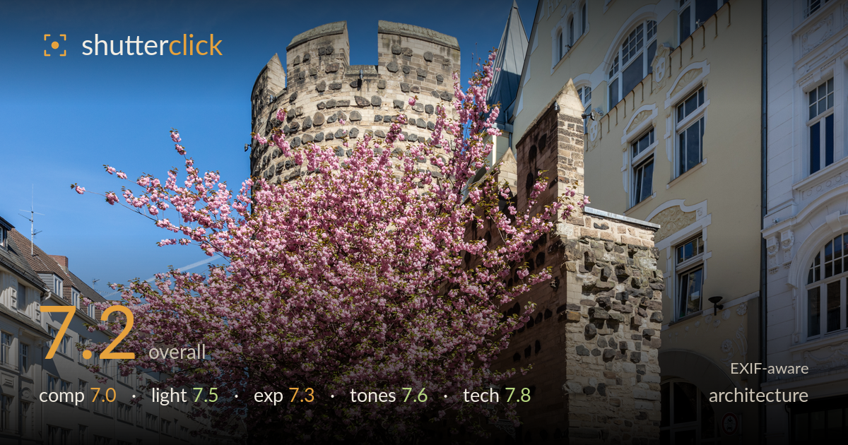
Cherry blossom by the old tower
Photo by Dietmar Rabich

| Focal length | 20 mm |
| Aperture | f / 9.0 |
| Shutter | 1/250 s |
| ISO | ISO 200 |
| Exp. comp. | 0.0 EV |
| Shot at | 09:41 · Apr 10, 2020 |
A well-executed architectural street scene where a blossoming cherry tree becomes an unexpected co-lead against a medieval stone tower. The pairing of soft pink against rough masonry is the image's strongest idea, and the light is handled cleanly. What holds it back is the tension between two competing subjects — the tree partly obscures the tower it should be framing, so neither reads with full clarity. Verticals on the right-hand buildings are largely controlled but not perfect, and the foreground plaza carries more empty pavement than the composition needs. A stronger point of view would resolve which element leads.
The scene balances the round tower, the blossoming tree, and the receding shopfront street on the left into a layered frame with genuine depth. The problem is that the tree and tower fight for the same space — the blossom masks much of the tower it should complement, leaving the central subject ambiguous. The lower-left plaza reads as dead pavement that pulls weight from the subject. The diagonal cobblestone lines lead the eye in, which helps, but a position further left or a slightly higher vantage would let the tower stand clear of the foliage.
Direct sunlight from the front-right models the tower's masonry well, raking across enough to reveal the coursing of stone and the recessed windows on the yellow facade. The light on the cherry blossom is bright and even, keeping the pink saturated without washing out. The clear sky and hard midday-ish light produce strong contrast that suits the stone but casts a somewhat heavy shadow across the base of the tower. Slightly lower, warmer light would deepen the texture on the tower and lend the whole scene more dimensionality.
Exposure is well judged for a high-contrast sunny scene. Highlights on the pale facades and blossom hold detail without clipping, and the sky retains gradation from deep blue to lighter horizon. Shadow areas along the tower base and beneath the arch stay readable, showing restraint in a scene that could easily have blocked up. The overall brightness feels accurate and deliberate rather than accidental. A touch more shadow lift in the darker masonry would recover the stone detail currently lost in the lower-left of the tower.
Colour is clean and pleasing — the pink blossom, the warm sandstone and basalt masonry, and the graded blue sky sit together naturally without oversaturation. White balance reads accurate, with the pale facades holding neutral whites. Contrast is on the higher side, appropriate for the crisp spring light, and the mid-tones in the stonework retain good separation between the different rock types. The green foliage at the tree base adds a small complementary note. Nothing feels pushed; the palette is honest and coherent.
The 20mm on full frame is a sensible choice for capturing the tower, tree, and street context in one frame, and f/9 delivers deep front-to-back sharpness that keeps both the masonry detail and the distant shopfronts crisp. ISO 200 keeps noise negligible and 1/250s is more than sufficient for a static scene. Focus appears accurately placed across the mid-ground, and the stonework resolves with fine texture. The main technical caveat is wide-angle geometry: at 20mm the buildings on the right and the tower show mild converging verticals and some edge distortion, which matters more in architecture than most genres. The verticals are close but not fully corrected. A tilt-shift lens or careful perspective correction in post would straighten the facades. The lens handles the bright sky without visible flare, and corner sharpness holds well for an Art-series wide. Overall the execution is solid and the settings are appropriate to the subject.
What would elevate it
Tags
Shot something like this?
Expert photo critique, on demand — scored across six categories, EXIF-aware. Start with 3 free critiques, no credit card.
critique my photo — free