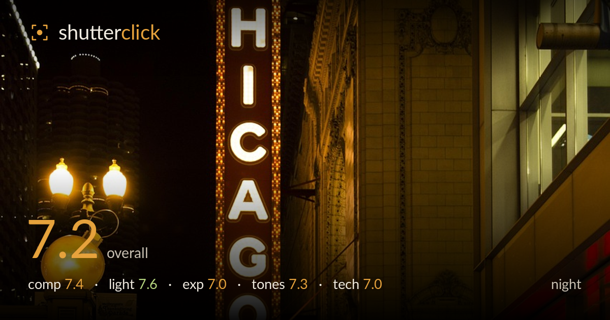
Chicago theatre marquee at night
Photo by sam99929

No EXIF metadata in this file
Technical analysis based on visual assessment only.
The iconic Chicago Theatre marquee anchors this night frame with confident vertical weight, and the receding sidewalk gives real depth. The famous sign and the playful Zelda marquee are the clear draw, well supported by the warm building glow and a distant skyline. What most holds the image back is the wide, unresolved right side: the Walgreens facade eats a large portion of the frame without adding much, competing with the marquee for attention. The pedestrians on the sidewalk are small and scattered rather than forming a decisive foreground moment. A tighter, more intentional balance between sign, street, and figures would sharpen the storytelling.
The vertical marquee dominates the left-center and reads instantly, with the sidewalk drawing the eye into depth toward the walking figures. The lamp post and ornate gate on the left add framing texture. The trouble is the right third: the flat Walgreens facade occupies substantial space without earning it, pulling weight away from the sign. The skyline pocket at left is a nice secondary layer. A composition that lets the marquee breathe against the night while cropping or repositioning the bland storefront would concentrate the energy far more effectively.
The mixed artificial light is handled well for the hour: the incandescent marquee bulbs glow warm, the building facade is bathed in a pleasant amber wash, and the red storefront lighting adds a contrasting accent. The globe lamp on the left provides a bright anchor. Direction is naturally motivated and the light shapes the ornate stonework nicely. The one weakness is that the foreground sidewalk falls into flat, low-contrast dimness, leaving the pedestrians unmodeled and murky rather than caught in any pool of light.
Exposure is judged to protect the bright marquee bulbs, which hold detail without heavy blooming — a sound priority for this scene. The warm facade sits in a healthy midtone range. The black sky is clean and deliberate. The cost is the foreground: the sidewalk and figures sit deep in the shadows with little recoverable detail, and faces read as silhouettes. A slightly brighter exposure, or lifting shadows in post, would bring the street life forward without endangering the sign highlights.
The warm amber palette is cohesive and evokes the theatre-district mood convincingly, with the red storefront and cool distant skyline offering welcome contrast. White balance leans warm but suits the tungsten sources. The marquee whites stay reasonably neutral against the glow. Saturation is controlled rather than gaudy. The shadows go slightly muddy and greenish in the darkest street areas, and a touch more separation in the deep tones would keep the foreground from feeling flat. Overall a pleasing, unforced night grade.
The image appears well controlled for handheld or tripod night work — the marquee is sharp, the bulb detail crisp, and noise is kept in check across the warm facade, suggesting a sensible ISO and clean processing. Depth of field is deep enough to hold both the sign and the distant building, appropriate for this establishing shot. Focus lands cleanly on the Chicago sign, the natural priority. The weaker area is the foreground: the walking figures show mild motion softness and sit in noisy shadow, so none reads as a decisive, sharp subject. A slightly faster shutter combined with a marginally higher exposure would have frozen a pedestrian cleanly while keeping the sign safe. The verticals of the building lean slightly with the perspective, which suits the dramatic upward angle but could be nudged straighter if a more formal architectural feel were wanted. Solid, dependable execution overall, with headroom in foreground rendering.
What would elevate it
Tags
Shot something like this?
Expert photo critique, on demand — scored across six categories, EXIF-aware. Start with 3 free critiques, no credit card.
critique my photo — free