Church spire against a dusk sky
Photo by fietzfotos

No EXIF metadata in this file
Technical analysis based on visual assessment only.
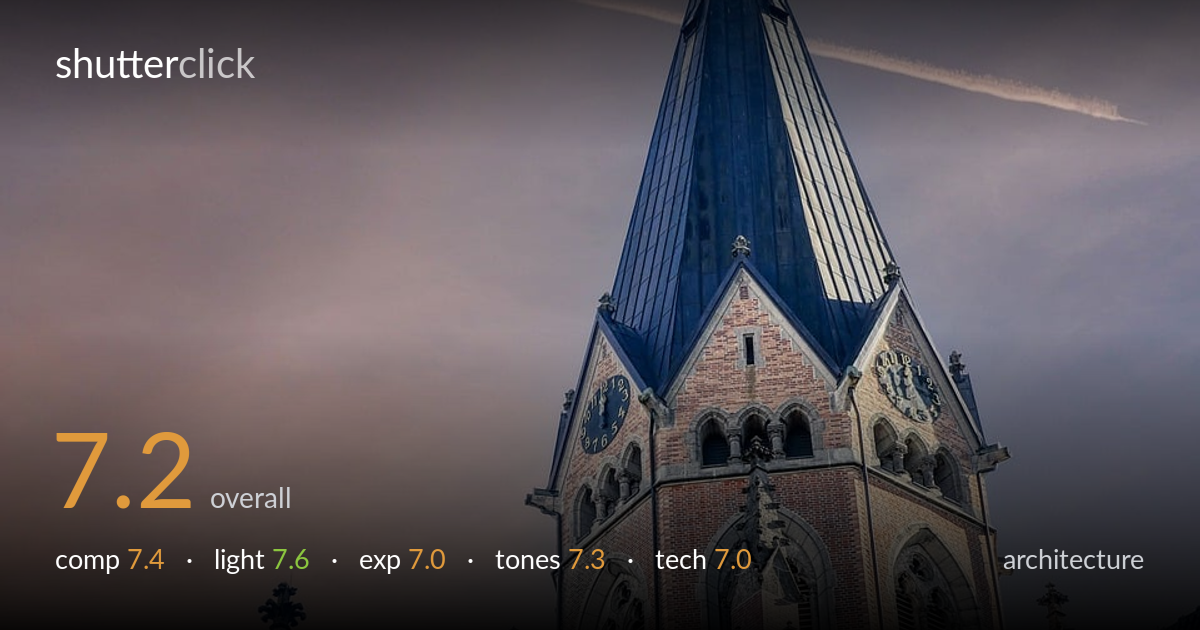
A confident low-angle study of a brick church tower that uses converging rooflines to draw the eye upward to the spire and cross. The warm dusk sky and the interplay of blue slate against warm brick give the frame genuine atmosphere. What most holds it back is the tower's placement hard to the right, leaving a large expanse of empty sky on the left that isn't quite doing enough compositional work, and the spire that crowds the top edge. Verticals lean noticeably from the upward tilt — a known trade-off of shooting steep, but it reads as slightly unresolved rather than deliberate.
The stacked, converging rooflines form strong diagonals that funnel attention to the tower and spire — a natural strength of the low vantage. Placing the tower on the right third works, but the resulting left half of sky is largely inert and could be trimmed. The cross very nearly kisses the top edge, which feels tight rather than intentional; a touch more headroom would let it breathe. The foreground roof anchors the base well and adds layered depth to the scene.
Low, warm dusk light rakes across the brickwork, separating the sunlit right face of the tower from the shadowed left and giving the masonry pleasing dimensionality. The blue slate spire and roofs pick up cool tones that play nicely against the warm sky and brick. Direction is doing real work here — the modelling on the gables and buttresses is clear. The soft, hazy sky keeps highlights gentle, though a slightly stronger side-glancing moment would push the surface texture of the brick further.
Exposure is well balanced across a tricky range — the bright dusk sky holds gradation without blowing out, and the shadowed roof planes retain slate detail. Midtones on the sunlit brick sit comfortably. The darkest roof areas in the lower foreground edge toward crushed but keep enough structure to read. Overall a deliberate, controlled rendering with no obvious clipping. A hair more shadow lift in the deepest slate would recover a touch of texture without flattening the mood.
The warm-cool split — dusty mauve-and-peach sky against slate blue and warm brick — carries the mood effectively. White balance leans warm, which suits the hour. Contrast is moderate and appropriate, holding both the airy sky and the darker roofs. The blues in the slate feel slightly pushed, edging toward a graded look, but it stays within reason. Mid-tone gradation in the sky is smooth. Reining in the slate saturation marginally would make the palette read more natural.
Focus is accurate across the tower, with the brickwork, clock faces and window tracery all rendering crisply — depth of field is clearly sufficient for the whole structure to sit sharp, which is what architecture asks for. There is no visible motion blur and noise is well controlled in the shadow areas, suggesting a clean capture. The most obvious technical issue is perspective: the steep upward tilt causes the verticals to converge dramatically, and the tower and gables lean inward toward the top. For a study that leans into drama this can work, but it currently sits between deliberate exaggeration and uncorrected keystoning. Perspective correction in post would straighten the tower faces, or a tilt-shift lens on a reshoot would control convergence at capture while keeping the imposing scale. The wide framing also introduces mild edge softness and slight geometric stretching at the corners, common at short focal lengths shot upward. Cropping the dead sky would also tighten the geometry.
what would elevate it
tags
Shot something like this?
Expert photo critique, on demand — scored across six categories, EXIF-aware. Start with 3 free critiques, no credit card.
critique my photo — free