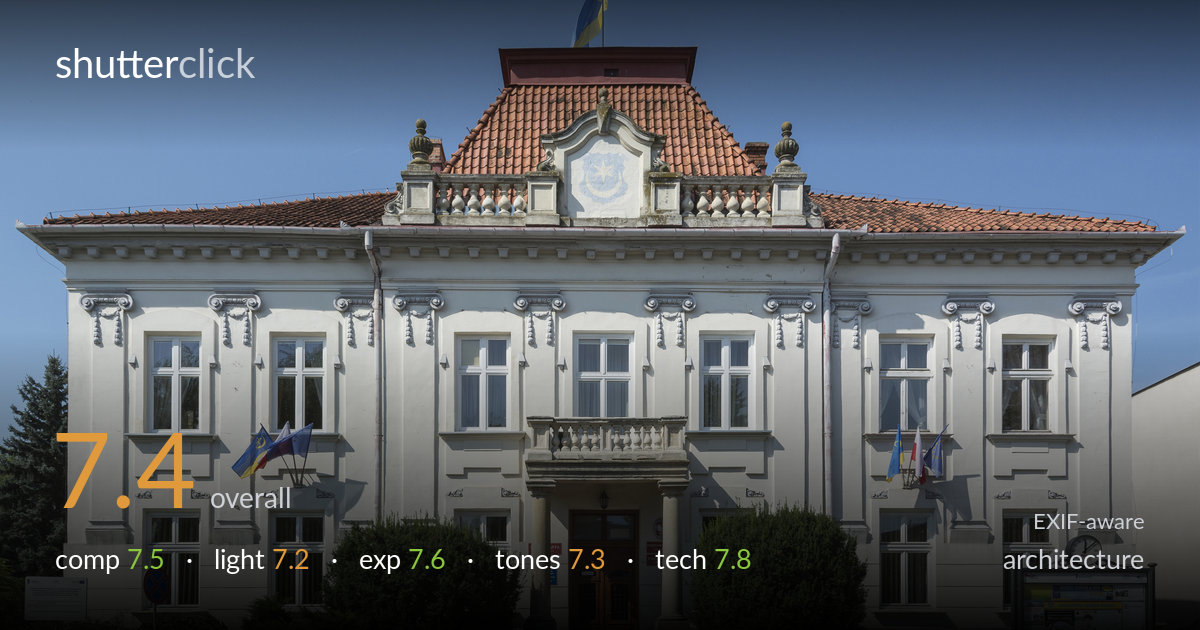
Civic building facade in symmetry
Photo by Jacek Halicki

| Focal length | 18 mm |
| Aperture | f / 11.0 |
| Shutter | 1/500 s |
| ISO | ISO 400 |
| Exp. comp. | 0.0 EV |
| Shot at | 12:02 · Sep 6, 2014 |
A clean, symmetrical frontal record of a civic building that succeeds as documentation through careful framing and well-controlled verticals. The central axis is respected and the facade is rendered crisply edge to edge. What most holds the shot back is the busy ground level: the bushes, signs, no-parking pole, and notice board on the right compete with the architecture and unbalance the foreground. The midday light is also unflattering, flattening the ornament and casting hard shadows under the cornice. Strong as a Wikimedia-style record; a stronger light and a tidier foreground would lift it toward a more expressive architectural image.
The frontal, symmetrical approach suits a civic facade and the central entrance, balcony, and crest stack neatly on the axis. Verticals read close to true and the building sits well within the frame with breathing room above the flag. The ground level undermines this order, though: the notice board and clock on the right have no counterweight on the left, and the cluster of signs, pole, and shrubs clutters the base. A slightly higher vantage or a cleaner sweep across the foreground would let the geometry dominate as intended.
Bright, high, near-frontal sun lights the facade evenly and keeps the white plaster legible, but it is the least interesting light for this subject. The relief carving, ionic capitals, and cornice brackets flatten because the light hits straight on rather than raking across, so texture and depth are suppressed. Hard shadows tuck under the roofline and balcony without modelling the ornament. The clear sky is clean but adds little. Lower, angled side light from earlier or later in the day would carve out the decorative detail.
Exposure is well judged for a bright white building under strong sun. The plaster holds highlight detail without clipping, the red tile roof retains texture, and the shadowed doorway and shrubbery keep enough shadow information to read. The histogram appears to use the range sensibly with no obvious blown areas across the large light expanse, which is the main risk here. The deep blue sky is rich without going black. Midtones in the stonework sit naturally. A balanced, controlled result with no meaningful correction needed.
White balance is neutral and the plaster reads as a believable off-white. The terracotta roof and warm wooden door give pleasant colour accents against the saturated blue sky. Contrast is moderate and appropriate, though the sky's blue is pushed slightly hard and verges on heavy in the upper corners. The greens of the shrubs are a touch muted. Overall tonal range is healthy from the dark doorway to the bright facade. A gentler sky saturation and a slight lift in the foreground greens would feel more natural.
Settings are well chosen for the task. At 18mm on the DX body the wide lens captures the full facade from a constrained street position, and the choice to keep verticals near-parallel suggests careful camera levelling. f/11 is the right call for front-to-back sharpness across a flat subject and sits near the lens's optimal aperture, avoiding diffraction softening. ISO 400 is slightly higher than necessary in this bright light, where ISO 100 would have given marginally cleaner files, but noise is a non-issue here. 1/500s is far faster than needed for a static building and locks the flags mid-flutter. Focus is accurate across the facade and detail holds up well, though the extreme corners show the mild softness and slight distortion typical of an 18-200 superzoom at its wide end. A prime or a dedicated wide would render the edges crisper, and a small amount of correction would tidy the residual barrel distortion in the cornice line.
what would elevate it
tags
Shot something like this?
Expert photo critique, on demand — scored across six categories, EXIF-aware. Start with 3 free critiques, no credit card.
critique my photo — free