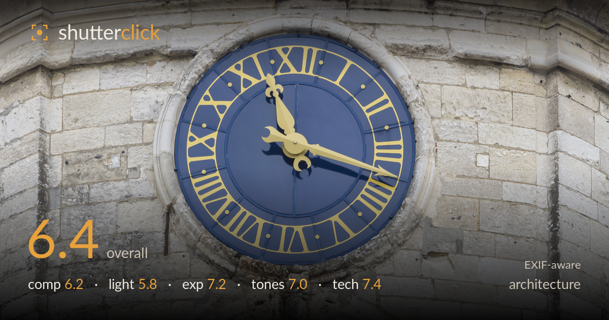
Clock face on a stone bell tower
Photo by CEphoto, Uwe Aranas

| Focal length | 170 mm |
| Aperture | f / 5.6 |
| Shutter | 1/80 s |
| ISO | ISO 50 |
| Exp. comp. | 0.0 EV |
| Shot at | 09:17 · Apr 20, 2014 |
A tightly framed detail study of a bell tower, anchored by the blue-and-gold clock face against warm limestone. The clock reads as the clear focal point and its colour contrast against the neutral stone is the image's real strength. What most holds it back is the vertical stacking of clock, arch, and louvred bell openings running straight down the centre, which reads more like an inventory than a composition — and the flat, overcast light that flattens the stone's considerable texture. A stronger raking light and a compositional choice about which element leads would lift this from a competent record shot to something with more depth.
The frame stacks three elements — clock, arch, louvres — vertically down the centre, which gives symmetry but little tension or hierarchy. The clock is the obvious focal point yet sits high and slightly left, while the bell openings below compete for attention without a clear relationship. The tight crop removes context and any sense of the tower's overall form. The louvred roof sections repeat pleasingly, offering rhythm, but the composition reads as a catalogue of features rather than a resolved image with one lead subject.
The overcast, diffuse light is even and free of harsh shadows, which keeps the clock face clean and readable, but it flattens the limestone's rich texture and the depth of the arched recess. Stone architecture like this rewards directional, raking light that carves out the weathered surfaces and the relief of the masonry blocks. As shot, the wall reads uniformly grey and the arch loses its three-dimensional depth. Timing for low-angle side light would transform the surface character considerably.
Exposure is well controlled. The blue clock face holds its colour without blocking up, the gold numerals and hands retain detail, and the bright limestone stays clear of highlight clipping despite its high reflectance. Shadow detail inside the dark bell openings is preserved enough to read the bells within. The histogram sits comfortably in the midtones with no aggressive clipping at either end. ISO 50 gives a clean, noise-free file. A deliberate, even exposure that suits the flat light.
The palette works on the contrast between the deep navy and warm gold of the clock and the neutral grey-beige stone — a restrained, effective pairing. White balance is accurate, keeping the limestone neutral without a colour cast. Contrast is on the gentle side, appropriate to the overcast conditions but contributing to the flatness of the stone surfaces. The slate roof sections add a cool grey counterpoint. Tonal gradation across the wall is smooth, though a touch more local contrast would give the masonry more presence.
At 170mm and f/5.6 on the 5D Mark III, focus lands accurately on the clock face and the stonework around it is crisp. 1/80s is adequately steady for the focal length with IS engaged, and no motion blur or camera shake is visible. ISO 50 delivers a clean, detailed file with excellent tonal smoothness. Depth of field is sufficient given the near-planar subject, so f/5.6 is a reasonable choice. The 28-300mm superzoom holds up well here, with acceptable sharpness and no obvious distortion in the frame. One technical concern for architecture: the crop and long-lens perspective compress the tower, and there is slight convergence in the vertical masonry lines — the frame appears shot looking upward, so the walls lean subtly inward. Perspective correction in post, or a shift lens on a reshoot, would keep verticals true. Focus, exposure, and noise control are all handled well; the perspective is the one execution point worth addressing.
What would elevate it
Tags
Shot something like this?
Expert photo critique, on demand — scored across six categories, EXIF-aware. Start with 3 free critiques, no credit card.
critique my photo — free