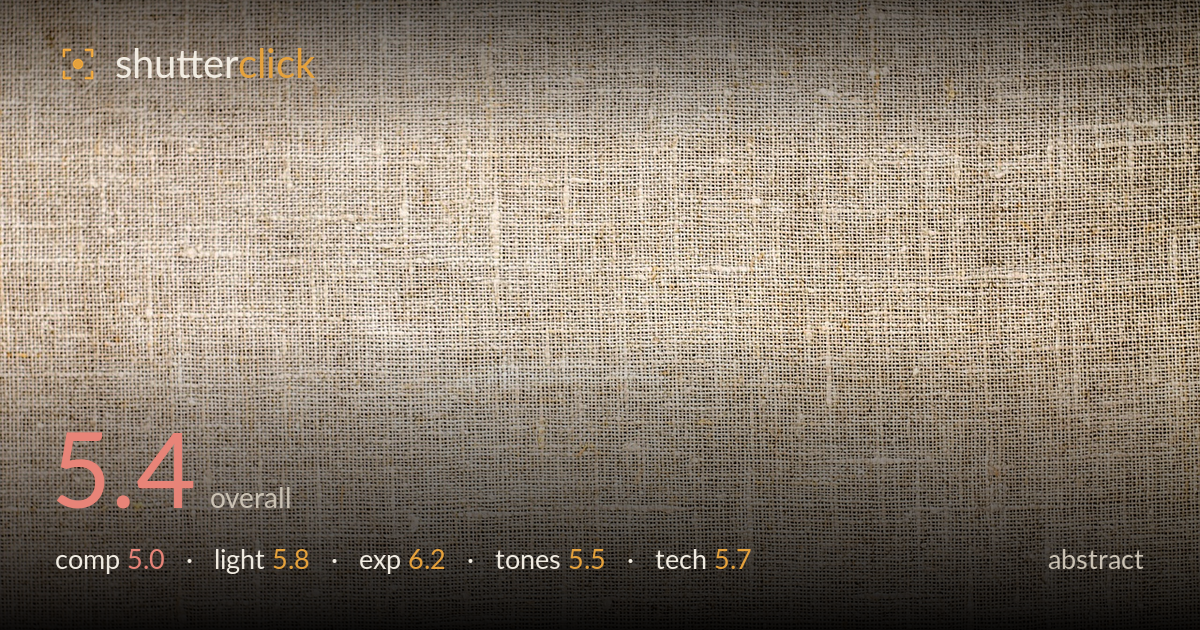
Coarse linen weave in soft light
Photo by virin000

No EXIF metadata in this file
Technical analysis based on visual assessment only.
A flat, evenly-lit study of coarse linen weave that reads more as a stock texture than a resolved abstract image. What works is the consistent grain and the subtle warm gradient sweeping from the darker left edge into the brighter centre-right, which lends a faint sense of light across the surface. What holds it back is the absence of a compositional anchor or rhythm strong enough to hold attention — the weave is uniform edge to edge with no focal tension, dominant line, or shift in scale. As a texture asset it succeeds; as an abstract statement it needs a stronger graphic idea.
The frame is filled edge to edge with uniform weave, which gives an honest, all-over field but no focal point, no rhythm change, and no compositional tension to lead the eye. Abstract work still benefits from a dominant line, a break in the pattern, or a shift in scale — none of which is present here. The faint diagonal seams and slubs in the weave are the only interruptions, and they are too subtle to organise the frame. A raking angle or tighter crop on an irregularity would build structure.
The light is soft and broad, wrapping the surface evenly with only a gentle falloff toward the darker upper-left corner. That softness keeps the tonality clean but flattens the weave — the individual threads never cast the small shadows that would make the texture feel tactile. For a fibre subject, a low, raking side light is what separates a flat scan from a dimensional surface. The subtle warm gradient across the frame is the most successful lighting element, hinting at direction without ever committing to it.
Exposure is well controlled and safe. Highlights in the brightest central region hold without clipping, and the shadowed corners retain full detail in the weave. The histogram sits comfortably in the upper mids with no crushed blacks — appropriate for a high-key neutral texture. Nothing is technically wrong here. The image could arguably carry slightly more contrast to give the tonal range some snap, but as a deliberate, evenly-lit rendering the brightness placement is accurate and clean throughout the frame.
The palette is a narrow band of warm beiges and oatmeal, faithful to natural linen but very low in tonal separation. White balance leans slightly warm, which suits the fibre but leaves the whole frame in a single register with little contrast between threads. The gradation from the cooler, darker left edge to the warmer centre is the tonal highlight. A touch more contrast and a small local dodge on the brightest threads would give the mid-tones more life without breaking the muted, natural character.
Focus and depth of field appear well handled for a flat subject — the weave is rendered sharply across most of the frame, suggesting the sensor plane sat roughly parallel to the fabric, with only mild softening toward the corners that reads as gentle field falloff rather than missed focus. Noise is not an issue; the surface is clean and the fine thread detail resolves clearly, indicating a low ISO and adequate light. Nothing suggests motion blur or camera shake. The main technical limitation is not execution but intent: a texture this uniform asks for either a macro-level crop that reveals individual fibres and their weave crossings, or a raking light that carves dimension into the surface. As shot, the technical competence is solid but serves a fairly literal record of the cloth. Tighter framing on an anomaly — a snag, a slub, a fray — would give the sharpness something worth resolving.
What would elevate it
Tags
Shot something like this?
Expert photo critique, on demand — scored across six categories, EXIF-aware. Start with 3 free critiques, no credit card.
critique my photo — free