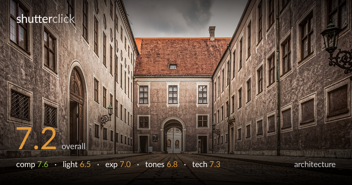
Cobblestone courtyard leading to the arch
Photo by ddzphoto

No EXIF metadata in this file
Technical analysis based on visual assessment only.
A confident one-point perspective that uses the cobblestone courtyard as a powerful leading element, drawing the eye through the converging facades to the central arched portal. The very low camera position gives the foreground stones real presence and texture. What most holds it back is the tonal treatment: a heavy, HDR-leaning grade flattens contrast in the walls and pushes the orange roof and warm cobbles toward an artificial cast. The overcast sky is functional but flat, offering little drama. The symmetry is strong but the centred horizon and dominant empty foreground could be tightened. A cleaner, more natural grade and a touch more atmosphere would lift this considerably.
The one-point perspective is the clear strength — converging walls and the cobblestone seams funnel the eye straight to the central portal, a classic and effective architectural device. The low vantage emphasises foreground texture and scale. Symmetry is well held, with the two flanking facades balanced. However, the foreground occupies nearly half the frame and reads slightly empty once the texture interest fades; the central building sits a touch small. A marginally higher horizon, or tighter framing toward the portal, would give the destination more visual weight.
The flat, overcast light is even and avoids harsh shadows, which keeps the facade detail readable and the symmetry clean — appropriate for documenting architecture. But it offers little modelling: the relief of window surrounds, the arch, and the cobble texture stay muted because there is no directional raking light to carve them out. The brief warm break on the red roof is the only tonal lift in an otherwise grey sky. Late-afternoon side light, or a more dramatic sky, would add the depth this scene wants.
Exposure is well controlled across a wide brightness range. The sky retains cloud detail without blowing out, and the shadowed window recesses and the arch interior hold detail rather than blocking up. Midtones across the cobbles and plaster are placed sensibly. There is some evidence of shadow lifting that introduces a slightly muddy quality in the darker wall areas, and the overall image leans bright in a way that softens contrast. A touch more deliberate midtone separation would sharpen the read.
This is where the image works against itself. The grade leans heavily toward an HDR look — local contrast pushed, blacks lifted, and a strong warm-orange cast washing across the cobbles and roof that reads artificial rather than atmospheric. The grey walls turn slightly flat and lifeless as a result, and the sky's neutrality clashes with the warm ground. A cleaner white balance, deeper blacks, and a more restrained saturation on the orange would let the natural stone tones breathe and restore tonal honesty.
Execution is solid. A wide focal length captures the full courtyard and exaggerates the perspective convergence effectively, and depth of field appears deep enough to hold sharpness from the foreground cobbles through to the distant portal — appropriate for the genre. Focus looks accurately placed, with crisp detail in the central building and window surrounds. The verticals are largely well managed: the side facades converge inward by design with the wide lens, but the central building's verticals stay acceptably true, suggesting careful camera levelling or correction. The main technical limitation is not capture but processing — the aggressive tone mapping introduces a slightly crunchy, over-textured quality in the cobblestones and walls, and faint haloing risk around the rooflines where local contrast is pushed. Noise is well controlled and there is no visible motion issue. A gentler processing approach would preserve the genuinely good optical and focus work already present in the file.
what would elevate it
tags
Shot something like this?
Expert photo critique, on demand — scored across six categories, EXIF-aware. Start with 3 free critiques, no credit card.
critique my photo — free