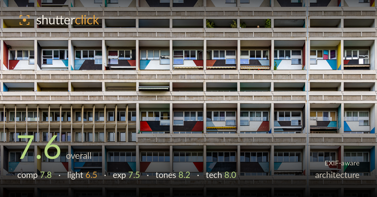
Colour-blocked facade of an apartment block
Photo by Matthias Süßen

| Focal length | 31 mm |
| Aperture | f / 9.0 |
| Shutter | 1/500 s |
| ISO | ISO 200 |
| Exp. comp. | -1.0 EV |
| Shot at | 12:33 · Jul 28, 2021 |
A confident, frame-filling study of a modernist housing facade that turns repetition and colour blocks into rhythm. The greatest strength is the tonal payoff — muted concrete grids punctuated by primary-colour balcony panels create genuine graphic energy. What holds it back most is the flat, overcast light, which mutes the depth of the recessed balconies and leaves the concrete without modelling. The frame is also very slightly off-kilter and the top and left edges cut awkwardly. Verticals hold up well for the focal length, and the pattern reads with satisfying density. A cleaner edge alignment and stronger raking light would elevate it further.
Filling the frame entirely with the facade is the right call — it commits to pattern and lets the eye wander the grid without distraction. The colour-block balconies break the monotony and give the eye anchor points. Two weaknesses: the vertical pipe on the right edge is a distracting intrusion, and the bottom strip of railing and streetlights feels like an accidental inclusion rather than a deliberate base. The overall alignment is fractionally rotated, so the horizontal courses drift slightly. A tighter, more level crop excluding the pipe would tighten it.
The flat, overcast light is the main limitation. It renders colours evenly and avoids blown highlights, which suits a documentary catalogue of the panels, but it gives the concrete no directional modelling and leaves the deep balcony recesses reading as murky voids rather than sculptural depth. There are no cast shadows to describe the projecting slabs, so the facade flattens toward a graphic plane. Directional side light late in the day would rake across the balcony returns and reveal the three-dimensionality this Brutalist-influenced structure has.
Exposure is well judged for a bright overcast sky. The -1 EV compensation protects the white panels and pale concrete from clipping, and the highlights hold detail throughout. Shadow recesses inside the balconies go dark but retain enough information to read as recessed space rather than dead black. Midtones sit a touch low, giving the whole frame a slightly heavy, subdued feel. A modest shadow lift in post would open the balcony interiors without risking the highlights, adding a little breathing room to the darker cells.
The tonal handling is the standout. The neutral concrete grid provides a restrained backdrop against which the primary reds, blues, yellows and greens of the balcony panels genuinely sing. White balance is clean and believable under diffuse daylight, and saturation is punchy without tipping into garish. Contrast between the matte concrete and the flat painted panels is nicely controlled. The overall grade holds a cohesive, slightly cool cast that reads authentically. If anything, the darkest recesses could gain a hint of separation, but the colour relationships are handled with real discipline.
The settings are well matched to the subject. f/9 on the RF 24-105 at 31mm keeps the entire facade plane sharp corner to corner, which is exactly what a frontal architectural pattern needs — depth of field is a non-issue here and the aperture sits in the lens's sweet spot for resolution. ISO 200 keeps the file clean with no visible noise, and 1/500s is far faster than needed for a static subject shot handheld, guaranteeing no motion softness. Focus is accurate across the grid. The 31mm choice on a full-frame body minimises perspective distortion, and verticals hold impressively straight, suggesting careful squaring-up to the wall. The only technical refinement would be a slight rotation correction to level the horizontal balcony courses, and a marginally tighter framing to exclude the drainpipe. Shooting from a position more perpendicular to the facade centre, or with a tilt-shift lens, would eliminate the faint keystoning, but for this focal length the execution is clean and deliberate.
What would elevate it
Tags
Shot something like this?
Expert photo critique, on demand — scored across six categories, EXIF-aware. Start with 3 free critiques, no credit card.
critique my photo — free