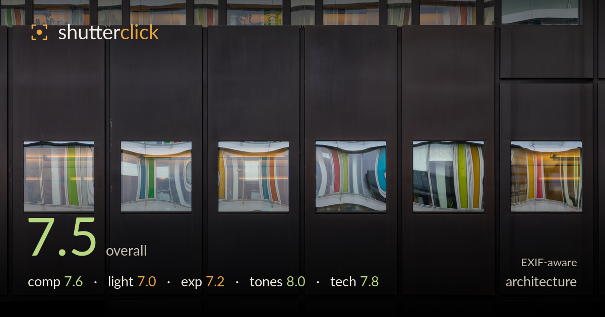
Colour reflected in a dark facade
Photo by Dietmar Rabich

| Focal length | 80 mm |
| Aperture | f / 6.3 |
| Shutter | 1/40 s |
| ISO | ISO 200 |
| Exp. comp. | 0.0 EV |
| Shot at | 12:35 · Jan 9, 2018 |
A strong exercise in graphic minimalism: a dark, matte panel grid punctuated by windows that hold warped, saturated reflections of a colourful neighbouring facade. The contrast between the sombre cladding and the candy-striped reflections carries the image, and the rhythm of vertical panels gives it backbone. What holds it back is a slight inconsistency in the grid — the upper-right panels break the otherwise tidy repetition and pull attention without quite paying off. The lower row of windows is the clear heart of the frame; giving it more weight and squaring the verticals precisely would tighten an already well-observed detail study.
The frame is built on a clean vertical rhythm — dark panels marching left to right, each framing a window of distorted colour. The two-tier arrangement of reflective openings creates a satisfying push-pull between the muted cladding and the vivid reflections. The break in the pattern at upper right disrupts the otherwise strict grid and introduces asymmetry that isn't fully resolved. The lower band of windows reads as the stronger row; anchoring the composition around it, or cropping the weaker upper-right section, would sharpen the graphic intent. Solid, deliberate framing overall.
Light here is entirely borrowed — the subject is the reflected facade, lit by soft, overcast daylight that keeps the coloured stripes even and glare-free. That flat ambient light suits the reflective surfaces, avoiding blown specular hotspots, but it also leaves the dark cladding somewhat inert and shadowless, so the panels read as flat black planes rather than dimensional surfaces. A touch of raking directional light would reveal the cladding's texture and separate the panels. For this reflection-driven concept, though, the diffuse conditions were the right call.
Exposure is judged to protect the coloured reflections, which retain their saturation without clipping in the brighter stripes. The dark panels sit deep but hold their form, and the balance between the two keeps the concept legible. The upper reflections push a little brighter and edge toward washing out in the pale bands, while the deepest cladding loses all micro-detail. A slightly darker overall placement would have deepened the panels for more contrast against the windows without sacrificing the reflection detail. Broadly deliberate and well controlled.
Tonally this is the image's strongest asset. The near-black, faintly warm cladding sets an ideal neutral ground for the saturated reflections — greens, yellows, teal, red and orange all read cleanly without looking oversaturated. White balance is convincing, and the contrast between matte dark surfaces and glossy colour is exactly what the concept needs. The tonal separation between the two window rows adds depth. The palette feels natural rather than pushed, and the restraint in the darks lets the colour do the talking.
The 5D Mark IV with the 24-105mm at 80mm is well suited to this compressed, frontal facade study, flattening the planes into a clean graphic grid. At f/6.3 depth of field is ample for a flat subject, and focus lands accurately across the panels and window edges — the reflections are sharp where they need to be. ISO 200 keeps noise negligible in the deep shadows, which matters given how much of the frame is dark cladding. The 1/40s shutter is slow for handheld work at this focal length, right at the edge of the reciprocal rule and reliant on the lens IS; the image holds up, but a tripod or 1/125s would have removed any doubt. The main technical refinement would be squaring verticals precisely in-camera or in post — some panel edges lean slightly off-plumb, which matters in a grid this rigid. Clean, competent execution overall.
What would elevate it
Tags
Shot something like this?
Expert photo critique, on demand — scored across six categories, EXIF-aware. Start with 3 free critiques, no credit card.
critique my photo — free