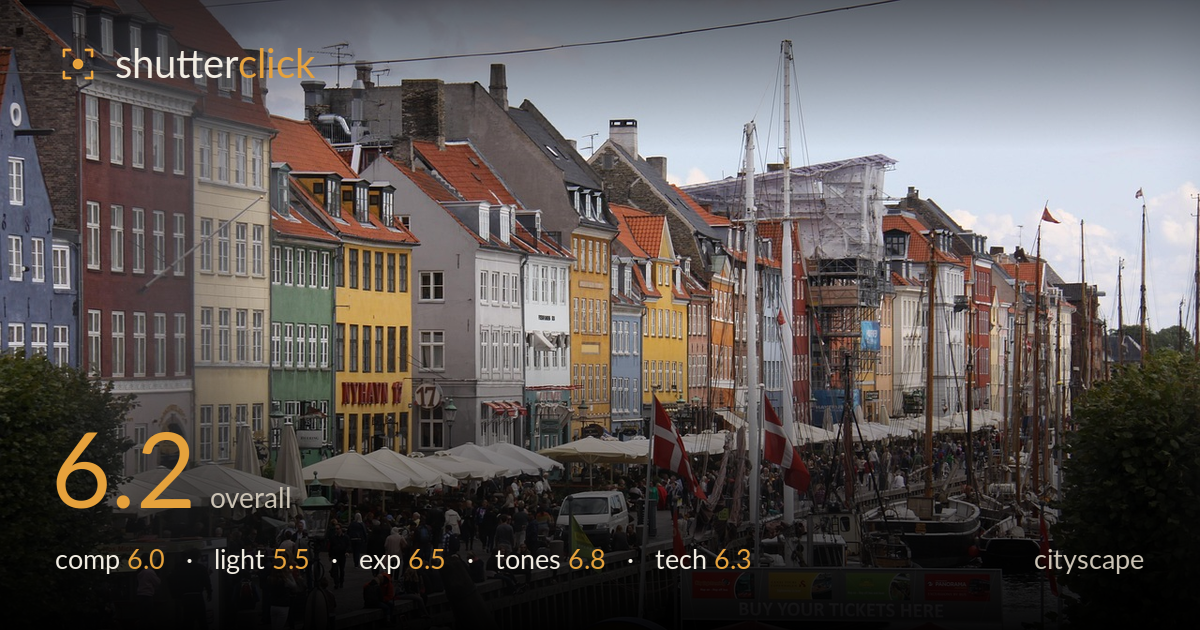
Colourful facades along the canal
Photo by Bjonsson

No EXIF metadata in this file
Technical analysis based on visual assessment only.
A recognisable, colourful Nyhavn view carried by the row of painted facades and the forest of masts, but held back by a cluttered, undirected foreground and flat overcast light. The frame tries to hold too much at once: the coloured houses, the boats, the crowd, and the dominant dark anchor and ticket booth in the lower third all compete without a clear anchor point. The waterfront's natural leading line pulls the eye well, but the busy foreground blunts the momentum. Cleaner framing and stronger light would lift this from a competent record shot toward something with real depth.
The receding line of coloured facades and the diagonal quay provide a natural leading line into the distance, which is the frame's strongest asset. But the lower third is congested: the dark anchor arm cutting across the bottom, the bright "BUY YOUR TICKETS HERE" booth, and the scattered crowd all fight for attention with no clear focal point. The horizon and building tops sit high, leaving foreground clutter dominant. A higher vantage or a tighter crop toward the facades and masts would concentrate the interest and let the line breathe.
The flat, overcast light is the main limitation. It renders the scene evenly but drains the saturation and dimension from the famous facades, which need directional sun to glow. Shadows are weak and the sky is a featureless pale grey, adding no drama or depth. There is no modelling on the buildings or masts, so the whole frame reads a little lifeless. Late-afternoon side light or the warmth of golden hour would make these colours sing and give the boats and rigging shape.
Exposure is handled competently for tricky conditions. The bright overcast sky is close to but not blown, retaining faint tonal separation, and the shadowed foreground still holds usable detail in the crowd and paving. Midtones sit reasonably, and the coloured facades keep their hue without clipping. The overall image leans slightly flat, a consequence of the light rather than the exposure decision. A touch more contrast in post would give the histogram more spread without risking the highlights already sitting near the top.
Colour is the picture's real appeal: the reds, yellows, ochres and greens of the facades come through with believable, well-balanced white balance and no obvious cast. Saturation is honest rather than pushed, which suits the scene. The limitation is contrast and vibrancy, both suppressed by the flat sky, leaving the palette a little muted overall. The grey sky and grey paving bracket the frame with dead tone. Selectively lifting the facade colours and adding local contrast would let the signature Nyhavn palette carry more of the image.
Depth of field is deep, as a cityscape wants, keeping both the foreground crowd and the distant facades acceptably sharp. Focus appears to land on the mid-ground buildings and boats, which is a sensible choice, and there is no obvious motion blur despite the moving crowd, suggesting an adequate shutter speed. Noise is well controlled in the shadows, pointing to a low ISO in reasonable daylight. The lens choice compresses the receding facades nicely, though the framing includes a lot of unhelpful foreground. Verticals on the buildings lean slightly inward on the left edge, a mild perspective issue worth correcting. Overall sharpness is fine for a documentary record but the detail in the masts and rigging softens toward the distance, which is expected. A slightly higher shooting position would have cleared the messy near-ground clutter and let the technically sound rendering of the facades do more work. Execution is solid; the constraints are compositional and light-related rather than mechanical.
What would elevate it
Tags
Shot something like this?
Expert photo critique, on demand — scored across six categories, EXIF-aware. Start with 3 free critiques, no credit card.
critique my photo — free