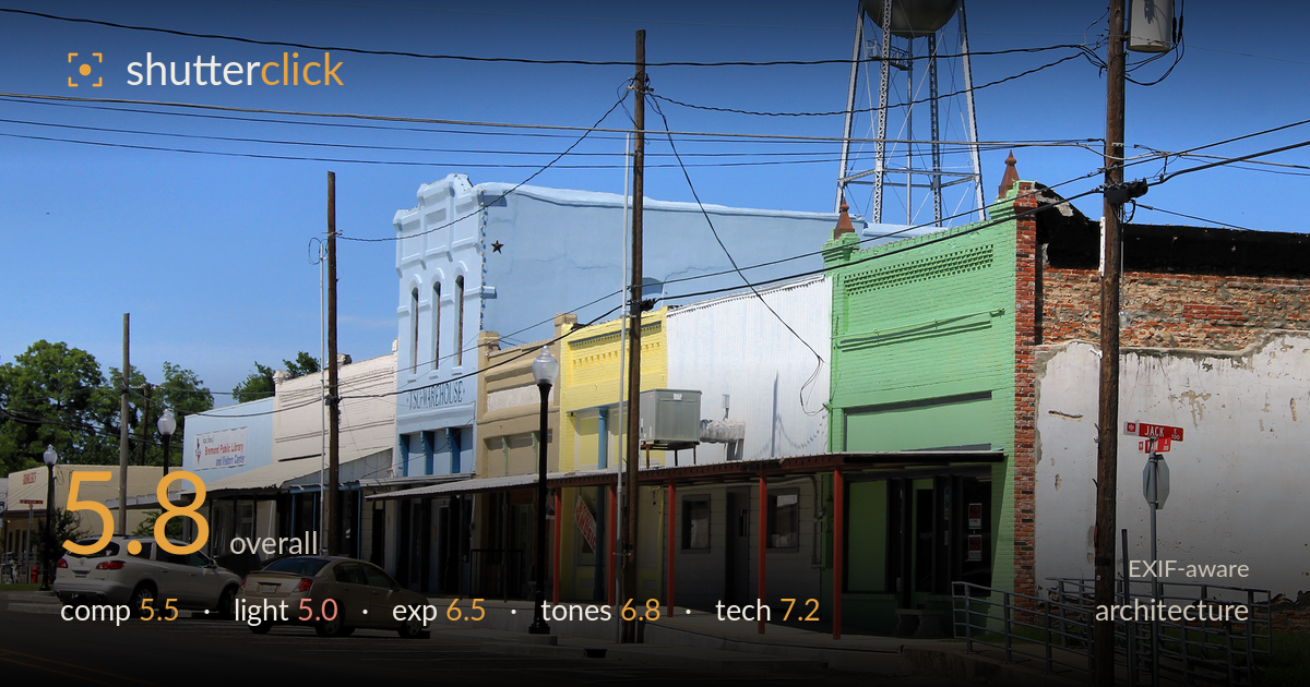
Colourful storefronts under the water tower
Photo by Larry D. Moore

| Focal length | 47 mm |
| Aperture | f / 11.0 |
| Shutter | 1/500 s |
| ISO | ISO 200 |
| Exp. comp. | 0.0 EV |
| Shot at | 15:48 · May 29, 2015 |
A documentary record of a small-town main street that captures the row of colourful storefronts and the landmark water tower, but the frame is dominated by a chaotic tangle of overhead wires and utility poles that fragment the composition. The receding row of shops offers a natural leading line and the varied facade colours give the frame life. The harsh midday sun flattens the scene and casts hard shadows under the awnings. A lower angle, a cleaner sightline, or a time of softer light would let the architecture read without the visual clutter competing for attention.
The oblique view down the storefront row creates a workable diagonal that draws the eye toward the green brick building and water tower, and the colour progression of the facades adds rhythm. The trouble is the dense web of power lines and the two prominent utility poles slicing vertically through the frame — they crowd the sky and pull focus from the buildings. The parked cars at bottom-left anchor the scene but sit awkwardly close to the edge. A position that isolated the storefronts from the wire clutter would strengthen the read.
Shot under high, hard midday sun, the light does the architecture few favours. Facades facing the camera are evenly lit but flat, with little of the raking direction that would model brick texture and cornice detail. The deep shadows beneath the awnings block up into dark voids that hide the shopfronts. The water tower and green building catch full sun and read cleanly, but the overall effect is harsh rather than shaping. Early or late light would rake across the facades and reveal far more surface character.
Exposure is handled competently for a bright, high-contrast scene. The blue sky holds its tone without clipping, and the metal water tower retains detail in its highlights rather than blowing out. The trade-off is the awning shadows, which fall dark and lose shopfront detail — expected given the dynamic range on offer at midday. Midtones on the coloured facades sit at a natural brightness. A slight lift in the shadows during processing would recover some of the recessed storefront detail without harming the sky.
White balance is neutral and the sky renders a clean, believable blue that sets off the pastel facades — the pale blue, yellow and green storefronts read with pleasant saturation. Contrast runs high, a direct consequence of the hard light, which crushes the shadow areas. The brick and weathered stucco on the right show decent tonal separation. Colours are lively without appearing oversaturated. Taming the highlight-to-shadow contrast would even out the tonal range and let the muted architectural colours breathe more gently across the frame.
The settings are well matched to the conditions. At f/11 the depth of field carries sharpness from the near cars through the water tower, appropriate for an architectural streetscape where front-to-back clarity matters. ISO 200 keeps noise negligible in the shadows, and 1/500s is more than enough to freeze a static scene — arguably faster than needed, leaving room to close down further or drop ISO if desired. The 47mm focal length on the crop sensor gives a natural, mild-telephoto perspective that compresses the row believably without obvious distortion. Focus is accurate across the plane and detail holds in the brickwork and tower lattice. The main technical limitation is not the capture but the absence of perspective correction: the verticals of the poles and buildings lean slightly, and the frame would benefit from levelling. Overall the execution is clean and the gear choices sound for the subject; the settings are not what holds this image back.
What would elevate it
Tags
Shot something like this?
Expert photo critique, on demand — scored across six categories, EXIF-aware. Start with 3 free critiques, no credit card.
critique my photo — free