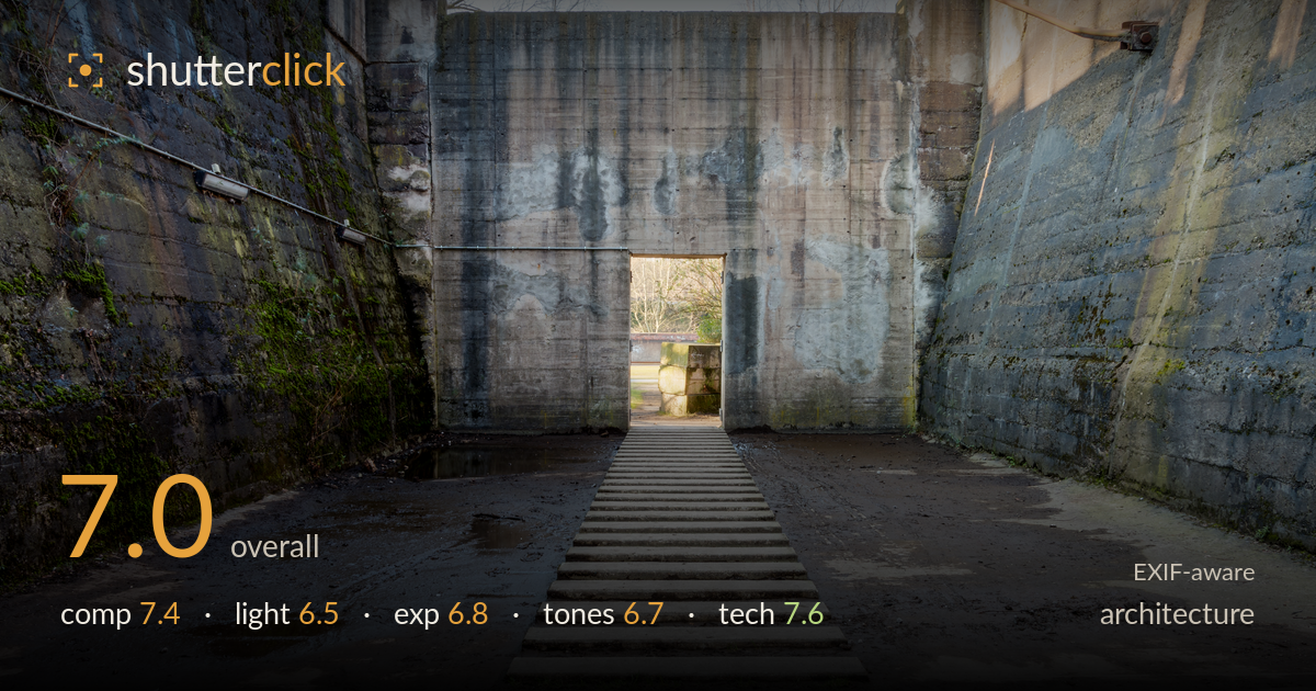
Concrete path to the doorway
Photo by Dietmar Rabich

| Focal length | 22 mm |
| Aperture | f / 13.0 |
| Shutter | 1/6 s |
| ISO | ISO 100 |
| Exp. comp. | 0.0 EV |
| Shot at | 14:30 · Feb 27, 2016 |
A strong central-axis composition that uses the ribbed concrete ledges as a leading line straight to the bright doorway, turning a derelict lock or bunker into a study of one-point perspective. The symmetry is deliberate and the vanishing-point doorway provides a satisfying payoff. What most holds it back is the flat, mixed light — the left wall sits in cold shade while the right catches warm sun, splitting the frame tonally and leaving the muddy foreground dull. A little converging-vertical tidy-up and a brighter grade on the near ground would lift it. The bones here are genuinely good.
The one-point perspective is the clear strength: the ribbed slab pathway pulls the eye directly to the illuminated doorway, and the two flanking walls frame it symmetrically. Centring the vanishing point works here precisely because the subject is geometry. The slabs entering from the bottom edge anchor the foreground well. The frame is a touch bottom-heavy with muddy ground, and the busy top corners — bare branches and the pipe fitting upper right — clutter the edges. A slightly higher vantage would compress the mud and give the path more presence.
The light is the weakest structural element. Shooting into an open doorway with a bright sky beyond means the interior walls sit in flat, indirect illumination while raking sun grazes the right wall and top of the frame, splitting the scene into cold shadow left and warm highlight right. That imbalance fights the symmetry the composition works so hard to build. Overcast, even light — or waiting until the sun cleared the walls entirely — would render the concrete texture more uniformly and keep the eye on the geometry rather than the tonal divide.
Exposure is well managed for a high-contrast scene. The bright doorway retains detail rather than blowing to pure white, and the sky beyond the top opening holds together. Shadow detail in the darker left wall and the moss survives without crushing to black. The muddy foreground reads a little muddy in tone as well as substance — lifting those midtones would open the near ground. Overall the histogram appears to use the range deliberately, with no significant clipping, which is a solid result given the backlit doorway.
The palette is muted and cool-leaning, appropriate to weathered concrete, but the split between the green-grey moss and cold shade on the left and the warmer sunlit right wall creates an uneven white-balance impression across the frame. The concrete's mottled staining gives useful texture, though contrast is a touch flat in the shadowed areas, leaving the mud lifeless. A subtle contrast lift and warming the shadows slightly to unify the two halves would give the tones more cohesion without losing the austere, industrial mood.
Settings are well chosen for the subject. The EF-S 10-22mm at 22mm on the 70D gives a wide but not distorted field, suiting the enclosed geometry, and f/13 delivers front-to-back sharpness that keeps both the near slabs and the distant doorway crisp. ISO 100 keeps noise negligible and preserves the concrete's fine texture. The 1/6s shutter is slow, implying a tripod — sensible for this static scene and the reason the small aperture was usable. Focus appears accurate across the depth. The main technical shortfall is verticals: the flanking walls lean inward slightly, a mild keystoning that a small perspective correction in post would straighten. The wide lens also stretches the foreground, which exaggerates the mud's prominence. Overall this is competent, deliberate execution — the tripod discipline and aperture choice are exactly right for the scene, and only minor perspective cleanup stands between this and technically clean architectural rendering.
What would elevate it
Tags
Shot something like this?
Expert photo critique, on demand — scored across six categories, EXIF-aware. Start with 3 free critiques, no credit card.
critique my photo — free