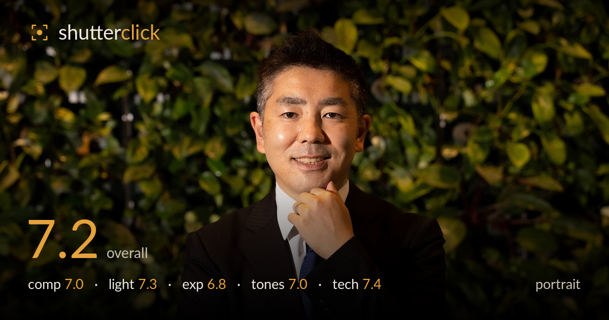
Confident businessman against a green wall
Photo by Rikkis_Room

No EXIF metadata in this file
Technical analysis based on visual assessment only.
A competent corporate headshot with a warm, natural rapport and a green foliage backdrop that lifts it above a plain-wall studio look. The hand-to-chin pose reads as engaged rather than stiff, and the expression is genuine. What most holds it back is the dark suit swallowing shadow detail and merging into the frame's lower half — the exposure protects the face at the cost of the body. The centred placement is safe, and the busy leaf background occasionally competes with the subject. Cleaner separation and a touch more shadow recovery would elevate this from serviceable to polished.
The subject sits dead-centre, which suits a formal headshot but plays it safe — a slight offset with the gaze into more space would add life. The crossed-arm, chin-to-hand pose is well chosen, forming a stable triangular base and conveying approachable confidence. The foliage wall provides context without a distracting hard edge. However, the dark suit occupies much of the lower frame as an undifferentiated mass, and the crop through the elbows feels slightly tight. A hair more headroom balance would help the eye settle.
Soft, directional light from the front-left shapes the face well, with a gentle falloff across the cheek and a natural catchlight in the eyes. The modelling is flattering and avoids harsh nose or under-eye shadows. The foliage catches warm rim light on the right, adding depth. The main limitation is that the same light barely registers on the dark suit, leaving the torso flat and detail-starved. A subtle fill or reflector on the jacket side would preserve fabric texture and keep the lower half from going inky.
The face is exposed accurately with retained highlight detail on the forehead and cheeks — no blown skin. The trade-off is the suit, which sits deep in the shadows with little recoverable texture in the lapels and buttons. This appears to be a deliberate exposure for the face rather than a mistake, and it works for the subject, but the histogram is weighted heavily to the shadows. Lifting the darkest quarter-tones slightly in post would reveal the tailoring without flattening the mood.
White balance leans warm, which flatters the skin and harmonises with the green backdrop. The foliage carries a pleasant range of yellow-greens with warm rim highlights. Contrast is moderate and the skin tones are clean and believable. The blue tie provides a welcome cool accent against the warmth. The shadows in the suit crush to near-black with little tonal gradation, which is the weakest part of the tonal range. A touch more separation in the dark tones would give the image fuller depth without disturbing the pleasant colour mood.
Focus is placed accurately on the eyes, which are sharp with visible detail, and the skin rendering is clean without over-sharpening. The depth of field is judged well — the background is softened enough to separate the subject yet retains enough texture to read as living foliage, suggesting a moderate aperture and sensible working distance. The focal length is flattering, with no obvious facial distortion, indicating a short telephoto or standard lens used at a reasonable distance. Noise is well controlled in the skin and midtones. The chief technical weakness is the deep shadow in the suit, where lack of light and exposure choice combine to lose fabric detail; a fill source rather than any lens or focus fault would address this. Sharpness across the face and hand is consistent, and the framing holds the key elements. Overall the execution is solid and professional, let down only by the underlit lower half of the frame.
What would elevate it
Tags
Shot something like this?
Expert photo critique, on demand — scored across six categories, EXIF-aware. Start with 3 free critiques, no credit card.
critique my photo — free