Converging glass towers
Photo by Pana68

No EXIF metadata in this file
Technical analysis based on visual assessment only.
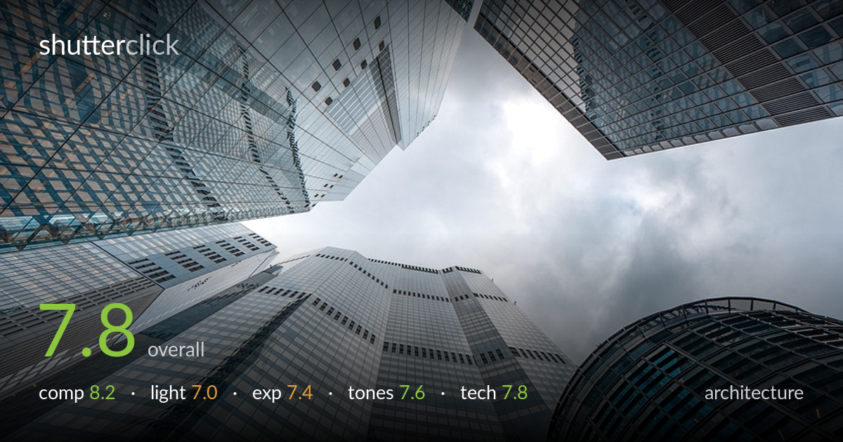
A confident upward-looking composition that converges multiple glass towers toward a central patch of sky, generating strong vertical drama and graphic energy. The radial convergence of facades is the image's biggest strength, pulling the eye into that bright pocket of cloud. What most holds it back is tonal flatness in the overcast sky and a cool, slightly muddy white balance that drains some punch from the glass. The warm brick column on the right is a welcome contrast point but sits awkwardly close to the edge. Tighter perspective control and a stronger tonal separation between sky and structure would elevate this from a strong grab to a polished architectural study.
The upward fisheye-like convergence is the engine here — every tower leans toward the central sky gap, creating a powerful radial pull. The off-centre vanishing point keeps it dynamic rather than static. The curved glass cylinder on the right and the warm brick column add textural variety against the flat blue facades. The brick element does crowd the right edge, and the sky pocket sits slightly low and right of centre, which works but feels marginally unresolved. The dense layering of repeating window grids rewards close looking and gives genuine depth.
Flat overcast light dominates, which suits the cool corporate glass and renders the facades evenly without harsh blown highlights. The soft, directionless quality is honest to the conditions but costs the image modelling and sparkle — the glass reads more grey than luminous. Some subtle reflected warmth in the upper-left atrium glazing adds interest. Stronger directional light, or a break in the cloud throwing a shaft across the towers, would carve more dimension into these surfaces and lift the sky from blank to atmospheric.
Exposure is well balanced for a tricky high-contrast skyward scene. The bright sky pocket is held just short of full clipping, retaining cloud texture, while the shadowed glass and brick keep workable detail. Midtones sit a touch low across the facades, contributing to the overall muted feel. The darker recesses of the atrium glazing fall into near-black but read as intentional depth rather than error. A modest lift in the structural midtones would open the image without risking the sky highlights.
The palette leans cool — steely blues and greys across the glass with a desaturated overcast sky. It's coherent and architectural, but the sky reads slightly muddy and the blues verge on flat. The warm terracotta brick on the right is the key tonal counterpoint and earns its place. White balance is a hair too cool, giving the whole frame a faintly clinical cast. A touch more contrast separation between sky and structure, plus slightly cleaner highlights, would sharpen the read.
Sharpness holds well across the converging planes, with the window grids resolving crisply even into the far reaches of the frame — evidence of a well-chosen aperture and careful focus on a deep scene. The ultra-wide perspective stretches the towers convincingly and the corner detail stays clean without obvious smearing, suggesting a capable wide lens. Distortion is present but reads as deliberate radial convergence rather than uncorrected error, which is the right call for this kind of looking-up shot. Noise is controlled and the image appears handheld-steady. The main technical refinement would be perspective management: while the dramatic lean is intentional, the brick column on the right shows some lens curvature that could be eased, and a marginally more centred alignment of the sky aperture would tighten the symmetry. Overall the execution is solid and the deep depth of field is appropriate to the subject — every facade earns its sharpness.
What would elevate it
Tags
Shot something like this?
Expert photo critique, on demand — scored across six categories, EXIF-aware. Start with 3 free critiques, no credit card.
critique my photo — free