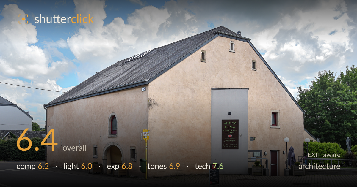
Converted barn restaurant on the corner
Photo by Cayambe

| Focal length | 28 mm |
| Aperture | f / 9.0 |
| Shutter | 1/250 s |
| ISO | ISO 200 |
| Exp. comp. | 0.67 EV |
| Shot at | 13:55 · Jun 12, 2019 |
A clean, well-executed three-quarter view of a converted barn restaurant that documents the building competently but stops short of a compelling architectural statement. The strong gable end anchors the frame and the corner-on angle reveals both roof and facade, but the composition leans documentary rather than designed, and midday overhead light flattens the pale render and mutes the texture that gives the structure its character. Verticals are held well and detail is crisp throughout. The main limits are timing and light: a lower sun would model the walls and give the slate roof depth. Solid, honest work with room to elevate.
The three-quarter corner view is the sensible choice, presenting the gable end and long roof plane together and giving the building volume. The wedge of foreground road and paving leads in from the lower left, but there is a lot of dead tarmac at the bottom and the bus-stop pole and signboards clutter the lower right without adding interest. Placing the building's corner near a third works, though the wide sky is generic. A slightly higher viewpoint or a tighter crop would reduce the empty foreground and strengthen the geometry.
Overhead midday sun with broken cloud is the weak point here. The light falls flat across the pale render, flattening the wall texture and the subtle staining that would otherwise add character, while the slate roof reads as a dull grey mass with little modelling. Shadows are short and offer no raking definition to the stonework around the arched doorway. The bright, busy sky competes for attention. Early or late side light would rake across the gable, revealing surface texture and giving the roof depth and separation.
Exposure is handled well for a high-contrast midday scene. The +0.67 EV compensation keeps the shaded corner facade open and readable without blowing the sky, and the brightest cloud edges retain detail rather than clipping to paper white. Shadow areas under the arch and in the hedges hold enough information. The render walls sit at a natural brightness. There is a slight overall flatness that comes from the lighting rather than the exposure itself. Nothing needs rescuing; the histogram appears well managed across a demanding range.
White balance is neutral and believable, with warm render, natural greens and a clean blue sky. The colour rendering is pleasant and the pale stucco holds its subtle variations. Contrast is moderate, which suits the documentary intent but contributes to the flat feel; the slate roof in particular lacks tonal separation and reads as a single grey. Saturation is restrained and natural. A touch more local contrast on the roof and walls, and slightly deeper blues in the sky, would add punch without looking processed.
Technically this is well judged. The Z 7 with the 24-70mm f/4 S at 28mm and f/9 is an appropriate combination for architecture, giving front-to-back sharpness across the building while staying clear of diffraction softening. ISO 200 keeps the file clean with ample dynamic range for the bright sky against the shaded facade, and 1/250s is more than enough for a handheld static subject. Focus is accurate and the render texture, roof tiles and signage all resolve crisply. Verticals are held impressively close to true for a 28mm view taken from ground level off the corner, suggesting careful camera levelling or competent correction; only the gable edges show the faint outward lean inherent to the angle. The lens choice at the wider end introduces mild perspective stretch on the near foreground, but nothing distracting. Execution is the strongest aspect of this frame: the settings serve the subject, and nothing was left to chance.
What would elevate it
Tags
Shot something like this?
Expert photo critique, on demand — scored across six categories, EXIF-aware. Start with 3 free critiques, no credit card.
critique my photo — free