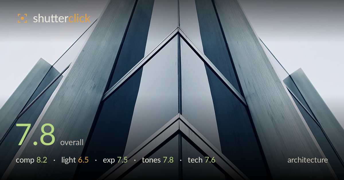
Corner rising to a point
Photo by DAVID_UNDERLAND

No EXIF metadata in this file
Technical analysis based on visual assessment only.
A confident upward-looking study of a building's corner that turns the structure into a near-symmetrical spearhead against the sky. The convergence of the two facades to the apex is the strong idea here, and it reads cleanly. What most holds it back is the flat, overcast light — it renders the metal cladding without much modelling, and the sky is a featureless pale wash that adds no interest. The near-symmetry is compelling but slightly off-centre, and the apex crowds the top edge. Tightening the geometry and shooting under more directional light would elevate this from a solid graphic exercise to a striking one.
The vertical framing and low upward angle exploit the corner geometry well, driving both facades to a single apex near the top. The chevron mullion lines create strong repeating rhythm and lead the eye upward. The near-symmetry is the backbone of the shot, though the central spine sits marginally left of centre and the apex is pushed hard against the top edge, leaving it cramped. A touch more breathing room above and a truer central alignment would let the convergence resolve more cleanly and give the peak somewhere to point.
Overcast, diffuse light dominates, and it is the weakest element. It renders the metal panels evenly with no directional modelling, so the surfaces read flat rather than sculptural. The glass reflects only a pale grey sky, adding little depth or luminance variation. Soft light does keep the whole facade evenly exposed and avoids harsh blown highlights, which suits the clean geometry — but the building's forms would gain far more presence under raking, low-angle sun that would separate the planes and put life into the reflective panels.
Exposure is well managed for flat conditions. The pale sky sits bright but appears to retain some tone rather than clipping to pure white, and shadow detail in the darker recesses of the facade is preserved. The metal midtones are placed sensibly, keeping the subtle texture of the cladding readable. Dynamic range demands here are modest given the low-contrast light, and the histogram would sit comfortably. Nothing looks accidental — the brightness decisions serve the subject, even if the source light gives little to work with.
The cool blue-grey palette is a deliberate and fitting choice for the steel-and-glass subject, lending a controlled, architectural mood. The monochromatic restraint keeps the geometry front and centre. Contrast is moderate, leaning slightly soft in line with the overcast source, and the tonal transitions across the panels are smooth. The one weakness is the sky, which contributes a large area of near-featureless pale tone. A subtle contrast lift on the facade or a graduated darkening of the sky would strengthen the tonal separation without breaking the cool cohesion.
Execution is clean and controlled. Focus holds sharp across the facade, with the mullion edges and panel seams crisply rendered from apex to base, indicating an aperture and focus distance well suited to keeping the whole plane acceptably sharp. There is no visible motion blur or noise, consistent with adequate light and a stable exposure. The wide, upward field of view captures the full convergence and, importantly, the vertical lines converging to the apex read as an intentional perspective choice rather than uncorrected keystoning — the near-symmetry justifies the distortion. The one refinement available at the technical level concerns alignment: the central spine tilts fractionally, and the apex sits slightly off the vertical centreline, both of which perspective correction and a level tripod head would resolve precisely. Lens choice serves the subject well, giving dramatic scale without excessive edge stretching. Overall this is competent, careful work where the main limitation is the light available rather than any handling error.
What would elevate it
Tags
Shot something like this?
Expert photo critique, on demand — scored across six categories, EXIF-aware. Start with 3 free critiques, no credit card.
critique my photo — free