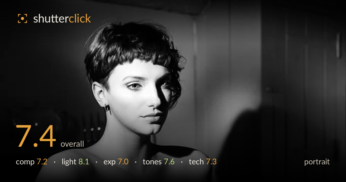
Corset portrait in raking light - Claire Rammelkamp
Photo by Martin Sojka

No EXIF metadata in this file
Technical analysis based on visual assessment only.
A moody, single-source boudoir portrait carried by directional light that sculpts the corset's lace texture and the model's collarbone and shoulders convincingly. The dramatic side lighting is the strongest asset, and the black-and-white treatment suits the low-key intent. What most holds it back is the cast shadow on the wall behind the head — it reads as a distracting doubled silhouette rather than a controlled backdrop element. The pose is a touch stiff, and the eyes sit slightly softer than critical sharpness. Tightening the background and lifting eye detail would elevate this from atmospheric to genuinely compelling.
The three-quarter turn and downward gaze establish a strong, classic boudoir pose, and the corset's vertical busk gives a natural line down the frame. The kitchen setting adds authenticity but competes for attention — the teapot, cabinet handle and counter clutter the negative space rather than supporting the subject. The hard cast shadow on the right wall doubles the head silhouette and pulls the eye away. A cleaner or darker background, and a slightly lower angle to reduce the looming shadow, would concentrate attention where it belongs.
The dominant asset here. A single hard side light rakes across the face and body, carving the collarbones, shoulder and the lace's raised texture with real dimension. The falloff into shadow on the far side of the face adds mood and mystery. The one cost is the strong cast shadow thrown onto the back wall, which reads as a second, distracting shape. Feathering the light, moving the subject further from the wall, or adding a subtle fill on the shadow side would preserve the drama while taming that background artefact.
Exposure is judged for a low-key look and largely holds. The corset's brightest whites sit near the top of the range without obvious clipping, retaining lace detail. Shadow areas fall deep and inky, appropriate to the mood, though the far side of the face and the lower body lose more detail than ideal, leaving the legs and hips as an undefined dark mass. A hair more shadow lift, or a touch of fill, would keep the lower half from dissolving while keeping the overall darkness intact.
The black-and-white conversion suits the intimate, dramatic intent, with a wide tonal spread from the bright corset to near-black surroundings. Midtone gradation on the skin is smooth and flattering, and highlight roll-off on the shoulders is controlled. Contrast is pushed fairly hard, which serves the mood but crushes some texture in the darkest areas. A slightly gentler black point in the background shadows would recover a sense of the room without diluting the low-key feel. Overall a coherent, deliberate tonal treatment.
Working from visual evidence, this appears shot at a moderate aperture giving enough depth to keep the face and corset acceptably sharp while softening the background. Focus lands close to the intended plane, though the eyes read a touch soft — critical focus seems to sit slightly forward, on the cheek or nose rather than the eyes, which costs the portrait some of the connection a razor-sharp gaze would provide. Noise is well controlled in the midtones, suggesting a sensible ISO, and there's no visible motion blur. The lens rendering is clean with no obvious distortion on the figure. Focal length flatters the proportions without stretching. The main technical gains would come from nailing focus precisely on the near eye and, at the shoot stage, positioning the subject to avoid the hard wall shadow — both are about placement and precision rather than gear. The execution is competent and the foundation is solid.
What would elevate it
Tags
Shot something like this?
Expert photo critique, on demand — scored across six categories, EXIF-aware. Start with 3 free critiques, no credit card.
critique my photo — free