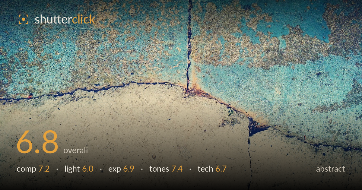
Cracked teal and cream wall
Photo by Pexels

No EXIF metadata in this file
Technical analysis based on visual assessment only.
A found-texture abstract that reads primarily through its colour split — warm cream against weathered teal — and the sweeping diagonal boundary between them. The strongest element is that curving seam and the vertical crack that punctures it, giving the frame a natural focal anchor. What holds it back is that the two halves feel evenly weighted, flattening the tension the division could create, and the light is flat, so the surface texture stays visual rather than tactile. A raking light would give the pitting and cracks real dimension. The concept is sound; execution and staging carry it further than lighting does.
The diagonal boundary between the pale lower half and the mottled blue upper half gives the frame a strong organic division, and the vertical crack meeting that curve creates a genuine focal junction just right of centre. The split sits close to a horizontal midline, which slightly halves the frame and evens the weight of the two zones. Letting one texture dominate more — pushing the seam higher or lower — would sharpen the tension. The lower cream expanse also reads a touch empty compared to the busy upper field.
The illumination is flat and frontal, even across the whole surface, which keeps colours legible but does little to shape the material. For a texture study like this, that is the main missed opportunity: the pitting, the crack ridges, and the flaking edges all stay graphic rather than dimensional. A low, raking side light would rake shadow into every pit and crack, turning the surface tactile. As it stands the light serves the colour contrast well but sacrifices the relief and depth the subject is built on.
Exposure is well controlled with no meaningful clipping — the pale concrete holds detail rather than blowing out, and the darker crevices retain information. The overall balance leans bright, which suits the airy, sun-bleached mood, though the lower cream field sits close to flat in its brightest patches. Midtones in the blue region are handled nicely, preserving the mottled variation. Nothing here reads as accidental; the brightness placement supports the light, high-key feel, and the histogram appears comfortably within range across both tonal zones.
The colour relationship is the picture's real strength — a weathered teal-to-cyan against warm cream and rust, a complementary pairing that carries the frame. The grade leans faded and slightly desaturated, which reads as a deliberate vintage or cross-processed look and suits the aged surface. Rust accents along the crack add welcome warmth against the cool field. The one caution is that the muted, uniform saturation can make the whole image feel slightly hazy; a touch more separation in the blues would add depth without breaking the mood.
Focus and sharpness appear adequate across the plane — this is a flat, parallel subject, so depth of field is not a demanding factor, and the surface detail holds together reasonably well throughout. There is no visible motion blur, and noise is not an issue at this scale. The rendering is a little soft in the finest texture, whether from the capture or from the faded processing, so the pitting and grain read more as tone than as crisp micro-detail. Sharper capture with more contrast in the fine structure would make the surface feel more present. The framing is level and the whole surface is kept parallel to the sensor, which keeps the geometry clean and avoids distortion — the right choice for a flat texture study. Overall the execution is competent and free of obvious faults; the limiting factor is not gear handling but the flat light, which no technical setting can fully compensate for. A closer, more raking approach would reward finer capture.
What would elevate it
Tags
Shot something like this?
Expert photo critique, on demand — scored across six categories, EXIF-aware. Start with 3 free critiques, no credit card.
critique my photo — free