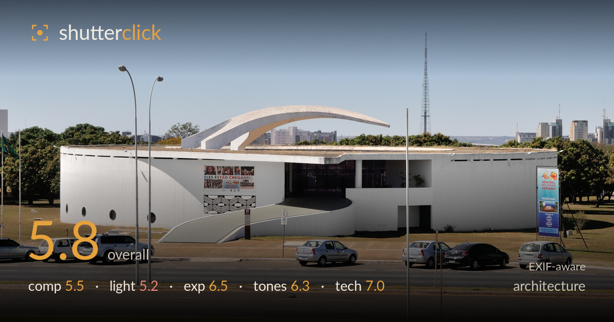
Curved canopy over the museum
Photo by Cayambe

| Focal length | 35 mm |
| Aperture | f / 10.0 |
| Shutter | 1/400 s |
| ISO | ISO 200 |
| Exp. comp. | 0.0 EV |
| Shot at | 11:12 · Oct 28, 2009 |
The distinctive curved-canopy building by Niemeyer is the natural draw, but the frame is cluttered by a broad parking lot and busy roadway that separate the viewer from the architecture. The geodesic sphere in the foreground competes for attention rather than leading into the building, and the swathe of empty lawn below eats a third of the frame. The clean white forms and the sweeping arch read well against the blue sky, but flat midday light flattens the concrete's sculptural quality. A tighter framing that isolated the architecture from the street furniture and cars would let this design breathe.
The building's sweeping arch is the strongest element, yet it sits small in the upper third while a large sphere and empty foreground lawn dominate the lower half. The row of parked cars, light poles and roadway form a cluttered midground band that fragments the frame and distances the eye from the architecture. The sphere and the building never resolve into a clear relationship. Cropping out much of the lawn and the road, or shifting to align the sphere as a deliberate foreground anchor, would give the composition purpose and let the curved canopy dominate.
Shot under high, roughly overhead midday sun, the light is functional but unflattering for architecture. The white facade is evenly lit but lacks the raking shadows that would model the curved canopy and reveal the concrete's texture and depth. Shadows fall short and hard beneath the sphere and cars without shaping the main forms. The flat frontal quality leaves the building looking two-dimensional. Late-afternoon side light would carve the arch's curve and give the flat white surfaces the dimensionality this sculptural design deserves.
Exposure is well controlled for a bright, high-contrast scene. The white facade holds detail without blowing out, and the sky retains tone and gradation. Shadow areas under the vehicles and sphere keep enough information without blocking up. The histogram sits comfortably within range given the strong midday contrast. There is a slight overall brightness that could be reined in a touch to add snap to the whites, but nothing clips destructively. A deliberate, safe reading of a demanding lighting situation.
The palette is clean and cohesive — cool blue sky, crisp white concrete, and green lawn — with accurate white balance and no obvious colour cast. Contrast is moderate and appropriate for the flat light, though the whites could carry a touch more punch. The distant city and telecom tower sit in slightly hazy, low-contrast tones typical of shooting across a wide open plaza. Saturation is natural and restrained. A modest contrast lift and a cleaner separation between the white building and pale sky would strengthen the tonal read.
The settings are sensibly matched to the conditions. At f/10 on the 35mm lens, depth of field is deep enough to keep the foreground sphere, the building, and the distant skyline acceptably sharp — the right call for an architectural establishing shot. ISO 200 keeps noise negligible and preserves clean tones in the sky and white facade. The 1/400s shutter easily freezes the moving traffic and needed no faster speed here. Focus appears accurate across the plane, with good edge-to-edge detail on the D300's sensor. The 35mm focal length on a crop body gives a natural, roughly 52mm-equivalent perspective that keeps verticals largely upright and avoids exaggerated distortion. The main technical shortcoming is not in the exposure triangle but in framing and viewpoint: a slightly higher or shifted vantage would have reduced the competing foreground clutter. Verticals on the light poles read close to true, so no significant keystoning correction is needed. Execution is solid; the limitation is compositional intent.
What would elevate it
Tags
Shot something like this?
Expert photo critique, on demand — scored across six categories, EXIF-aware. Start with 3 free critiques, no credit card.
critique my photo — free