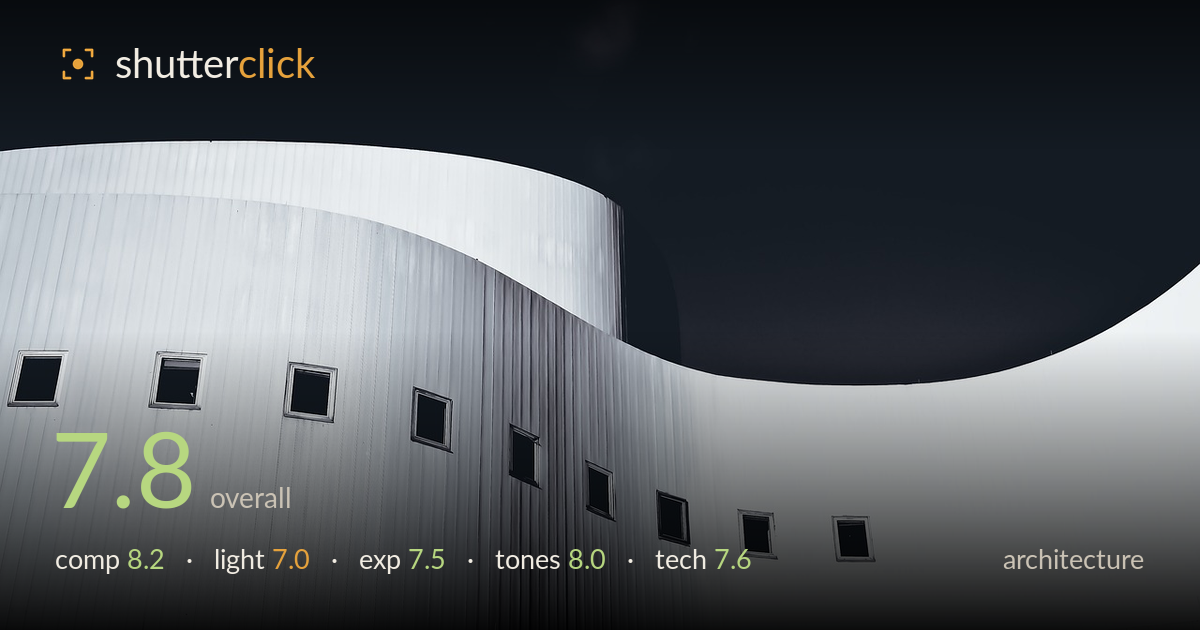
Curved facade against a black sky
Photo by 652234

No EXIF metadata in this file
Technical analysis based on visual assessment only.
A confident graphic study built on the sweeping S-curve of the facade played against a heavy black negative space. The composition's strength is that interplay of curve and void, with the scattered small windows acting as rhythmic punctuation. What holds it back is a slight tonal flatness in the corrugated cladding, which reads soft and greyish where crisper mid-tone separation would give the ribbing more punch. The black sky is bold but very close to featureless, and one faint smudge in the upper area draws the eye. Still, a well-seen abstraction of form and line.
The undulating S-curve dividing lit facade from black sky is the backbone here, and it works — a strong diagonal sweep that carries the eye from lower left up to the right. The scattered windows provide rhythm and scale against the large clean planes. The large expanse of black balances the detailed wall well as negative space. The three-band horizontal stacking of facade sections gives layered depth. The curve of the right edge nicely echoes the main sweep, tying the frame together.
The light is soft and flat — an overcast or shadowless condition that renders the white cladding evenly but drains it of dimensional modelling. That flatness suits the clean graphic reading but leaves the corrugated ribbing looking muted rather than sculpted. The one area of genuine shape comes where the curved wall recedes into faint shadow at centre, giving a hint of depth. Raking directional light would carve the vertical ribbing and separate the overlapping planes far more emphatically.
Exposure is well controlled for a high-key subject against near-black — the white cladding holds detail without clipping to paper white, and the window recesses sit at solid black without swallowing the frames. The sky is pushed to near-total black, which reads as a deliberate choice rather than an error. The faint tonal smudge upper-centre suggests a small area of retained detail or sensor artefact worth cleaning. Overall the dynamic range is used decisively, keeping bright and dark extremes intact.
The monochrome treatment is the right call and the tonal split — bright neutral facade versus dense black — is handled with conviction. Mid-tones in the cladding could use slightly more separation; the ribbed panels drift into a uniform pale grey that flattens texture. Shadow depth in the windows is good and gives the frame anchoring blacks. Highlight roll-off on the white walls is smooth. A touch more mid-tone contrast would let the vertical seams register more crisply.
Focus appears accurate across the facade, with the window frames and ribbed seams holding definition where the surface faces the camera. Depth of field is more than sufficient for this flat, planar subject. Sharpness is decent though the cladding softens slightly in the mid-tones, which may be as much a lighting and contrast issue as a resolution one — the fine vertical lines don't render as crisply as the geometry invites. There's no visible motion blur or noise of concern; the black areas stay clean rather than showing banding, which matters when pushing tones this dark. The wide framing captures the full curve without visible keystoning on the verticals, a good sign for perspective handling given the upward angle. The faint smudge in the upper black region is the one execution flaw that would benefit from a clone-out. A slightly higher-contrast rendering of the cladding, either in capture or post, would reward the sharp lens work already present here.
What would elevate it
Tags
Shot something like this?
Expert photo critique, on demand — scored across six categories, EXIF-aware. Start with 3 free critiques, no credit card.
critique my photo — free