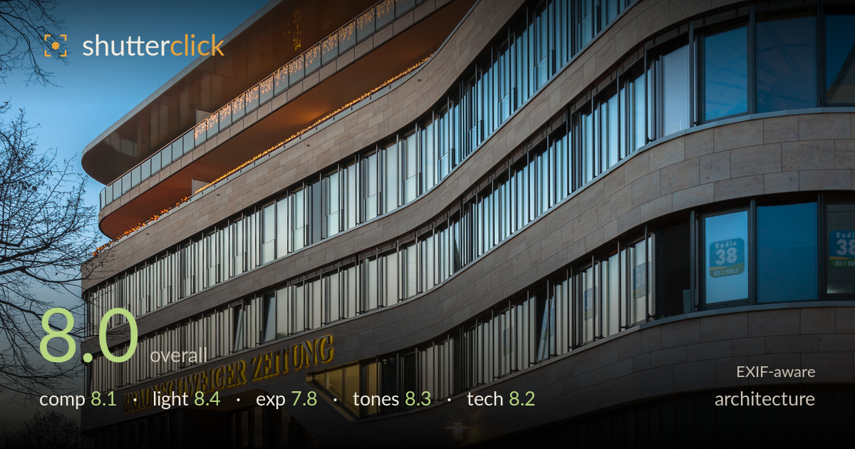
Curved facade at blue hour
Photo by PtrQs

| Focal length | 28 mm |
| Aperture | f / 8.0 |
| Shutter | 1.6 s |
| ISO | ISO 100 |
| Exp. comp. | -0.7 EV |
| Shot at | 17:51 · Dec 19, 2020 |
A confident blue-hour architectural study that lets a sweeping curved facade command the frame while the road sweeps the eye in from the lower left. The timing is the real win — that narrow window where interior warm light balances a deep cobalt sky, with the illuminated signage anchoring the mid-frame. The dynamic curve of the building against the graduated sky reads with real authority. What holds it back most is verticals that lean slightly and a foreground road that eats more space than it earns. Cleaner perspective control and a marginally tighter base would elevate an already accomplished frame.
The curved facade is the strongest element, filling the frame with sculptural energy as it sweeps from upper right down toward the illuminated entrance. The road forms a workable leading line drawing the eye up into the structure. The paving and asphalt foreground, however, occupies a large lower third that is visually inert — trimming it would concentrate attention on the building. The bare tree at left adds a useful counterweight and softens the hard geometry. Sky proportion up top is generous but justified by the gradient.
Blue-hour timing is expertly judged. The warm interior glow and amber signage sit against a cool graduated sky in a classic, well-balanced pairing, and the last light on the stone gives the facade dimensionality rather than flat rendering. The recessed soffit lighting along the balcony edges adds warmth that guides the eye across the curve. Street lamps glow without overwhelming. The one caution is that the shadowed lower street corner falls quite dark, losing the shaping the upper facade enjoys.
Exposure balances a tricky range well — the bright signage and interior windows retain colour and legibility while the sky holds its gradient without banding. The -0.7 EV compensation protected the highlights sensibly. The trade-off shows in the foreground road and lower-right dark facade, where shadow detail thins into near-black. The histogram leans toward the shadows, appropriate for the mood, but a touch more lift in the darkest street area would recover texture without harming the blue-hour feel. Highlights on lamps are controlled.
The colour relationship is the highlight — deep cobalt sky graduating cleanly toward the horizon, warm tungsten accents on stone and signage, and neutral limestone that reads true. White balance splits the warm/cool divide convincingly without oversaturation. Contrast is well controlled, holding both the glowing interiors and the shadowed lower corner. The tonal transition across the sky is smooth. If anything, the darkest shadows could carry marginally more separation, but overall the grade is disciplined and atmospheric rather than pushed.
The settings are well matched to the task. At f/8 on the 17-35mm at 28mm, depth of field covers the facade front to back with the lens near its sharpest aperture, and ISO 100 keeps the file clean with no meaningful noise in the shadows. The 1.6-second exposure on a tripod is entirely appropriate for blue hour and renders the static architecture crisply. Focus is accurate across the stone and windows. The main technical shortfall is perspective: the verticals lean inward and the whole structure tilts slightly, which a shift lens or later keystone correction would resolve — important in architecture where converging parallels are judged strictly. The 28mm choice avoids extreme wide-angle distortion while still capturing the sweep, a sensible compromise. A slightly more level camera position or a touch of upward correction in post would tighten the geometry. Overall execution is clean and deliberate, with only the perspective discipline separating it from top marks.
What would elevate it
Tags
Shot something like this?
Expert photo critique, on demand — scored across six categories, EXIF-aware. Start with 3 free critiques, no credit card.
critique my photo — free