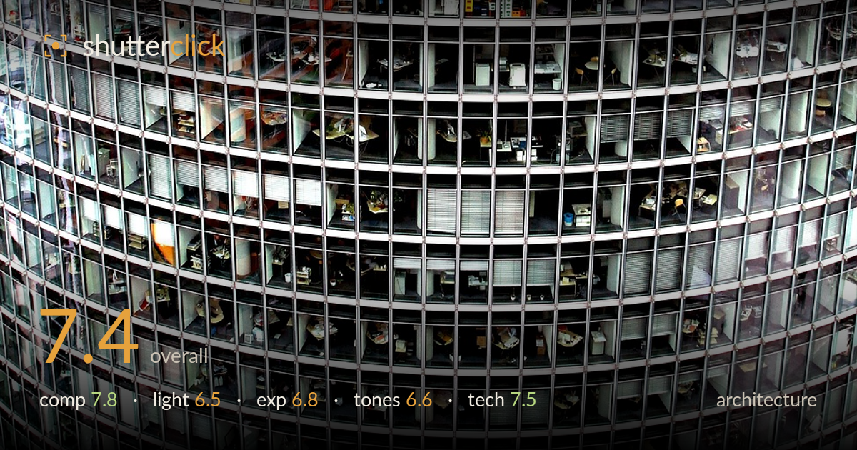
Curved grid of a glass tower
Photo by moerschy

No EXIF metadata in this file
Technical analysis based on visual assessment only.
A confident full-frame abstraction of a curved glass tower, where the relentless grid and its gentle bowing are the whole subject — and that commitment pays off. The tight crop lets the geometry breathe without distracting sky or street, and the peek into countless lit office interiors rewards close inspection. What most holds it back is tonal flatness and a slightly murky, cool-neutral rendering that mutes the interior warmth and lets the many small dark reflections read as noise rather than pattern. A touch more contrast control and a cleaner white balance would let the structure snap. Strong graphic instinct throughout.
The decision to fill the entire frame with the curved facade is the right call — no wasted sky, no distracting base, just pure repeating grid. The convex bow of the tower reads as a subtle lens-like curve that gives the flat pattern dimensionality and a sense of scale. Horizontal floor bands and vertical mullions create a dense, satisfying matrix. The centring works here because the symmetry is the point. The many lit interiors add layers of micro-interest that reward lingering, keeping an otherwise rigid pattern from feeling static.
Flat, overcast daylight dominates, which keeps the exterior mullions evenly lit but offers little modelling to separate the glass planes from the metal grid. The real light interest comes from within — warm interior fixtures glowing against cool exterior reflection — but that contrast stays subdued rather than dramatic. Overcast conditions suit the even geometry, yet the scene would gain from either a directional raking light to sculpt the curve or a dusk moment when the interior lights fully take over against a darker facade.
Exposure is broadly well judged for a high-dynamic-range subject — the bright grid holds detail and the darker interiors mostly retain information without crushing to pure black. A few glass panels tip toward highlight flatness, and the deepest reflected pockets sit close to muddy. The midtones carry the mass of the frame safely, but the overall reading is a little low-contrast, giving a slightly hazy feel. Pulling the black point down modestly and lifting local contrast in the interiors would give the exposure more decisive separation.
The palette is cool and neutral — greys, steel blues, and glass greens — punctuated by the warm dots of interior lighting. That interplay is the strongest tonal asset, but the grade currently mutes it; the whole frame reads slightly desaturated and hazy. White balance leans cool, which suits the glass but drains life from the warm interiors that could otherwise pop. A cleaner separation between the cool exterior and warm interior tones, plus a small saturation and contrast lift, would sharpen the mood.
Focus and sharpness appear solid across the plane of the facade, which is essential for a pattern-driven frame — the grid stays crisp from edge to edge with no obvious falloff, suggesting a well-chosen aperture and a focal length that compressed the scene nicely. The curvature reads as the building's actual convex form rather than lens distortion, which speaks to controlled optics or careful framing. Detail resolution in the interiors is good enough to reward close viewing without breaking into mush. The main technical limitation is micro-contrast: the image reads slightly soft globally, likely from atmospheric haze or a lack of contrast in processing rather than focus error, and the darker reflections carry a faint noise-like texture. Tightening acuity through capture sharpening and clarity on the interior zones would let the fine window detail resolve more decisively. Verticals and horizontals hold well given the curved subject, so perspective control is not an issue here — this is a clean, competent execution.
What would elevate it
Tags
Shot something like this?
Expert photo critique, on demand — scored across six categories, EXIF-aware. Start with 3 free critiques, no credit card.
critique my photo — free