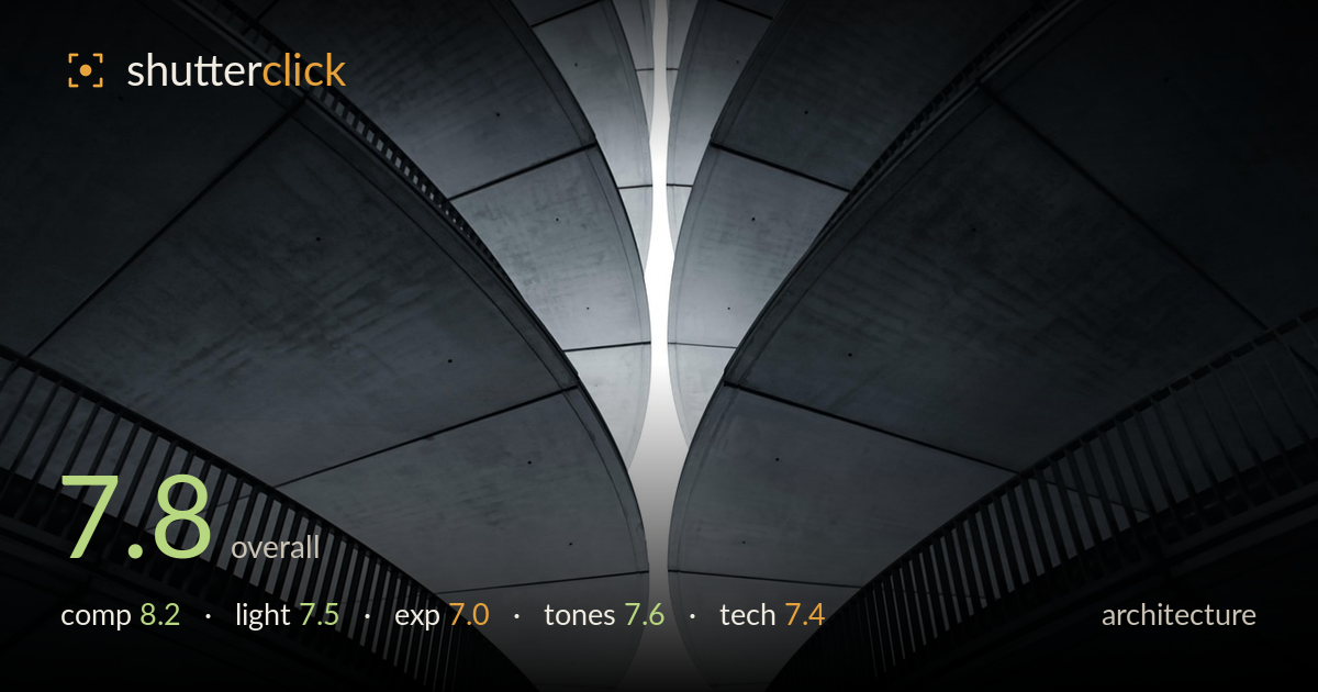
Curves of concrete reaching for the sky
Photo by Dylanleagh

No EXIF metadata in this file
Technical analysis based on visual assessment only.
A confident near-symmetrical study of curving concrete balconies that reads as much as abstraction as architecture. The mirrored sweep of the two structures around a bright central sliver of sky is the picture's engine — it pulls the eye upward and creates strong graphic tension. What most holds it back is the central highlight, which blows out to pure paper white and drains the sky of any tonal information, flattening the depth the curves work so hard to build. The near-black lower corners also lose all structure. Tighter highlight control and a touch more shadow recovery would let the geometry breathe without weakening the impact.
The mirrored composition is the strongest decision here — two sweeping concrete curves cradle a narrow vertical of sky that splits the frame and draws the eye up through the funnel. The balustrades add rhythm and scale against the smooth undersides. Symmetry is close but not perfect, and the slight imbalance between the two sides is noticeable once seen. The tight upward framing removes any orientation cue, which serves the abstract reading well. A hair more precision on the central axis would lock the symmetry.
The light is soft and diffuse, wrapping the concrete undersides in gentle gradation that describes their curvature nicely. Directionality is subtle but present, darkening toward the outer edges and brightening toward the central sky gap. That gradient does most of the modelling work. The main weakness is the overpowering central highlight — the sky is so bright it becomes a hard white void rather than a light source that shapes the forms. Shooting under slightly less contrasty sky conditions would preserve more nuance in that gap.
Exposure is judged for the concrete midtones, which sit in a pleasing range with visible surface texture. The trade-off is a fully clipped central sky — pure white with no recoverable detail — and near-black lower corners that swallow structure. In this abstract context the blown sky arguably functions as intentional negative space, but the loss is total rather than controlled. Bracketing and blending, or metering to hold a hint of tone in that gap, would give a more deliberate high-key result.
The near-monochrome, cool-desaturated palette suits the concrete subject and reinforces the graphic mood. Midtone gradation across the curved undersides is smooth and does the heavy lifting for depth. Contrast is pushed fairly hard — the jump from deep shadow to blown highlight is abrupt, and the shadow depth in the corners crushes some detail. A gentler highlight roll-off and slightly lifted blacks would extend the tonal range and let the material texture read more fully across the whole frame.
Focus and sharpness appear well handled across the concrete surfaces, with the balustrade slats holding crisp definition where they catch the light — a good sign that the plane of focus and depth of field were adequate for the subject. The wide, upward-tilted framing is characteristic of a wide lens used to capture the full sweep, and the curves read cleanly without obvious distortion artefacts beyond what the architecture itself provides. There's no visible motion blur or noise of concern in the midtones, suggesting a controlled exposure at a sensible ISO. The primary technical limitation is dynamic range: the scene's contrast between shaded concrete and bright sky exceeds what a single frame holds cleanly, resulting in the clipped highlight and blocked shadows. An exposure blend or graduated approach would have captured the full range. Verticals and the central axis are close to true, though a fractionally more precise alignment would tighten the symmetry that the composition depends on.
What would elevate it
Tags
Shot something like this?
Expert photo critique, on demand — scored across six categories, EXIF-aware. Start with 3 free critiques, no credit card.
critique my photo — free