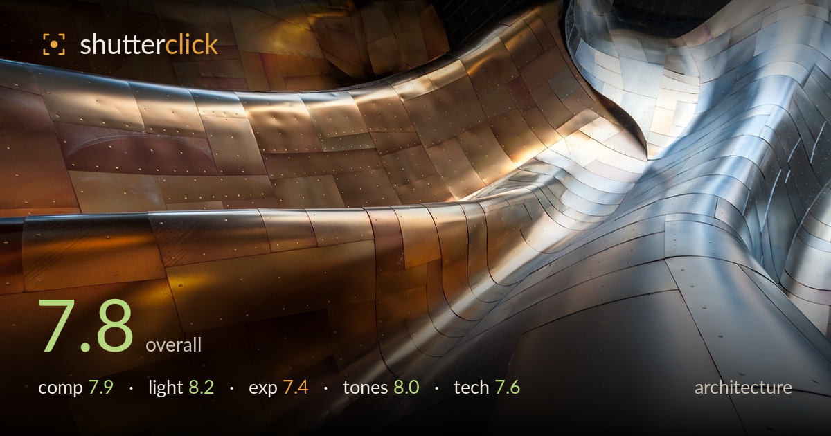
Curves of copper and steel
Photo by sakulich

No EXIF metadata in this file
Technical analysis based on visual assessment only.
A confident abstract read of a Gehry-style skinned facade, and the strongest asset is the way warm copper and cool steel divide the frame into competing temperatures. The sweeping curves of the panelled seams act as leading lines that carry the eye through the composition, and the tiled patchwork of rivets adds texture across every surface. What holds it back is a shadow core low-centre that muddies into near-black without much recovered detail, and a right-side transition where the two curved forms nearly merge into visual confusion. The frame reads more as pleasing texture than as a resolved graphic statement — a stronger anchor point would lift it.
The curved seams function as genuine leading lines, sweeping from lower left up and around toward the bright cleft on the right. The warm-to-cool diagonal split gives the frame real structure and the rivet grid holds interest everywhere. The weakness is the busy right third, where two curved masses converge and the eye loses a clear resting point. The dark trough running low-centre also splits the frame without quite becoming a deliberate anchor. As abstract architecture it works; a single dominant curve given more breathing room would resolve it further.
The light is the real draw here — soft, wrapping illumination that models the compound curves without harsh specular blowouts, and the warm glow pooling into the copper panels against the cooler steel gives the frame its whole emotional payload. Direction is glancing enough to reveal the subtle undulations in each panel and pick out every rivet. The only shortfall is in the lower shadow pockets, where the fall-off goes flat and detail collapses. A touch more ambient fill in those troughs would preserve the material read throughout.
Highlights are handled well — the bright steel and the warm reflections retain texture rather than clipping to paper white, which is the hard part with polished metal. The midtones sit nicely, giving the copper its glow. The compromise is at the bottom of the range: the deep trough low-centre and the shadowed panels lower left slide into near-black with little recoverable detail. Whether that's deliberate or a limit of dynamic range, a fraction more shadow lift, or a bracketed frame, would keep the material texture alive throughout.
The colour story is the standout — a controlled warm-cool contrast between burnished copper-gold and brushed steel-blue that never tips into oversaturation. White balance is judged to let the warm reflections read as intentional glow rather than a cast. Tonal range across the mid and upper values is smooth, with gentle gradation over the curved surfaces. Contrast is well pitched for the mood. The one caveat is the crushed low shadows, which cut the tonal range short at the bottom. A gentler black point would extend the gradation.
Focus and sharpness are handled well across the frame — the rivet detail and the panel seams stay crisp from foreground to the deeper reaches of the curve, suggesting an aperture chosen to hold depth across the receding surfaces. No obvious motion blur or camera shake, and the polished metal is rendered without distracting noise even in the darker zones, which points to a clean, low-ISO capture. The wide framing suits the sweeping forms, though there's mild distortion in the curved lines that reads as a natural product of a wide lens on a large curved subject rather than an error. The main technical limit is dynamic range: the deepest shadow troughs lack recoverable information, which a bracketed exposure or a lower-contrast raw development would have preserved. Execution is otherwise assured — the challenge of a highly reflective, curved surface is met with even sharpness and controlled highlights, which is the hard part.
What would elevate it
Tags
Shot something like this?
Expert photo critique, on demand — scored across six categories, EXIF-aware. Start with 3 free critiques, no credit card.
critique my photo — free