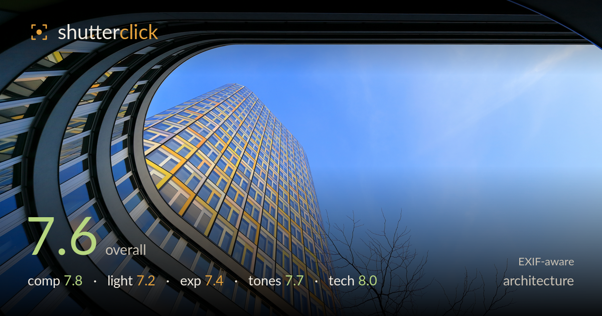
Curving facade framing a golden tower
Photo by Martin Falbisoner

| Focal length | 16 mm |
| Aperture | f / 8.0 |
| Shutter | 1/125 s |
| ISO | ISO 200 |
| Exp. comp. | 0.0 EV |
| Shot at | 19:02 · Mar 31, 2017 |
A confident upward composition that turns the curving foreground facade into a sweeping frame for the golden tower — the strongest single idea here. The dynamic curl of the balcony floors leads the eye cleanly toward the receding high-rise, and the bare tree adds a welcome organic counterpoint against the flat blue. What holds it back is a large, slightly empty expanse of sky on the right that dilutes the tension, and a top edge cluttered by the reflective window frame the shot appears to be taken through. Tightening the balance and cleaning that top edge would elevate a genuinely striking perspective.
The sweeping curve of the foreground facade is the star, funnelling the eye toward the golden tower with real momentum. The diagonal thrust of the high-rise and the delicate bare tree provide strong secondary interest. The weakness is the right third: a large blank stretch of sky sits unbalanced against the dense curve, leaving the frame feeling lopsided. The dark reflective frame along the top edge intrudes and reads as clutter rather than an intentional device. A crop trimming right and top would concentrate the energy.
Low-angle sun rakes the tower's facade, igniting the yellow and gold panels against the cool blue sky — an effective warm-cool interplay. The light direction gives the receding floors a satisfying sense of modelling and depth. However, the sky is fairly flat and uniform, and the overall light lacks the drama of golden hour; it reads as clear midday-to-afternoon. The curved foreground facade catches only muted reflected light, so its detail sits in shadow and competes less than it could with the illuminated tower.
Exposure is well controlled for a high-contrast scene shooting into bright sky. Highlights on the golden panels hold their detail without blowing, and the blue sky retains gradation rather than washing out. Shadow areas in the darker foreground curve stay readable. The reflective glass surfaces avoid harsh clipping. The image sits perhaps a touch bright overall, and the upper-right sky edges toward its lightest without full punch. A slight pull on the sky would deepen it, but nothing here reads as an error.
The warm gold of the tower against the graduated blue sky is the tonal centrepiece and it works well — a clean, complementary palette. White balance is accurate, with neutral greys in the concrete edges and no colour cast. The blue gradation from deep upper-left to pale right feels natural. Contrast is healthy without crushing the shadowed foreground. Saturation is pushed slightly, giving the yellows an almost neon edge in places; easing that back marginally would keep the facade rich but more believable.
The 16mm focal length on the 16-35mm f/4L is the right tool for this looming, converging perspective, and the exaggerated verticals are used deliberately rather than fought. f/8 is a sensible choice — the lens's sweet spot — delivering front-to-back sharpness across the curving facade, the distant tower, and the fine tree branches, all of which hold crisp detail. ISO 200 keeps noise invisible, and 1/125s is more than adequate for a static architectural subject handheld at this wide angle. Focus is accurate across the plane. Corner performance and edge sharpness are strong for an ultra-wide. The one technical caveat is that the frame appears shot through a reflective glass surface — the dark band across the top and the subtle reflections in the sky suggest as much — which introduces a slight veiling and the intrusive top edge. Shooting without that intervening glass, or repositioning to exclude it, would clean up the result. Execution otherwise is sound and controlled.
What would elevate it
Tags
Shot something like this?
Expert photo critique, on demand — scored across six categories, EXIF-aware. Start with 3 free critiques, no credit card.
critique my photo — free