Curving glass facade at blue hour
Photo by 652234

No EXIF metadata in this file
Technical analysis based on visual assessment only.
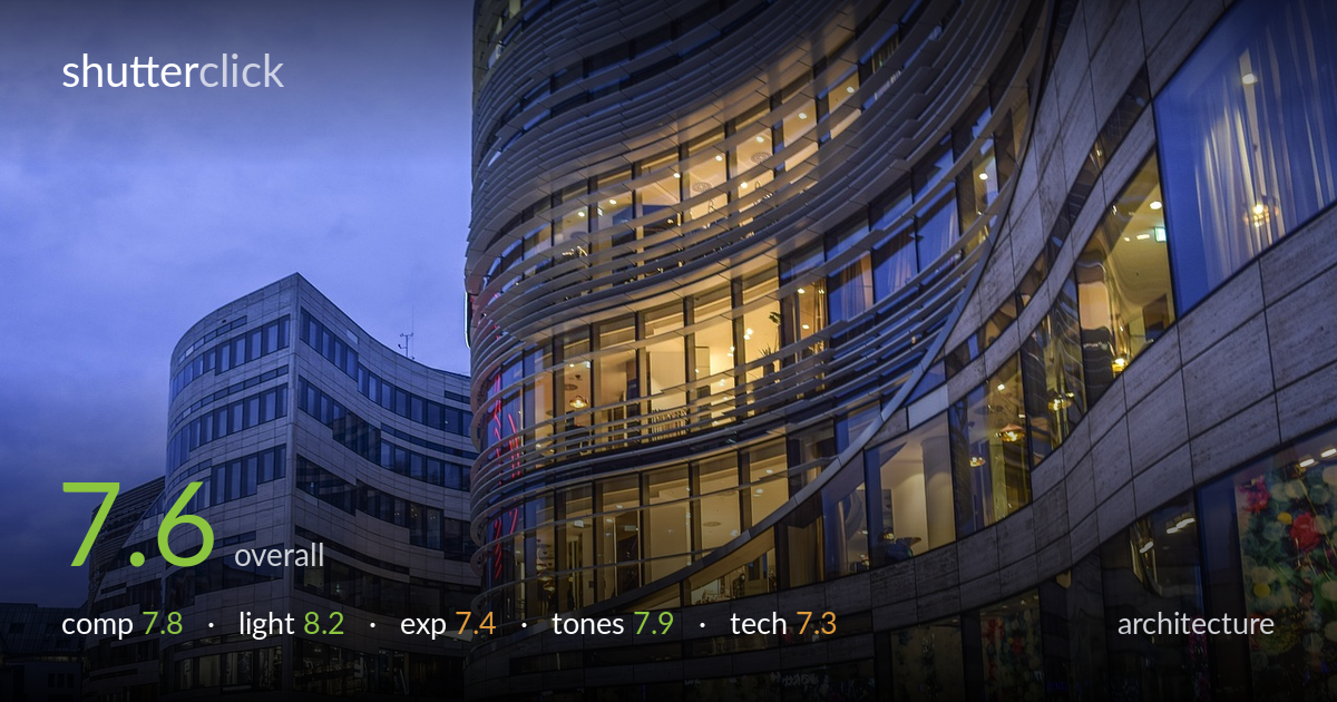
A confident blue-hour treatment of curving glass-and-stone facades, where warm interior light against cool twilight does most of the heavy lifting. The sinuous ribbon-glass tower anchors the frame and the receding plaza on the left adds welcome depth and human scale. What most holds it back is verticals that lean inward and a busy lower-right corner of flower-display windows that competes with the cleaner architectural geometry above. A slightly higher viewpoint and corrected verticals would let the building's curves read as designed rather than slightly distorted. Strong material rendering and an excellent moment in the light.
The curving facade sweeps the eye from lower right up and around the tower, a natural leading movement that suits the architecture. The plaza on the left opens depth and gives the pedestrians scale. Balance is reasonable, though the bright florals in the lower-right shop windows pull attention away from the geometry. The frame edges crop the tower's top awkwardly, cutting the building's apex. A touch more breathing room above, or a deliberate choice to abstract the curve, would resolve that tension.
Timing is the photo's biggest strength. Shooting at blue hour balances the deep cobalt sky against the warm tungsten glow pouring from the interiors, and the two temperatures play off each other beautifully. The lit floors reveal interior structure and add layers of depth through the glass. Reflections on the curved panels catch and bend the light, animating the surface. The illuminated ground floors anchor the base. Light direction and quality are well matched to the subject and the moment is well caught.
Exposure holds a wide dynamic range competently — the bright interior windows retain detail without blowing out badly, and the dim plaza still shows pedestrians and paving. The sky sits at a pleasant mid-luminance that keeps the blue rich. Some of the hottest window panels are near clipping, and the deepest shadows on the left buildings lose a little separation. Overall it reads as a deliberate, well-judged balance rather than an accident, with only minor highlight recovery needed in the brightest glass.
The warm-cool split is the tonal centerpiece and it is graded with restraint — ambers and golds against a saturated twilight blue. White balance is handled well, letting the tungsten read warm without going orange. Contrast is healthy and the stone facades retain a neutral mid-tone that grounds the color story. Saturation in the floral display windows is a touch aggressive and slightly cartoonish against the more sober architecture. Pulling those back marginally would keep the palette coherent.
Focus appears accurate across the facade, with the glass detailing and stone texture rendered crisply where it matters. Depth of field looks sufficient to keep both the near windows and the receding plaza acceptably sharp, suggesting a sensible mid-range aperture for a static architectural subject. Noise is controlled well for a low-light scene, indicating either a steady support or careful ISO management. The wide focal length captures the sweep of the curve but introduces the most visible weakness: the verticals on the left buildings lean inward and the tower bows, classic wide-angle convergence that an architecture frame is judged strictly on. Perspective correction in post, or a tilt-shift approach on a reshoot, would straighten the parallels and let the curved geometry read as intentional rather than distorted. The slight motion blur on moving pedestrians is acceptable and even adds life to the plaza. Execution is solid; line discipline is the main area to refine.
what would elevate it
tags
Shot something like this?
Expert photo critique, on demand — scored across six categories, EXIF-aware. Start with 3 free critiques, no credit card.
critique my photo — free