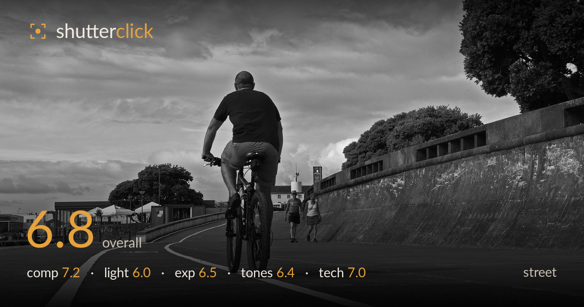
Cyclist on the seaside promenade
Photo by Proteu67

No EXIF metadata in this file
Technical analysis based on visual assessment only.
A clean, well-structured seaside promenade scene anchored by the cyclist and a strong curving line that pulls the eye through the frame. The low camera angle gives the tarmac real presence and the white lane markings do genuine compositional work. What holds it back most is the flat, overcast light — it renders the sky heavy and the midtones muted, so the frame lacks a decisive graphic punch or a clear moment. The two walkers offer a secondary story beat but sit small and unresolved. Strong bones, but the light and the missing peak moment keep it from landing fully.
The curving lane line is the strongest element, sweeping from the lower-left corner through the cyclist and out toward the distant figures — a genuine leading line that gives the frame depth and momentum. The low angle exaggerates the foreground road, which works. The cyclist sits slightly right of centre, well placed against the sky. The sea wall on the right and cluster of buildings on the left balance the scene. The two walkers ahead add a second focal point, though they read a little small and incidental rather than integrated.
Flat, diffuse overcast light dominates, which suppresses modelling on the cyclist and flattens the road surface into an even grey. The heavy cloud cover carries some drama in its texture but offers no directional shaping — no raking side light to reveal the tarmac's texture or sculpt the figures. The result is even and legible but lacks a light-driven focal accent. A break in the cloud, or shooting nearer golden hour, would have added the tonal separation and mood this composition is set up to carry.
Exposure is balanced across a difficult high-key sky and darker road. The brightest cloud edges hold detail without blowing out, and shadow areas under the trees and in the cyclist's shirt retain some information. The midtone road sits a touch dark, pulling the overall image toward a muted heaviness. There is no obvious clipping at either end, which is a solid result under a bright overcast sky. Lifting the road midtones slightly would open the frame and give the tarmac more presence.
The black-and-white conversion is competent but a little flat. Midtones dominate and the image lacks the deep blacks and clean highlight roll-off that would give it snap. The sky carries the most tonal interest, its clouds separating reasonably well, but the road and figures share too similar a grey. Contrast could be pushed harder to lift the cyclist and lane lines off the tarmac. The white markings do provide welcome bright accents against the grey. A stronger tonal curve would sharpen the mood.
Focus appears to land accurately on the cyclist, with the bike and rider rendered sharp enough to anchor the frame. Depth of field is broad, keeping the road, walls, and distant walkers all acceptably crisp — appropriate for a scene where context matters. There is no visible motion blur on the cyclist, suggesting a shutter speed fast enough to freeze the moderate pace, and noise is well controlled throughout, consistent with good light. The wide framing suits the promenade setting and the curving line. One limitation is that the distant walkers, while sharp, are small enough that their gestures don't read clearly — a slightly longer focal length or a moment when they were closer would have strengthened the secondary subject. The overall execution is clean and controlled; nothing is technically wrong, but the frame plays it safe rather than pushing the depth or timing that would make the technical choices feel decisive.
What would elevate it
Tags
Shot something like this?
Expert photo critique, on demand — scored across six categories, EXIF-aware. Start with 3 free critiques, no credit card.
critique my photo — free