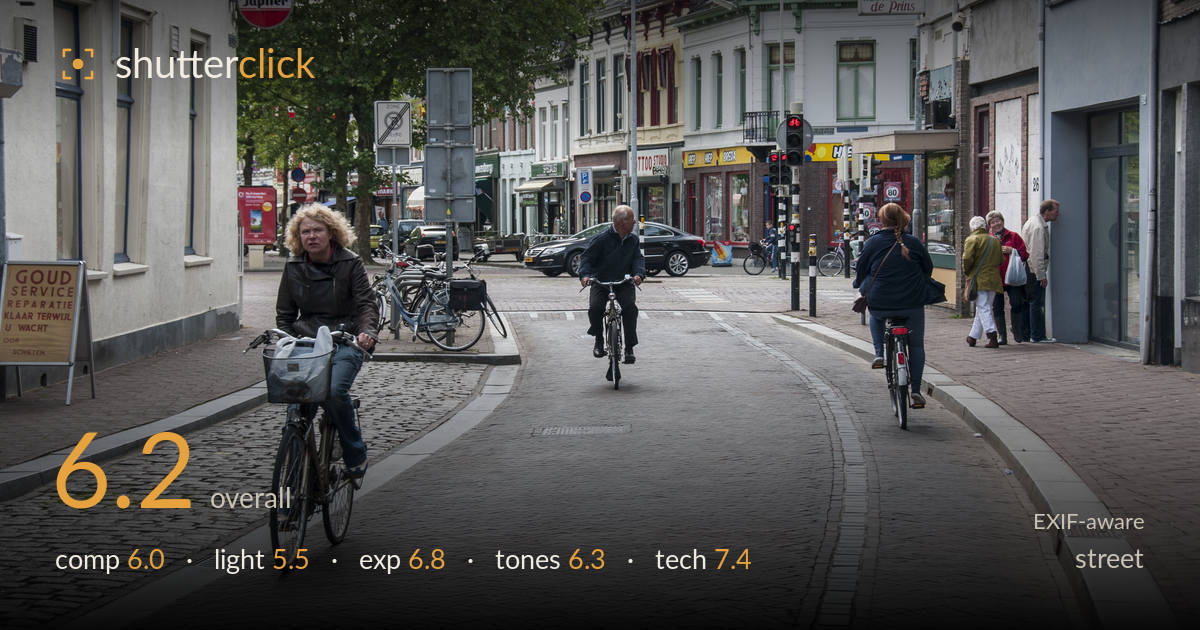
Cyclists on a cobbled town street
Photo by Ralf Roletschek

| Focal length | 48 mm |
| Aperture | f / 8.0 |
| Shutter | 1/250 s |
| ISO | ISO 200 |
| Exp. comp. | 0.0 EV |
| Shot at | 15:01 · Jun 27, 2013 |
A competent, information-rich Dutch street scene that documents the cobbled cyclist zone well but lacks a single decisive moment to anchor it. The approaching cyclist on the left is the strongest element — she meets the lens and provides a clear focal point — but the frame is split between three separate cyclists and a cluster of pedestrians, none in real relationship with the others. The flat overcast light keeps everything legible but drains energy from the scene. Sharpness, depth of field and shutter choice are all well handled. The gap between good documentation and a memorable street photograph is a moment where gesture or juxtaposition ties the actors together.
The wide cobbled street funnels the eye inward and gives good depth, with the left-hand cyclist providing a strong near anchor. But the frame carries three unrelated cyclists plus a pedestrian group, and the eye ping-pongs between them without a hierarchy. The parked bikes and street furniture in the mid-ground clutter rather than support. The horizon and verticals sit reasonably level. A tighter framing on the approaching cyclist, or a moment where two subjects align, would give the balance a clear centre of gravity it currently lacks.
Flat, even overcast light renders every sign and facade legibly, which suits documentary intent, but it flattens form and drains the scene of mood. Shadows are weak and directionless, so the cobbles and brick — surfaces that reward raking light — read as texture-less grey. There are no highlights to shape the cyclists or lift the storefronts. The soft light is forgiving on faces but offers nothing to build atmosphere around, leaving the image informative rather than evocative.
Exposure is well judged for the flat conditions. The bright overcast sky holds without blowing out badly, and shadow detail under the awnings and inside the storefronts is retained. Midtones sit where they should, keeping the cobbles and brick reading naturally. The overall level is a touch flat, a direct consequence of the light rather than a metering error. The histogram is safely contained with no meaningful clipping, and the exposure decisions read as deliberate and controlled throughout the frame.
White balance is neutral and believable under grey skies, with the red Jupiler sign and traffic lights providing welcome colour accents against the muted brick and stone. Contrast is on the low side, again a product of the overcast, leaving the tonal range somewhat compressed and the image feeling slightly muted. Saturation is restrained and natural. A modest contrast lift and a small boost to the warm brick tones would give the scene more separation and life without pushing it toward artificiality.
The settings are well matched to the scene. f/8 delivers deep depth of field that keeps the near cyclist and the distant storefronts acceptably sharp — appropriate for a documentary street frame where context matters. 1/250s cleanly freezes the approaching cyclist and the pedaling motion with no smearing, and ISO 200 keeps noise negligible with clean shadow rendering. The 48mm setting on the 18-200 gives a natural, undistorted perspective that reads as the eye sees it. Focus lands accurately on the foreground cyclist, the critical subject. The only limitation is the lens itself: this superzoom is a touch soft and low in micro-contrast at the edges compared with a prime, and some of the flatness in fine detail traces to it rather than to technique. Nothing here holds the image back technically — the execution is clean and the choices sound for the conditions and intent.
What would elevate it
Tags
Shot something like this?
Expert photo critique, on demand — scored across six categories, EXIF-aware. Start with 3 free critiques, no credit card.
critique my photo — free