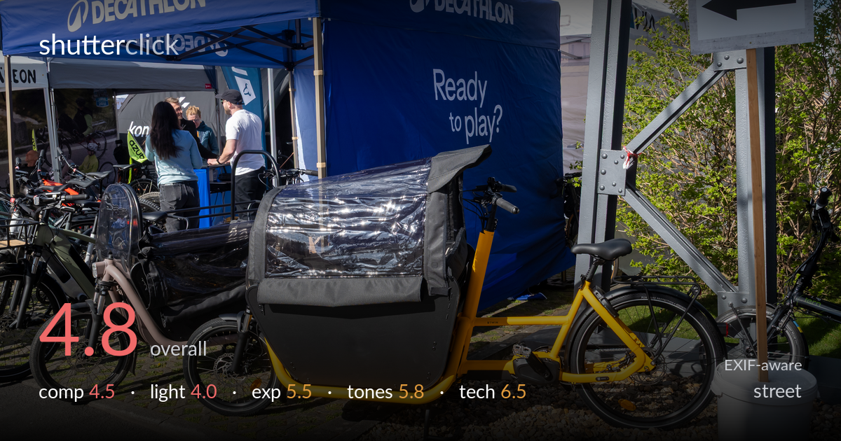
Decathlon cargo bike booth
Photo by Matti Blume

| Focal length | 16 mm |
| Aperture | f / 6.3 |
| Shutter | 1/400 s |
| ISO | ISO 200 |
| Exp. comp. | 0.0 EV |
| Shot at | 09:31 · Mar 29, 2025 |
This reads more as a documentary record of a trade-fair booth than a street photograph with a decisive moment. The frame is dominated by branded tents and a yellow cargo bike, with the human element — the group conversing under the canopy — pushed into the background and partly obscured. There is no clear narrative or gesture to anchor the eye, and competing signage, buckets, and overlapping bicycles clutter the space. Technically the capture is clean and sharp, but the harsh midday light flattens the scene. The strongest path forward is deciding what the photo is actually about and building the frame around it.
The frame is crowded and lacks a clear subject. The yellow cargo bike commands attention through colour but sits awkwardly in the lower-right quadrant, its rear wheel and rack tangling with the metal post and directional sign. The people — the natural candid heart of a street shot — are small, half-hidden under the canopy. Multiple competing elements (tents, signage, parked bikes, white bucket) pull the eye in different directions with no resolution. The diagonal of the kerb leads out of frame rather than into the scene.
Hard, high midday sun produces flat, unflattering light across the scene. The blue tents and yellow frame hold colour, but shadows are short and harsh, and the open shade under the canopies goes muddy while the gravel and pavement bake under direct sun. There is no directional shaping to give the cargo bike form or to separate the people from their surroundings. The light does the scene no favours — it documents rather than describes, with none of the raking warmth that would lend depth.
Exposure is competently handled for the difficult contrast range. Highlights on the white tent and signage hold without obvious clipping, and the yellow frame retains saturation. The shaded interior under the canopies sits dark but keeps enough detail to read the figures. The bright gravel bed is close to blowing but stays within range. Midtones are placed reasonably given the harsh light, and the histogram appears well controlled with no accidental crushing. A deliberate, safe exposure rather than an expressive one.
Colour is clean and broadly accurate — the Decathlon blues, the orange sign, and the yellow frame all register with believable saturation. White balance leans slightly neutral-cool, suiting the daylight. Contrast is high by necessity of the light, which leaves shadows somewhat blocked and highlights brittle on the white surfaces. There is little tonal grading or intent here; the colours are bright and busy rather than harmonised. The competing primaries add to the visual noise rather than building a cohesive palette.
The 16mm focal length on the Micro Four Thirds body (32mm equivalent) is a sensible reportage width, and execution is solid. At f/6.3 the depth of field is deep enough to keep the cargo bike, the people, and the background tents acceptably sharp — a reasonable choice for a documentary frame, though it offers no subject isolation to lift the bike from the clutter. The 1/400s shutter freezes the static scene easily and leaves ample margin had anyone moved. ISO 200 keeps the file clean with no visible noise, well within the sensor's comfort zone in bright daylight. Focus appears accurate on the cargo bike, and the LEICA zoom resolves crisp detail across the frame, from the gravel texture to the signage lettering. Technically there is little to fault — the settings are appropriate and the capture is clean. The limitation is creative, not technical: a wider aperture or a tighter focal length could have isolated a subject and given the frame the separation it badly needs.
What would elevate it
Tags
Shot something like this?
Expert photo critique, on demand — scored across six categories, EXIF-aware. Start with 3 free critiques, no credit card.
critique my photo — free