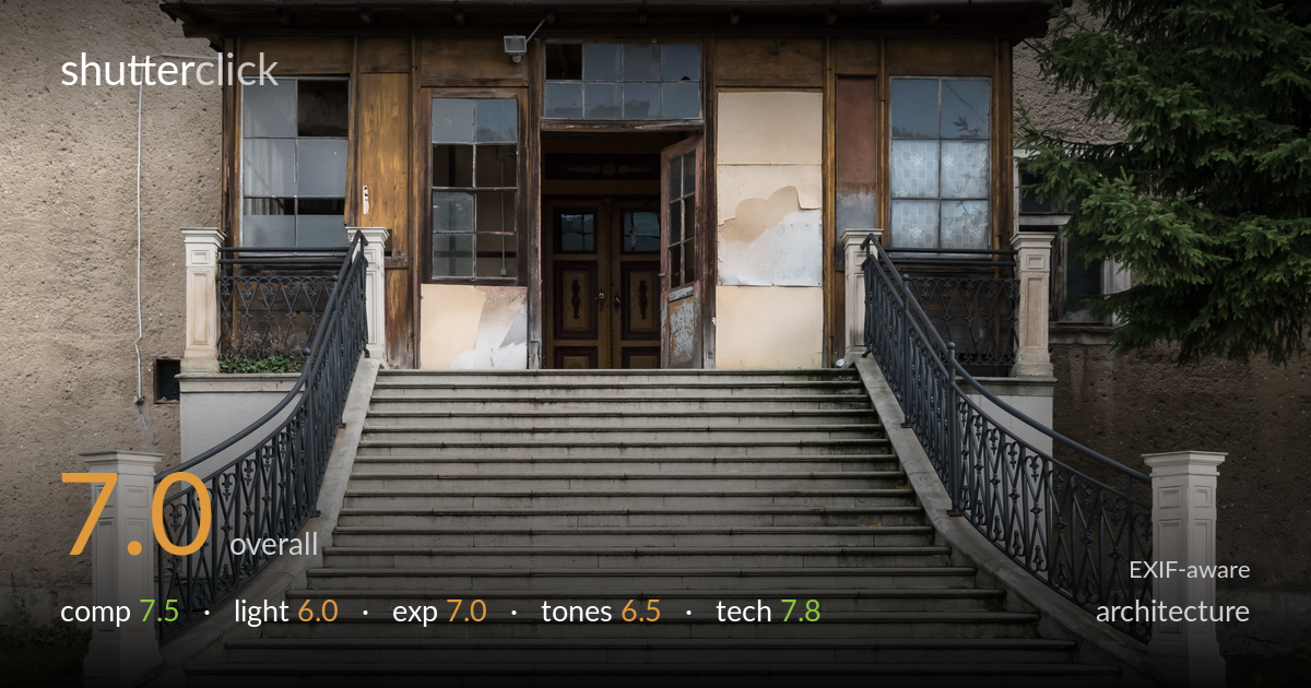
Decaying grand entrance
Photo by Jacek Halicki

| Focal length | 24 mm |
| Aperture | f / 10.0 |
| Shutter | 1/400 s |
| ISO | ISO 800 |
| Exp. comp. | 0.0 EV |
| Shot at | 11:38 · Oct 22, 2016 |
A disciplined, symmetrical study of a decaying grand entrance that holds together through careful framing and frontal alignment. The two sweeping staircases funnel the eye to the central doorway, and the layered textures of weathered timber, peeling render, and stone reward a long look. What most holds it back is flat, overcast light that mutes the porch's wealth of texture, and a slightly loose top crop that includes windows without committing to the upper facade. A return in raking side light and a more decisive framing decision at the top edge would lift this from a solid record shot to something with genuine atmosphere.
The dual curving staircases create a strong symmetrical funnel toward the central door, and the frontal, square-on alignment suits the subject. The crop is mostly balanced, though the top edge sits awkwardly — clipping two full upper windows without enough headroom to read as deliberate. The foreground pavement is generous, anchoring the steps well. Verticals stay convincingly upright. The spruce tree on the right adds welcome organic relief against the geometry, but the left side is comparatively bare, leaving a slight imbalance the rigid symmetry doesn't fully resolve.
Flat, overcast light gives even, shadowless coverage that keeps the whole facade legible, but it does the textures no favours. The weathered porch timber, peeling render patches, and the worn stone treads all carry detail that would come alive under directional light. As shot, the surfaces read as uniformly grey and slightly lifeless. The recessed doorway falls into shadow with little to model it. The diffuse conditions are forgiving for a record but undersell the decayed-grandeur character this entrance clearly has.
Exposure is well controlled across a wide tonal range. The light stone steps hold highlight detail without clipping, and the dark wrought-iron railings retain shape rather than blocking up. The shadowed doorway recess is the one area where detail thins, but it remains readable. The even overcast light made this an easier exposure to nail, and it has been handled cleanly with no obvious blown windows or crushed blacks. Midtones sit a touch flat, but that is a tonal-contrast matter rather than an exposure error.
The palette is muted and earthy — warm timber browns against cool grey render and stone — which suits the subject but lacks punch. White balance reads slightly cool and neutral, fitting the overcast conditions. Overall contrast is low, leaving the image feeling a little soft and grey in the midtones. The wood tones are the most engaging element and could carry more warmth and separation. A modest contrast lift and selective work on the timber would give the frame more depth without compromising its restrained, documentary character.
Settings are well judged for the subject. f/10 at 24mm delivers ample depth of field, keeping the foreground steps, the porch, and the recessed door all acceptably sharp — appropriate for an architectural facade. Focus is accurately placed and the frame holds detail across its width. The 24mm focal length gives a natural perspective with minimal distortion, and verticals are kept commendably upright, suggesting careful camera leveling. The one questionable choice is ISO 800 paired with 1/400s — for a static subject on what was presumably a stable position, ISO could have dropped to base (100) with a far slower shutter, yielding cleaner files and more shadow latitude in the doorway. At 1/400s the shutter is far faster than needed here. Noise is well controlled at this ISO on the D5500, so the cost is minor, but a tripod and base ISO would have been the optimal architectural approach. Lens choice is sensible for the working distance.
What would elevate it
Tags
Shot something like this?
Expert photo critique, on demand — scored across six categories, EXIF-aware. Start with 3 free critiques, no credit card.
critique my photo — free