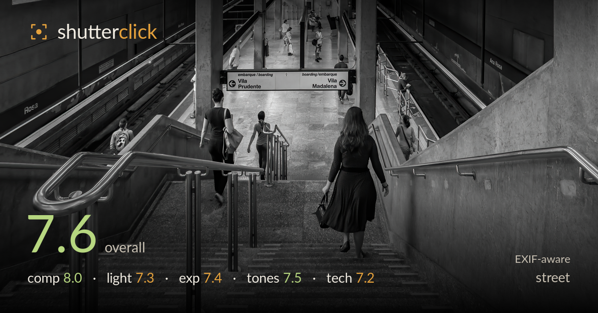
Descending into the metro
Photo by Wilfredor

| Focal length | 18 mm |
| Aperture | f / 4.0 |
| Shutter | 1/60 s |
| ISO | ISO 640 |
| Exp. comp. | 0.0 EV |
| Shot at | 09:41 · Dec 2, 2015 |
A strong architectural street frame anchored by the descending figure in the polka-dot dress, whose dark form and downward gaze carry the eye into the station's converging geometry. The symmetry of twin staircases, handrails, and platform tracks builds genuine depth, with the distant commuters and the boarding sign giving scale and context. What most holds it back is the mid-frame weight of the pillars and sign competing for attention, and shadow areas on the left platform that go muddy rather than resolving detail. The moment is quieter than decisive, but the layering and sense of place carry it.
The layered symmetry works well: twin staircases and handrails frame a central descent that funnels the eye toward the platform and the distant figures. The woman in the patterned dress is well placed just off-centre, her downward motion pulling the viewer through the frame. The converging tracks and pillars build convincing depth. The central pillar and the boarding sign do sit heavily in the middle, splitting attention, and the foreground steps eat a large share of the frame. A slightly higher vantage would ease that lower-third dominance.
The daylight spilling from the arched openings on the left gives the scene a soft, diffuse fill that suits the cavernous interior. The platform floor catches a gentle glow that separates it from the darker track recesses. Directionality is subtle, relying on ambient bounce rather than any strong raking source, so the marble textures on the stairs stay flat. The contrast between the bright central corridor and the shadowed side platforms reads naturally and gives the space its layered sense of scale.
Exposure is balanced for the bright central corridor, holding highlight detail in the floor and the arched window light without clipping badly. The trade-off is the left platform and lower track areas sinking into murky shadow where texture is lost rather than deliberately crushed. The polka-dot figure retains just enough tonal separation to stay legible against the steps. Midtones on the staircase are well placed. Lifting the deepest shadows a touch in post would recover platform structure without flattening the mood.
The black-and-white conversion suits the concrete-and-marble environment, with a reasonable tonal spread from bright floor to deep recesses. Contrast is judged for atmosphere rather than punch, keeping the mood restrained. The mid-tones on the granite steps carry nice gradation. Shadow depth on the left goes slightly flat and grey rather than resolving into rich blacks, so the image lacks a firm tonal anchor at the bottom of the range. A modest boost to black point would add authority.
At 18mm on the DX D300 the wide lens is well chosen for this deep, enclosing space, and the perspective handles the converging lines cleanly without excessive distortion at the edges. f/4 gives sufficient depth of field to keep the foreground steps and the distant platform acceptably sharp, appropriate for an environmental street frame where the whole scene matters. Focus sits on the central staircase and figure, which is the right call. The 1/60s shutter is on the slow side for moving people: the descending figures show mild softness from motion, though nothing frame-ruining. ISO 640 is well managed on this sensor, with only light noise in the shadowed platforms. The main technical limitation is that slower shutter against pedestrian movement — 1/125s or faster would have crisped the walkers. Overall the settings are coherent and suited to the subject, with execution that holds up under the wide framing.
What would elevate it
Tags
Shot something like this?
Expert photo critique, on demand — scored across six categories, EXIF-aware. Start with 3 free critiques, no credit card.
critique my photo — free