Descending vatican spiral
Photo by 16692474

No EXIF metadata in this file
Technical analysis based on visual assessment only.
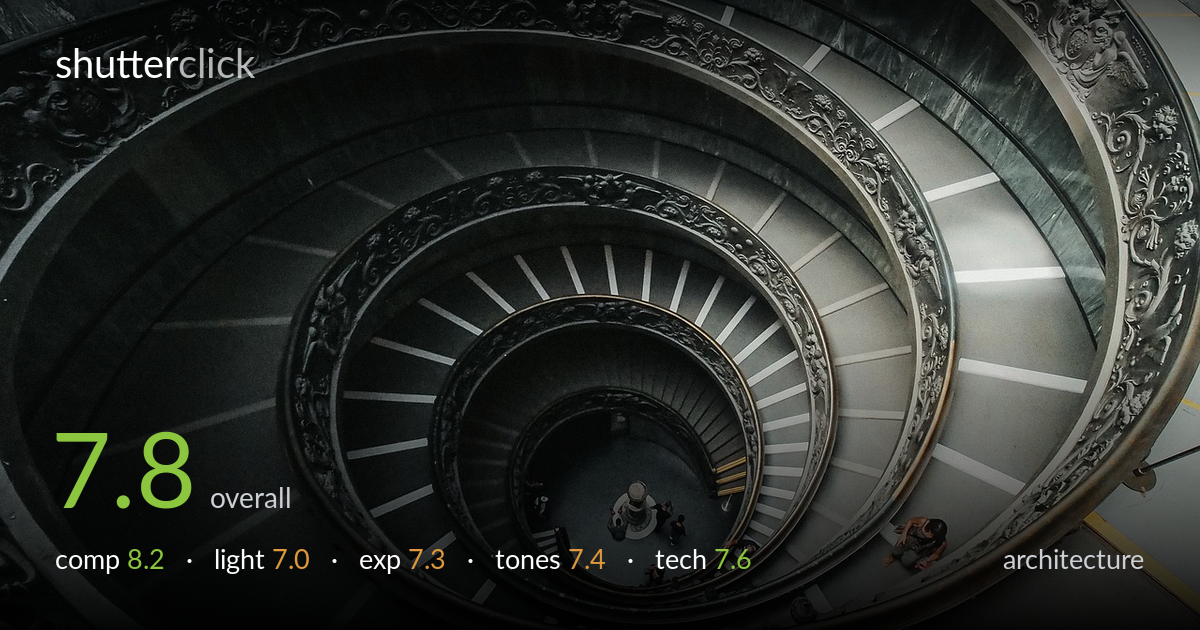
The double-helix spiral is read with confidence, and shooting from the top down lets the geometry unwind cleanly toward the central pillar. The figures at the base anchor scale and give the eye a destination. What most holds the frame back is the off-centre placement of the spiral's vortex: the eye of the helix sits low and right, leaving heavy dead wall along the top edge while cropping the outer rail tightly elsewhere. Tones lean cool and slightly flat, muting the ornate bronze relief. Tightening the spiral toward frame centre and lifting the relief detail would push a strong shot to excellent.
The descending spiral is the obvious draw, and placing the small cluster of people at the base gives scale and a clear terminal point for the eye to travel toward. The nested curves create genuine rhythm. The weakness is the centre of the vortex sitting low and right of frame, so the upper-left carries a large slab of plain wall that does little, while the outer rail is clipped tightly at top and right. Centring the helix's eye and allowing breathing room around the outermost curve would balance the rotation better.
The soft, diffuse museum light is even and shadowless, which keeps the whole spiral legible from top to base with no blown skylight or crushed wells. That evenness is also the limitation: the ornate cherub-and-scroll relief on the rail relies on directional light to reveal depth, and here it flattens into near-monochrome murk in places. A raking side light would carve those carvings into relief. The gentle falloff toward the dark centre, however, reinforces the sense of descending depth nicely.
Exposure is handled sensibly for a high-contrast interior. The bright stone treads hold detail without clipping, and the figures at the base remain visible rather than lost to shadow. The darker rail and inner wall sit heavy but retain texture on inspection. Midtones could be lifted slightly to open the lower-left shadows, where detail goes muddy. Overall the histogram appears controlled and deliberate, with no accidental underexposure, though a touch more shadow recovery would reveal more of the carved ornament.
The palette is cool and desaturated, which suits the stone and lends a restrained, classical mood, but it also drains warmth from the bronze relief that should be a highlight of the scene. Contrast is moderate and a little flat through the mid-tones, leaving the carving reading as grey rather than metal. The yellow floor markings and the orange jacket of the figure lower-right provide welcome small accents. A warmer white balance and slightly punchier mids would let the material qualities sing.
Focus and execution are sound. The spiral holds sharpness across its depth, and the railing detail nearest the camera resolves well, suggesting an aperture chosen to keep the receding structure acceptably crisp. The downward-looking perspective is steady, with no obvious camera shake despite what was likely dim interior light, implying a well-braced or supported shot. Noise is well controlled in the shadow areas, which speaks to a sensible ISO choice for the conditions. The lens covers the scene without gross distortion warping the curves, though the wide field does stretch the outer edges slightly. The main technical opportunity is depth: the very centre and the figures at the base lose a little crispness, and a marginally smaller aperture or precise focus on the central pillar would carry detail all the way down. As captured, the rendering is clean, sharp where it matters most, and free of distracting artefacts.
What would elevate it
Tags
Shot something like this?
Expert photo critique, on demand — scored across six categories, EXIF-aware. Start with 3 free critiques, no credit card.
critique my photo — free