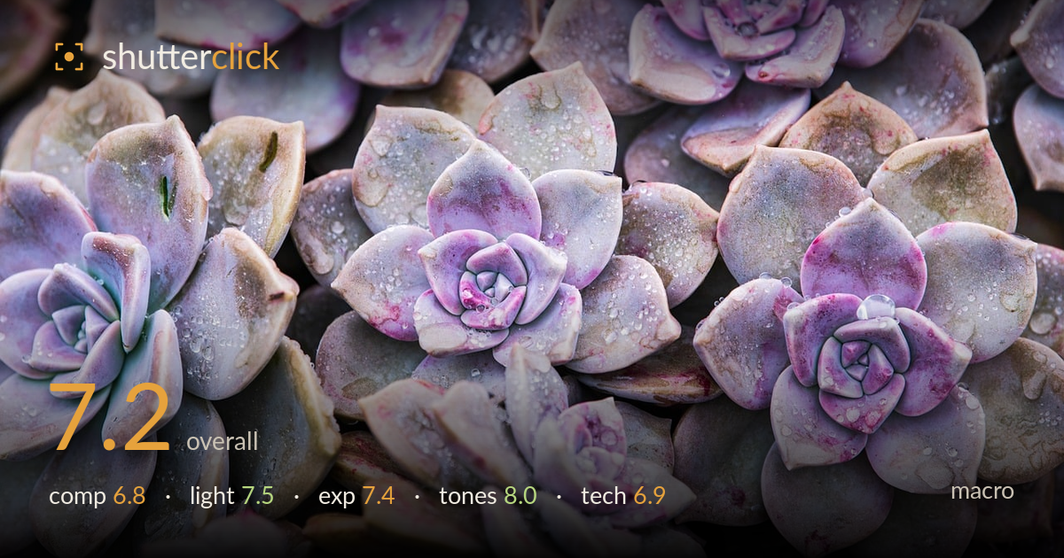
Dew-dropped succulent rosettes
Photo by MARTINOPHUC

No EXIF metadata in this file
Technical analysis based on visual assessment only.
A clean, appealing study of echeveria rosettes whose greatest strength is colour — the dusty lavender-to-pink gradient across the fleshy leaves is genuinely lovely, and the scattered water droplets add sparkle and freshness. What holds it back is the lack of a clear focal hierarchy: several rosettes compete for attention with no single dominant subject, and the frame reads more as a repeating pattern than a directed composition. Focus falls on the central rosette but softens elsewhere, which is expected at this magnification but leaves no rosette rendered with truly crisp, droplet-level detail. Tightening the concept would elevate it.
The all-over pattern of rosettes fills the frame edge to edge and creates pleasing visual rhythm, but no single rosette is given clear priority — the eye wanders between four or five equally weighted forms. The central lower rosette is the closest to an anchor, yet it sits low and is partly cut. Cropped rosettes at every edge feel incidental rather than deliberate. A composition built around one dominant rosette with the others as supporting texture would give the eye a clearer path.
Soft, diffuse light — likely overcast or shade — suits these fleshy surfaces well, wrapping the rounded leaves without harsh specular hits, though the droplets still catch enough highlight to sparkle. The gentle directionality reveals the powdery farina and subtle leaf modelling. It is a touch flat overall, and a hint more raking side light would carve deeper dimensionality into the rosette centres and lift the texture of the leaf edges. As is, it flatters the delicate colour without overwhelming it.
Exposure is well judged for the pastel palette — the pale lavender leaves hold their delicate tone without blowing to white, and the droplet highlights sparkle without clipping to distraction. Shadow pockets between the leaves retain enough detail to describe the layered structure. The overall reading sits slightly bright, which suits the airy mood, but a fraction less exposure would give the highlights on the wettest leaves a touch more security. Dynamic range usage is comfortable and controlled throughout.
The colour is the standout: a refined gradient from cool dusty lilac through mauve to warm rosy pink, with green-grey undertones grounding it. White balance reads neutral and believable, letting the powdery bloom on the leaves show honestly. Saturation is restrained and tasteful — the pinks glow without turning garish. Contrast is soft, matching the diffuse light, and the mid-tone gradation across each leaf is smooth and painterly. A very subtle contrast lift in the rosette centres would add depth without disturbing the delicacy.
At this magnification depth of field is inevitably shallow, and focus appears to land on the central lower rosette, which shows the crispest leaf edges and droplets. The surrounding rosettes fall off progressively — a natural consequence of the working distance rather than a fault, but it means no single element is rendered with the tack-sharp, droplet-by-droplet clarity that macro rewards. Detail in the sharp zone is good: the water beads read clearly and the farina texture is visible. For a subject this static, a focus-stacked sequence would have brought multiple rosettes into full sharpness and transformed the image from a soft pattern into a crisp study. Noise is well controlled and there is no visible motion blur. A slightly smaller aperture, or moving to place the plane of focus along a single rosette rather than across several at different depths, would concentrate sharpness where it counts. Execution is competent; the ceiling is a more deliberate handling of the focal plane.
What would elevate it
Tags
Shot something like this?
Expert photo critique, on demand — scored across six categories, EXIF-aware. Start with 3 free critiques, no credit card.
critique my photo — free