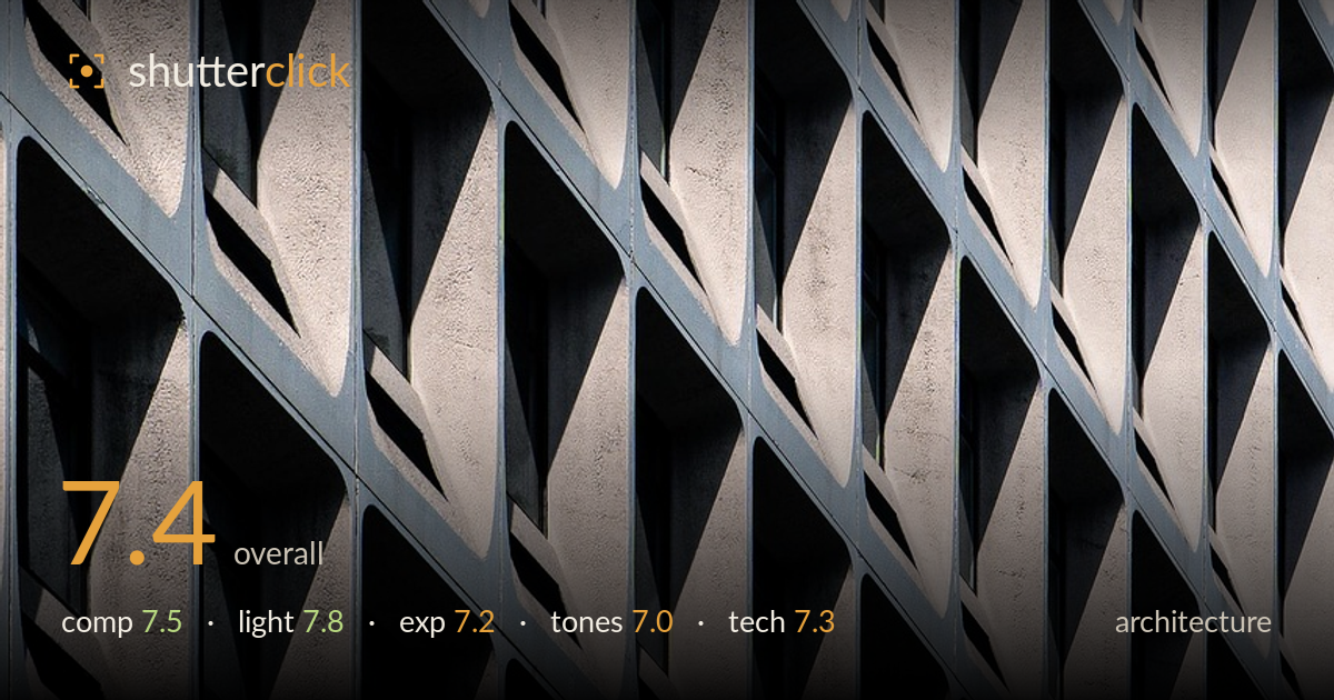
Diagonal rhythm of concrete windows
Photo by 41357766

No EXIF metadata in this file
Technical analysis based on visual assessment only.
A confident study of repetition, where the angled concrete window bays build a strong diagonal rhythm across the frame. The oblique shooting angle turns a flat facade into a play of light and shadow triangles, and the light does most of the heavy lifting. What holds it back is the lack of an anchor or break in the pattern — every cell reads nearly identically, so the eye slides without a resting point. The lone dark window upper-left is the only variation and it sits too close to the edge to fully work. A stronger tonal contrast and a clearer compositional accent would lift this from pleasant pattern to memorable image.
The diagonal grid of window bays creates a satisfying, insistent rhythm that fills the frame edge to edge — a sound choice for an abstract-leaning architecture study. The oblique angle is what makes it, converting the facade into repeating light-and-dark triangles. The weakness is the absence of a focal accent: the pattern is uniform enough that the eye finds nowhere to settle. The single darker window top-left is the only interruption, but it is pushed into the corner where it reads as an accident rather than a deliberate anchor.
Raking directional light is the strongest element here. It catches the angled concrete reveals and casts the deep triangular shadows that give the facade its sculptural depth and pattern. Without this low-to-mid side light the geometry would collapse into flatness. Highlights on the pale concrete hold texture rather than blowing out, and the shadow sides retain enough structure to read as form. The one caution is that the contrast is high enough that some of the darkest recesses fall to near-black, losing the detail that would have reinforced the repetition.
Exposure is judged to protect the bright concrete faces, which keep their gritty surface texture without clipping — the right priority for this subject. The trade-off is on the shadow end, where the deepest window recesses block up to near-black and lose recoverable detail. That works as graphic contrast but sacrifices some of the pattern's information. The midtones on the sunlit panels sit well and carry the tonal separation. A touch of shadow lift, or an exposure balanced slightly brighter, would have preserved more of the darkest cells.
A restrained, near-monochrome palette of warm concrete cream against cool blue-grey mullions suits the subject and reinforces the graphic intent. The cool-warm split gives the repetition a subtle two-tone structure. Contrast is on the high side, which sharpens the pattern but also crushes the darkest recesses. The concrete tones lean slightly flat in the sunlit passages and could carry a touch more separation between light and mid grey. White balance reads neutral and believable. Overall a coherent, understated grade that serves the geometry.
Focus and sharpness appear well maintained across the plane of the facade, which matters for an image built on repetition — the reveals and mullions hold crisp edges from foreground to the receding cells. Working parallel to the wall keeps depth of field manageable, and there is no obvious softness from camera shake or misfocus. The oblique framing means the far cells recede, and they remain acceptably sharp, suggesting a sensible aperture choice for the depth involved. Noise is not a visible concern; the tonal transitions are clean. The main technical note is that the frame is filled entirely with pattern, so there is no reference for absolute scale or a break to test critical focus against — but on the evidence, execution is solid. A slightly longer focal length compressing the grid further, or a marginally higher vantage to keep verticals truer, would have been the only refinements worth chasing.
What would elevate it
Tags
Shot something like this?
Expert photo critique, on demand — scored across six categories, EXIF-aware. Start with 3 free critiques, no credit card.
critique my photo — free