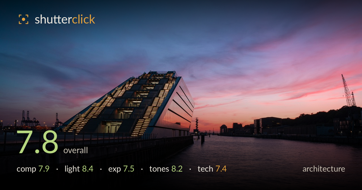
Dockland at blue hour
Photo by paulsteuber

No EXIF metadata in this file
Technical analysis based on visual assessment only.
A confident cityscape-architecture hybrid where the wedge-shaped Dockland building anchors the left third against a burning blue-hour sky. The strongest asset is the pairing of the illuminated diagonal staircase with the pink-and-blue gradient overhead — the building's angular form drives the eye and the sky rewards it. What most holds the frame back is the lower right: a large expanse of dim water carries little detail or reflection, leaving the bottom of the frame heavy and empty. Slightly firmer verticals and a touch more shadow recovery in the pier would tighten the whole.
The building's sloping wedge sits well on the left third and its illuminated staircase forms a strong diagonal that carries the eye up into the sky. The pier line leads in convincingly from the lower left. The water occupying the entire lower-right quadrant, however, is dark and featureless, and reads as dead weight rather than restful negative space. A reflection of the sunset or a lower vantage that compressed that empty foreground would balance the frame. The horizon sits low, which suits the dramatic sky.
The timing is the picture's biggest strength — a genuine blue-hour window with the western sky still holding intense pink and magenta against deepening blue overhead. The warm interior and staircase lighting of the building glows against that cool gradient, a satisfying colour-temperature contrast. The silhouetted cranes and distant skyline read cleanly against the afterglow. The only limitation is that the foreground pier and water receive almost no light, so much of the lower frame falls into flat shadow with little of the sky's drama reaching it.
Exposure is judged to protect the sky, and the coloured highlights hold gradation without clipping — a good call for this light. The building's lit windows sit right at the edge of blowing out but retain shape. The trade-off is the shadow end: the pier, the near water, and the base of the building sink into near-black with little recoverable detail. Some of that is intentional silhouette, but the foreground water in particular could carry more midtone information. The overall histogram leans dark by design.
The colour grade is the highlight: a clean transition from deep navy at the top through violet to hot pink near the horizon, with no muddy crossover. White balance keeps the sky's magentas believable while letting the building's tungsten glow read warm by contrast. Saturation is pushed but stays short of garish. The water picks up a subtle reflection of the pink, which helps. Shadow tones are dense and slightly flat, and a hint more separation in the darkest areas would add depth without disturbing the palette.
The image reads sharp where it counts — the building's edges, the staircase railings, and the distant cranes hold crisp detail, suggesting a well-chosen aperture and a stable support for what was almost certainly a longer exposure at this light level. The water's smooth, slightly softened surface indicates a shutter open long enough to calm the ripples, which suits the mood. Noise appears well controlled in the sky, with clean gradients and no obvious banding. The main technical shortfall is verticals: the building's right face and the near pier posts lean subtly, a keystoning artefact of a wide lens tilted up, which architecture work asks to be corrected. Depth of field is ample front to back, appropriate here. Focus accuracy is solid across the mid-ground. A little more attention to lens correction and perspective control in processing would lift the execution from competent to precise, given the strong foundation already present.
What would elevate it
Tags
Shot something like this?
Expert photo critique, on demand — scored across six categories, EXIF-aware. Start with 3 free critiques, no credit card.
critique my photo — free