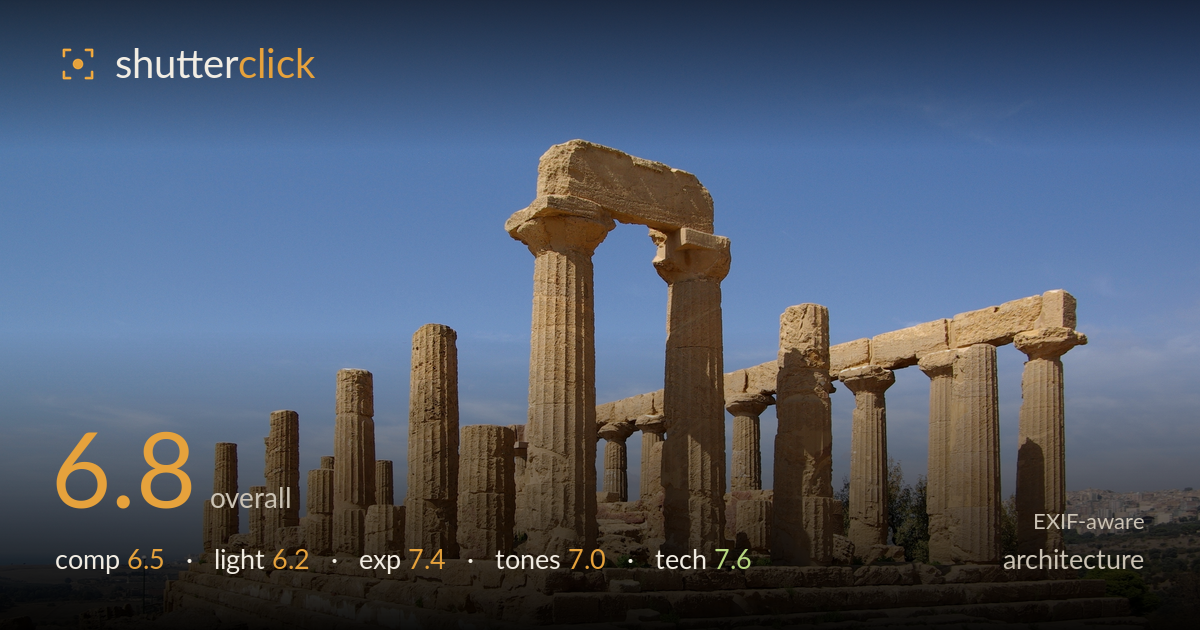
Doric temple colonnade under blue sky
Photo by Berthold Werner

| Focal length | 16 mm |
| Aperture | f / 11.0 |
| Shutter | 1/180 s |
| ISO | ISO 100 |
| Exp. comp. | 0.0 EV |
| Shot at | 12:24 · Oct 7, 2012 |
A solid documentary record of the Doric temple with the receding colonnade drawing the eye cleanly into the frame. The warm sandstone against deep blue sky reads well and the depth of field is fully sufficient. What most holds it back is the three-quarter angle combined with a wide focal length: the columns lean inward and the near colonnade dominates while the far row shrinks abruptly, and the midday sun flattens the stone's texture. A stronger frame would come from earlier or later light and a slightly more considered viewpoint that either exploits or corrects the converging lines.
The oblique three-quarter view gives good depth, with the colonnade receding as a natural leading line and the intact lintel providing an anchor. But the framing is loose: broad empty foreground of scrubby ground and scattered rubble competes for attention without adding much, and the far right columns crowd the edge. The horizon sits low, which helps the sky, yet the temple is pushed to frame-right with unbalanced dead space at left. A tighter crop favouring the structure would concentrate the geometry that makes the subject compelling.
High, near-overhead midday sun delivers strong contrast and clean separation of lit and shadowed column faces, but it does the stone few favours. The light is hard and flat across the fluting, so the surface texture and weathering that give these ruins their character are muted rather than raked into relief. Shadows fall short and steep. Golden-hour side light would model the columns dramatically, deepen the sandstone colour, and warm the whole scene beyond the somewhat neutral daytime rendering.
Exposure is well judged for the difficult bright conditions. The sunlit stone holds highlight detail without clipping, and the shadowed column sides retain texture rather than blocking to black. The blue sky is rendered fully without going milky. Only the brightest patches on the stylobate edge push toward the top of the histogram, but nothing meaningful is lost. At ISO 100 the tonal range is clean and the midtones sit comfortably. A deliberate, competent exposure with room to spare.
The warm ochre stone against the graduated blue sky is a pleasing, natural pairing, and the white balance reads accurate for midday. Saturation looks faithful rather than pushed. The sky darkens nicely toward the top of the frame. Contrast is a touch high from the hard light, which crushes some subtlety in the darker column faces, and the overall palette stays a little cool and flat. A slightly warmer grade would lend the sandstone more of the golden richness it deserves.
At 16mm on the K10D's APS-C sensor (roughly 24mm equivalent), the wide focal length is what drives the strong perspective but also the pronounced convergence of the vertical columns leaning inward — expected geometry for this angle, though uncorrected. f/11 is the right aperture choice, delivering front-to-back sharpness across the deep scene and sitting near the lens's optimal range, well clear of diffraction softening. ISO 100 keeps the file clean with no visible noise, appropriate for the bright, static subject. 1/180s is more than adequate for a handheld wide-angle shot of a stationary building. Focus is accurate across the stone, with crisp detail in the near columns and adequate resolution carrying to the far row. The main technical opportunity is perspective control: either a tilt-shift approach or a squarer viewpoint would tame the keystoning, or the leaning verticals could be corrected in post. Execution of the fundamentals is sound; the geometry is the one area architecture judges strictly.
What would elevate it
Tags
Shot something like this?
Expert photo critique, on demand — scored across six categories, EXIF-aware. Start with 3 free critiques, no credit card.
critique my photo — free