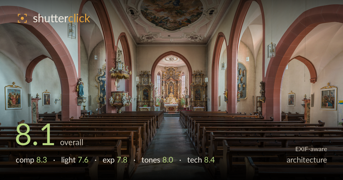
Down the aisle to the altar
Photo by DXR

| Focal length | 13 mm |
| Aperture | f / 11.0 |
| ISO | ISO 160 |
| Shot at | 10:37 · Aug 12, 2015 |
A disciplined central-axis church interior that uses symmetry with real confidence. The nave aisle runs dead-straight to the altar, the arcades mirror each other, and the ceiling fresco anchors the upper frame. Verticals are held admirably plumb for a 13mm shot, and depth of field carries detail from the foreground pews to the distant altar. What most holds it back is the flat midday light through the clerestory windows, which leaves the space slightly even and lifeless, and the very close pew backs at the bottom edge that crowd the entry into the frame. Strong, competent architectural work.
The one-point perspective is executed cleanly — the aisle bisects the frame and pulls the eye straight to the altar, with the arcades and pews framing symmetrically on both sides. The ceiling fresco is placed high and balances the visual weight. The pew backs at the very bottom, though, sit too close and dominate the foreground without adding much, and the extreme corners feel slightly empty. A step back or a fraction more altar in the vertical stack would tighten the read while keeping the disciplined symmetry intact.
The light is soft and diffuse, coming through the upper clerestory windows, which fills the space evenly and avoids blown highlights. That evenness is also the limitation: the interior reads a touch flat, with little directional shaping to separate the arches from the walls or model the ornate altar. The patch of sunlight on the aisle floor is the strongest light event and adds welcome warmth. Shooting when raking light streams through the nave windows would carve more dimension into the stone and woodwork.
Exposure is well controlled for a high-dynamic-range interior. The clerestory windows retain some structure rather than clipping to pure white, and shadow detail holds under the pews and in the side chapels. Midtones sit slightly bright, giving an airy feel appropriate to the space. A few of the stained-glass windows flirt with clipping but stay acceptable. The overall placement looks deliberate and even, with the histogram evidently managed — likely through bracketing or careful single-frame metering against the bright windows.
The warm sandstone floor, terracotta arches and cream walls form a coherent, muted palette that suits the sacred interior. White balance is neutral-warm and believable, with the wood pews rendering naturally. Contrast is moderate, keeping the ornate altar readable rather than crushed. The pink arch tone is well preserved. If anything the mid-tones are a little uniformly light, which slightly flattens tonal separation between similar surfaces; a touch more local contrast on the stonework would give the tones more depth without disturbing the calm mood.
At 13mm, f/11 and ISO 160, the settings are well matched to the subject. The 13mm ultrawide captures the full nave from a tight interior position, and — critically — verticals are kept close to plumb, suggesting careful levelling or perspective correction in post, which is exactly what architecture demands. f/11 delivers deep front-to-back sharpness, keeping the foreground pews and the distant altar both crisp while staying clear of diffraction softening. ISO 160 keeps noise negligible, and the base sharpness holds well into the corners with only mild ultrawide stretching of the outer pews. Focus is accurately placed for maximum depth. The main technical note is the ultrawide's inherent edge distortion, which exaggerates the nearest pews; a slightly longer focal length from further back, if space allowed, would reduce that stretch. A tripod and mirror-up or bracketed frames appear to have supported the clean result. Overall a technically sound, well-executed interior capture.
What would elevate it
Tags
Shot something like this?
Expert photo critique, on demand — scored across six categories, EXIF-aware. Start with 3 free critiques, no credit card.
critique my photo — free