Down the avenue toward the skyline
Photo by marekr

No EXIF metadata in this file
Technical analysis based on visual assessment only.
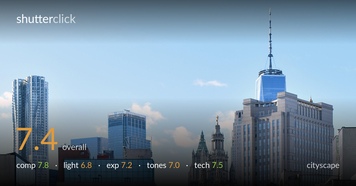
A strong use of converging perspective: the street drives the eye straight down the corridor of buildings toward the One World Trade spire, with the dense Chinatown facades framing both sides. The elevated vantage point pays off, layering the foreground street life against the distant skyline. What most holds it back is the flat midday light, which leaves the scene a little lifeless and the deep canyon shadows on the right partly muddy. The blue sky is clean but undramatic. The framing, depth, and storytelling are the real strengths here — it just needs better light to fully sing.
The central one-point perspective is the clear strength — the avenue funnels the eye down the frame to the One World Trade spire, an effective natural anchor at the vanishing point. Stacked buildings on both flanks build a dense urban canyon with genuine depth, and the foreground cars and signage give scale. The dead-centre symmetry suits the corridor subject. The horizon sits comfortably high. The frame edges crowd a little, clipping buildings abruptly, and the bottom foreground cars compete somewhat for attention.
High, fairly frontal midday sun renders the scene evenly but flatly, with little of the directional modelling that gives cityscapes drama. The right-hand buildings fall into a dim, contrasty shadow while the left and distant towers catch full sun, creating an uneven split across the frame. The clear sky offers no atmosphere or warmth. Golden-hour or low-angle raking light would carve texture into the facades and warm the stone of the distant towers, lifting the whole scene considerably.
Exposure is handled well across a tricky dynamic range. The bright sky and sunlit towers hold detail without clipping, and the shadowed right-side buildings retain enough information to read, if a touch dark. Midtones on the road and facades sit cleanly. The overall brightness feels deliberate and balanced for the conditions. Lifting the deep shadow side a little in post would recover some of the muddier detail in the Chinatown storefronts without compromising the highlights.
Colour is natural and pleasant — the warm brick and red signage of Chinatown play nicely against the cool blue sky and glass towers. White balance reads neutral and accurate. Contrast is moderate, suiting the documentary feel, though the shadowed buildings drift toward a slightly muddy, low-saturation cast. The sky gradient is smooth. A modest contrast and clarity boost in the midtones would give the stone facades more presence and separate the layered planes more crisply.
Sharpness is solid throughout, helped by what appears to be a moderate-to-long focal length that compresses the avenue and stacks the buildings effectively — a smart lens choice for this corridor view. Depth of field is deep enough to keep both foreground cars and the distant spire acceptably crisp, suggesting a well-judged aperture. Focus lands cleanly on the mid-distance buildings where the eye naturally rests. No motion blur is evident in the moving cars, so the shutter was quick enough for the scene. Noise is well controlled in good light. The main technical limitation isn't execution but the flat lighting conditions, which no setting can fix at capture. A slightly higher vantage or a touch more focal compression could stack the towers even more dramatically. Lens distortion is minimal and verticals read reasonably straight, which matters for a symmetrical corridor like this — keeping the camera level paid off here.
What would elevate it
Tags
Shot something like this?
Expert photo critique, on demand — scored across six categories, EXIF-aware. Start with 3 free critiques, no credit card.
critique my photo — free