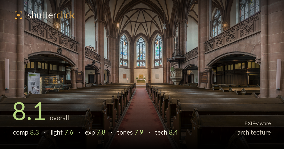
Down the nave to the altar
Photo by DXR

| Focal length | 13 mm |
| Aperture | f / 11.0 |
| ISO | ISO 320 |
| Shot at | 13:43 · Aug 20, 2015 |
A disciplined, symmetrical nave interior that uses the red aisle runner as a strong central leading line toward the altar and stained glass. The one-point perspective is executed with care, verticals held plumb and the vaulting resolving cleanly overhead. What most holds it back is the foreground: the two dark pew ends crowd the lower corners without adding much, and the eye-level camera position keeps the ceiling apex slightly cramped at top. Light is even and workable but flat, leaving the sandstone and vault ribs without much modelling. A cleaner foreground and a touch more tonal separation would lift a technically sound frame into a memorable one.
The one-point perspective is the backbone here, and it works: the red runner draws the eye directly to the altar and the trio of stained-glass windows, with the vault ribs converging overhead to reinforce the pull. Symmetry between the flanking pews, galleries and piers is held tightly. The weak point is the foreground pair of pew ends filling the bottom corners — they read as dark, formless mass rather than framing, and the low horizon leaves the ceiling apex slightly pinched at the top edge.
The interior is lit by diffuse daylight through the stained glass supplemented by the hanging fixtures, giving even, shadowless coverage that keeps the whole space legible. That evenness is also the limitation: the sandstone piers and the vault ribs receive little directional light, so their texture and three-dimensional form stay muted. The stained-glass windows glow nicely without blowing out, and the altar area holds warmth, but the overall rendering is more record-keeping than atmospheric — the architecture is described rather than dramatised.
A well-balanced exposure that manages a difficult interior dynamic range. The bright stained-glass windows retain colour and pattern rather than clipping to white, and the shadowed pew tunnels and gallery undersides still hold detail. Midtones on the sandstone sit comfortably. The deepest foreground pew shadows verge on blocking up in the lower corners, and a hair more brightness in the darkest under-gallery recesses would round out the tonal range. Overall the balance reads deliberate and controlled, consistent with careful bracketing or blending.
White balance is handled sensibly for a mixed daylight-and-tungsten interior, with the warm sandstone reading naturally against the cooler vault plaster. The red carpet provides a welcome saturated anchor without turning garish. Contrast is on the gentle side, matching the even light but leaving the mid-tones slightly soft in separation — the piers and vaults blend into one tonal band. A modest lift in local contrast on the stonework would give the ribs and mouldings more definition and depth.
The 13mm ultra-wide is the right tool for capturing a full nave from floor to vault in one frame, and f/11 delivers deep front-to-back sharpness that keeps both the near pews and the distant altar crisp. ISO 320 is a reasonable choice for a tripod interior, keeping noise negligible while allowing a workable shutter. Focus is placed well for the depth of field required. The standout technical achievement is perspective control: verticals are held genuinely plumb across the frame, with no visible keystoning on the tall piers — evidence of either careful levelling or corrective post-processing. Ultra-wide distortion is well managed too; the barrel bulge one might expect at 13mm is minimal. The only technical caveat is that shooting this wide from a central low position exaggerates the foreground pews relative to the altar, pushing the focal point small and distant. A slightly longer focal length from further back, if space allowed, would balance the scale more naturally.
What would elevate it
Tags
Shot something like this?
Expert photo critique, on demand — scored across six categories, EXIF-aware. Start with 3 free critiques, no credit card.
critique my photo — free