Downtown towers at night
Photo by Pexels

No EXIF metadata in this file
Technical analysis based on visual assessment only.
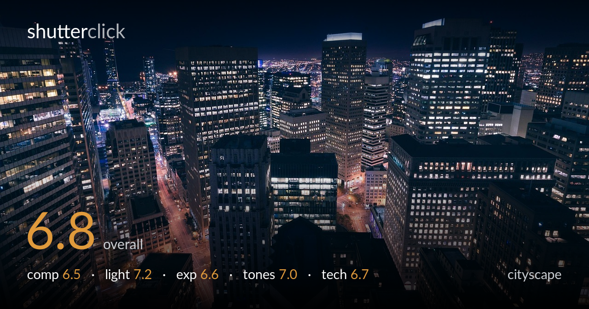
An elevated, immersive view into a dense downtown core at night, with warm street lines threading between cool-lit towers — the strongest asset is the layered depth from foreground rooftops to a faint distant skyline. What most holds it back is a slightly busy, unanchored composition: the eye wanders without a clear primary subject, and the cluster of towers competes rather than building hierarchy. Exposure is mostly controlled but some lit windows clip, and the deep foreground shadows swallow detail. A more deliberate focal anchor and cleaner shadow recovery would lift this from a solid record of the scene to a deliberate statement.
The high vantage point creates genuine depth, with foreground rooftops, mid-ground towers, and a hazy distant skyline stacking convincingly. The warm street grid cutting diagonally through the left half adds welcome leading lines. The weakness is the lack of a clear anchor — the frame is densely packed with competing towers and no single element wins the eye. The lit glass building in the lower centre is the most natural candidate but sits low and partly cropped. A composition built around one dominant structure, with the rest as supporting layers, would read with more intent.
The mix of warm sodium street light against cool blue-white office windows gives the scene its energy and reads as a classic blue-hour-into-night palette. The faint glow of the distant skyline adds atmospheric separation between near and far planes. The illuminated glass facade in the lower centre provides a bright accent that draws the eye. The challenge of this kind of scene is that the light is entirely found rather than shaped, and here the brightest windows pull attention somewhat randomly. Overall the ambient light works in the image's favour.
Exposure holds the broad scene together well, preserving the deep night sky without crushing it to pure black and retaining the faint distant city glow. The brighter lit windows, however, clip in several towers, losing the structure of the panes. The deep foreground shadows fall away into near-blackness, hiding detail in the nearest rooftops. This is a difficult high-dynamic-range situation, and the balance leans slightly toward protecting highlights at the cost of shadow information. A bracketed exposure or careful shadow lift would recover more of the foreground without flattening the mood.
The cool-versus-warm tonal split is the image's defining quality — deep navy sky and shadows against amber streets and white-blue windows. White balance is well judged, letting the two colour temperatures coexist without either feeling artificial. Contrast is strong and suits the nocturnal mood. The midnight blue of the sky rolls off cleanly. Where it could improve is in the muddier mid-tones of the unlit building faces, which sit in an undifferentiated dark grey. A touch more separation there would give the towers more dimensionality and stop them merging into one mass.
Sharpness across the frame appears solid, with the lit windows of the mid-ground towers rendering crisp enough to suggest a stable platform and a reasonably small aperture — appropriate for keeping the whole cityscape in focus. There is no obvious motion blur in the static architecture, and noise is controlled in the sky and brighter areas, though the deep shadows likely hide some luminance noise that would surface if lifted. The wide field of view captures the density of the district effectively but introduces mild perspective stretching at the edges, with the leftmost and rightmost towers leaning slightly. Focus appears accurate throughout, with no single soft zone. For a night cityscape of this scope, the execution is technically sound; the main gains would come from a tripod-enabled longer exposure to pull cleaner shadow detail, and minor perspective correction to straighten the converging verticals at the frame edges.
What would elevate it
Tags
Shot something like this?
Expert photo critique, on demand — scored across six categories, EXIF-aware. Start with 3 free critiques, no credit card.
critique my photo — free