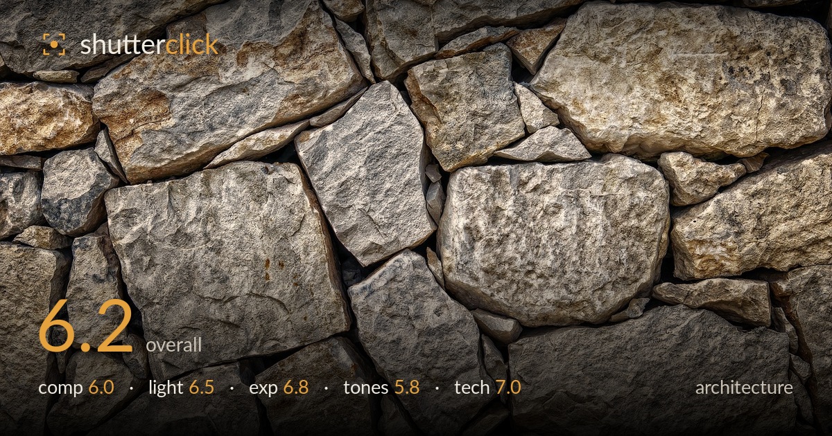
Dry stone wall texture
Photo by Tama66

No EXIF metadata in this file
Technical analysis based on visual assessment only.
A competent full-frame texture study of a dry-stone wall that fills the frame edge to edge with no wasted space. The strength is the fabric itself — irregular blocks locked together with a clear sense of interlocking geometry. What most holds it back is an over-processed, HDR-heavy look that flattens depth and pushes local contrast into a slightly grimy, halo-prone grey. There's also no compositional anchor: the eye wanders without a resting point. As a seamless texture it works; as an architectural photograph it lacks a hierarchy of interest and a cleaner tonal treatment to let the stone breathe.
The frame is filled deliberately, corner to corner, which suits a texture or pattern study and avoids dead space. The interlocking of the blocks creates a loose grid that carries the eye across the surface. What's missing is a focal anchor — no single stone, joint, or contrast break gives the eye somewhere to land, so it drifts. A slightly stronger diagonal emphasis, or building the frame around the larger rounded block lower-centre, would give the pattern a spine rather than reading as uniform infill.
The light is soft, fairly frontal, and even across the wall, which keeps the whole surface legible but does little to model the stone. Raking side light would carve out the depth of each joint and the pitted texture far more dramatically. As shot, the shadows in the recesses are shallow and the surface reads flatter than the physical relief of the wall actually is. The warm patches on the upper stones hint at directional sun that isn't fully exploited.
Exposure is well controlled for a high-contrast subject. Highlights on the pale stone faces hold detail without clipping, and the recessed joints retain shadow information rather than blocking to pure black. The midtones sit a touch high, giving a slightly washed, uniform brightness across the frame. A hair more shadow depth in the joints would add separation between stones. Overall a safe, deliberate reading of the surface with a usable, well-spread histogram and no obvious accidental under- or over-exposure.
This is where the image weakens. The heavy local-contrast processing — an HDR or clarity-driven look — gives the greys a grimy, over-worked quality and introduces faint halos around the harder edges. The warm browns and cool greys sit uneasily together, and the overall palette feels muddy rather than natural stone. Contrast is elevated everywhere at once, which flattens tonal gradation instead of building it. A gentler mid-tone treatment and reduced clarity would restore the stone's natural range and let the warm and cool tones separate cleanly.
Sharpness is good across the frame, with fine surface texture and the pitting of the stone rendered crisply from edge to edge, suggesting a well-chosen aperture and a flat plane of focus parallel to the wall — the right call for a texture subject. There's no visible motion blur and noise is not an issue. The lens appears to handle the flat subject without obvious distortion, and the parallel orientation to the wall avoids any keystoning concern. The main technical caveat is not capture but processing: aggressive local-contrast and sharpening have introduced edge halos and a slightly crunchy, over-detailed appearance that isn't natural to the stone. Dialling back the clarity and sharpening would produce a cleaner, more convincing rendering. Focus accuracy and depth of field are the strengths here; restraint in post is what the file needs to reach its potential. A polariser could also have cut some of the surface sheen for richer tone.
What would elevate it
Tags
Shot something like this?
Expert photo critique, on demand — scored across six categories, EXIF-aware. Start with 3 free critiques, no credit card.
critique my photo — free