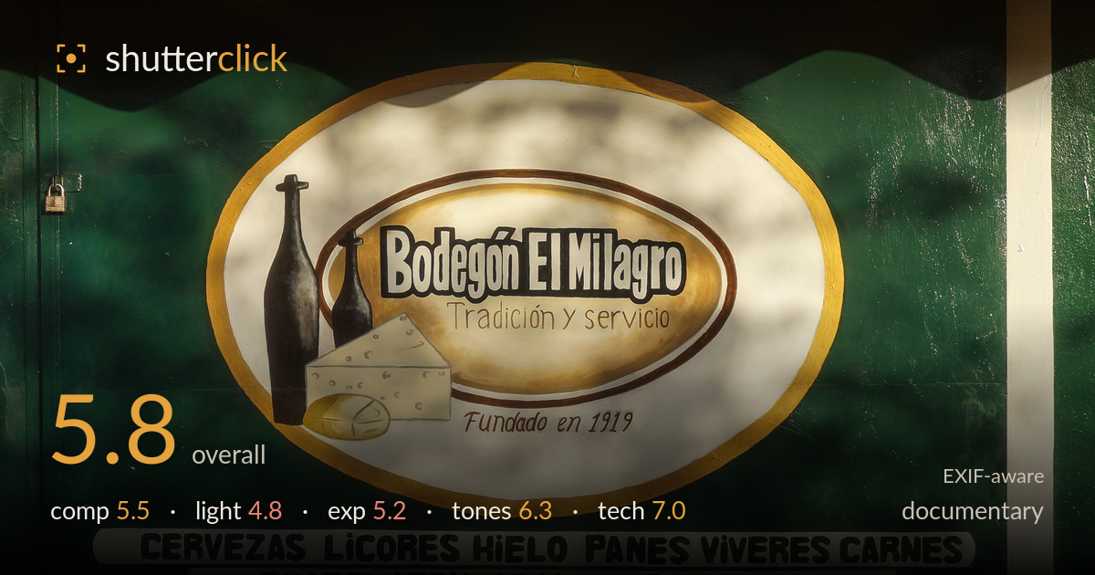
El milagro storefront in dappled sun
Photo by Rjcastillo

| Focal length | 35 mm |
| Aperture | f / 9.0 |
| Shutter | 1/200 s |
| ISO | ISO 100 |
| Exp. comp. | 0.0 EV |
| Shot at | 06:24 · Aug 18, 2013 |
A tightly framed record of a Venezuelan corner shop storefront, rich in vernacular detail — the hand-painted mural echoing the printed awning, the founding date, the litany of goods. As documentation it captures character, but as an image the harsh dappled sunlight is the biggest weakness: it fragments the green wall and the central painted oval into competing bright and dark patches that pull the eye away from the text. The frame is a flat, straight-on catalogue of surfaces with no human presence or wider context to anchor the narrative. Cleaner light and one storytelling element would lift it from inventory to document.
The straight-on framing suits a document of signage, keeping text and mural legible, and stacking the printed awning above the painted duplicate creates a nice repetition of the brand. But the frame is cramped — the awning is clipped top and the mural runs to both edges with no breathing room. The padlock at left hints at a closed shop, a small narrative touch, yet it competes with the dense text for attention. A little context — the doorway, street, or a person — would turn a flat catalogue of surfaces into a scene.
Harsh midday sun filtered through foliage is what most holds this image back. The dappled light scatters bright blotches across the green wall and directly over the central painted oval, breaking up the very element that should read cleanly. Shadows are hard-edged and the awning casts a heavy scalloped shade onto the door below. For flat copy work of signage this light fights the subject rather than serving it. Open shade or an overcast sky would render the paintwork evenly and let colour and text speak.
Exposure sits in a tricky spot given the extreme range from sunlit yellow to shaded green. The bright white oval and the sunlit awning push toward clipping in places, while the shaded green door retains detail but goes muddy. The overall brightness is workable and midtones are reasonable, but the dappled highlights are blown in patches where sun hits the paint. This is more a lighting problem than an exposure error — no single setting could tame this contrast. A shot in even light would make exposure straightforward.
The colour is the strongest aspect: the saturated cadmium yellow awning against the deep bottle-green wall is a bold, characterful pairing, and the warm ochres of the painted oval tie it together. White balance leans warm, appropriate to the sunlight, and the browns of the painted bottles and cheese hold their gradation. Saturation feels natural rather than pushed. The uneven light does compromise tonal consistency across the green, where sunlit and shaded areas read as different greens, but the palette itself carries genuine appeal.
The settings are sensibly chosen for flat copy work. At f/9 on the 18-55mm at 35mm, depth of field is ample to keep the entire wall plane sharp, and the straight-on angle keeps that plane parallel to the sensor — the right call for reproducing signage. ISO 100 delivers clean, noise-free files, and 1/200s at f/9 easily handles a static subject handheld in bright light. Focus appears accurate across the frame, with the painted text and awning lettering crisp. The lens is a modest kit optic but performs adequately stopped down to f/9, where corner softness and aberration are minimised. Verticals are close to true, with only slight convergence at the door edges. Technically this is a competent, well-executed capture; the limitation isn't the gear or settings but the ambient light the camera was pointed into. Nothing in the exposure triangle could have salvaged the dappled sun — that was a matter of timing and location rather than technique.
What would elevate it
Tags
Shot something like this?
Expert photo critique, on demand — scored across six categories, EXIF-aware. Start with 3 free critiques, no credit card.
critique my photo — free