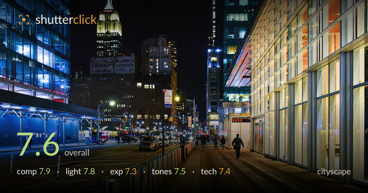
Empire state from a glowing sidewalk
Photo by marekr

No EXIF metadata in this file
Technical analysis based on visual assessment only.
A confident, well-observed night street scene that layers a glowing glass facade, a receding sidewalk, and the Empire State Building as a natural anchor. The strong diagonal of the illuminated building on the right pulls the eye deep into the frame, and the lone walking figure gives scale and a quiet human beat. What most holds it back is the very dark, empty sky occupying roughly a third of the top, and highlight clipping in the brightest windows. Tightening the framing and reining in the hottest highlights would sharpen an already accomplished composition. The instinct for depth and light balance is clearly there.
The right-hand facade forms a powerful leading diagonal that draws the eye toward the subway entrance and the walking figure, while the Empire State Building anchors the left third and gives the frame a recognizable landmark. The layering front-to-back is genuinely strong. The upper third of black sky, however, is dead weight and unbalances the frame toward emptiness. The scene tilts slightly, and the sidewalk bollards, though rhythmic, crowd the lower-left corner. A shorter top and squarer verticals would concentrate the energy.
The mixed artificial light is handled well: warm sodium glow on the sidewalk plays against the cool blue of the left construction hoarding and the golden window grid on the right. That warm-cool tension is the image's strongest asset and gives real depth. The lit facade acts almost as a giant softbox raking down the walkway. The brightest interior windows run hot, though, blowing out to pure white and losing the architectural detail that would have rewarded a slightly darker exposure at capture.
The midtones on the sidewalk and street are well placed, holding shadow detail without muddiness, which is difficult in a night scene. The exposure reads deliberate rather than accidental. The trade-off shows in the highlights: several window blocks on the right facade and around the subway signage clip to featureless white, and the Empire State crown's upper lights lose separation. Bracketing and blending, or simply protecting highlights by a stop, would recover that detail while keeping the shadows this clean.
The colour grade leans into the classic night-city palette of amber and teal, and here it feels earned rather than forced because those colours genuinely exist in the scene. Contrast is punchy, and the black sky reads convincingly. White balance is a touch warm on the sidewalk, pushing the pavers toward orange, which slightly flattens tonal separation between the walkway and the facade. A small pull toward neutral in the warm zone and a gentle highlight roll-off would restore gradation in the hottest windows.
Sharpness across the frame is good for a handheld-looking night frame, with the facade mullions and the Empire State detail rendering crisply, suggesting a steady support or a well-chosen shutter and ISO balance. Depth of field is deep enough to hold both the near bollards and the distant landmark acceptably, appropriate for cityscape work. Noise is controlled in the shadows, which is commendable given how dark the sky and street corners are. The main technical shortfall is highlight management rather than capture discipline: the brightest windows are beyond recovery, pointing to an exposure pushed slightly too far for the dynamic range, or a single frame where a blend was needed. The walking figure carries a hint of motion softness, acceptable at this scale. Verticals on the right facade lean slightly inward, a mild keystoning that lens correction or a small perspective adjustment in post would straighten. Focus placement and overall execution are solid.
What would elevate it
Tags
Shot something like this?
Expert photo critique, on demand — scored across six categories, EXIF-aware. Start with 3 free critiques, no credit card.
critique my photo — free